A wordmark logo for League of Minnesota Poets' newly renamed journal, Agates. The letterforms were hand-drawn in Adobe Illustrator. The roundness of the smaller letters connotes the stones found in Minnesota lakes and rivers. The flowing lines represent the banding found on agates.
Type used: Hand-drawn

A logo for a poetry retreat in Brainerd, Minnesota. For this design I repurposed pieces of my winning design for SkillsUSA. The customer requested that the design be round. A big challenge in this effort was making a woodtick look cute.
Type used: Adorn Engraving
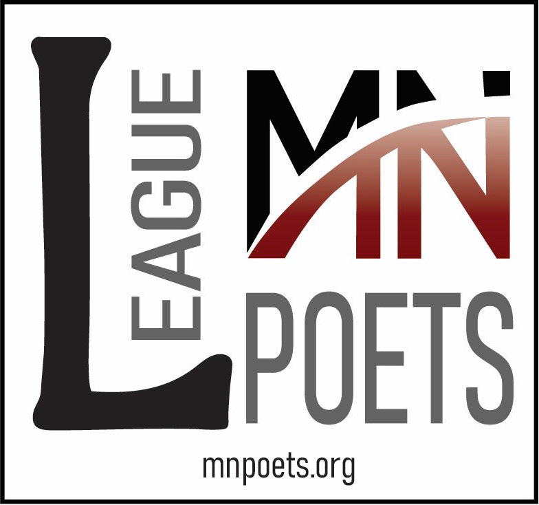
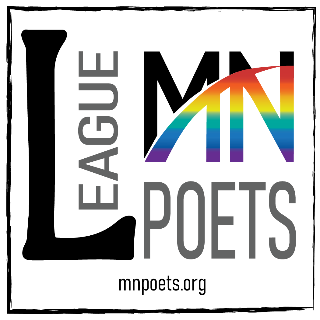
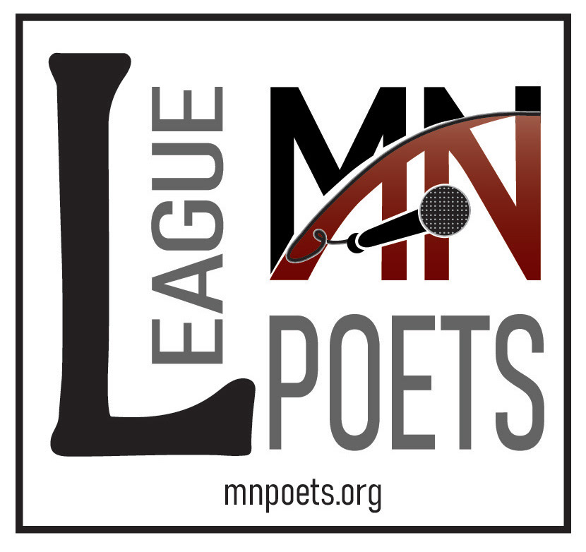
The Leage of Minnesota Poets came to me with a logo idea which I helped them refine. At their request I altered the logo for use at Pride and Spoken Word events.
Type used: Bahnschrift Bold Condensed and Light Condensed. The large L is hand-drawn.


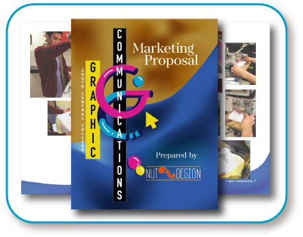
For a project during my Graphic Communications internship at South Central College: To design a logo and make a template for a magazine called goodSTUFF to feature student art and promote the Graphic Communications, Multimedia Technology, and Fine Arts programs. The lefthand logo uses colors consistent with the college's branding, while the righthand logo replaces the blue with white for situations where higher contrast is needed.
Type used: Alana Smooth, Futura Bold, Helvetica

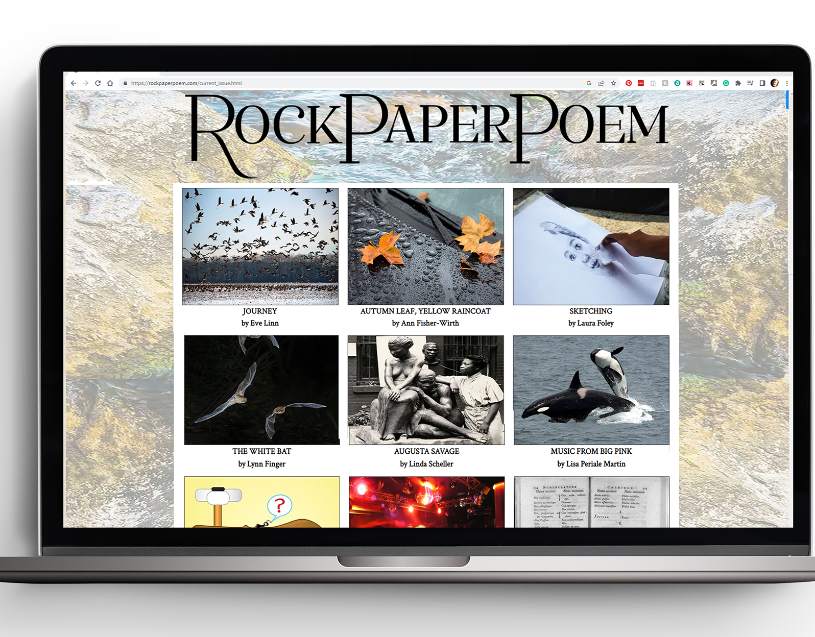
A wordmark logo for an online poetry journal with a whimsical name that is a play on rock-paper-scissors. I was encouraged to think of rock as something stable and grounding, rather than as a game piece, so I created something solid, putting all three words together and using large and small caps. To add a bit of playfulness to the piece I altered the bottom of the initial capital R, giving it curves and bringing the line to a point.
Type used: Gwyner Regular