Brand Book for SEMHA
a Catchafire Volunteer Project
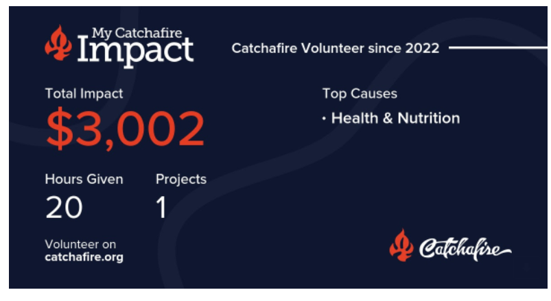
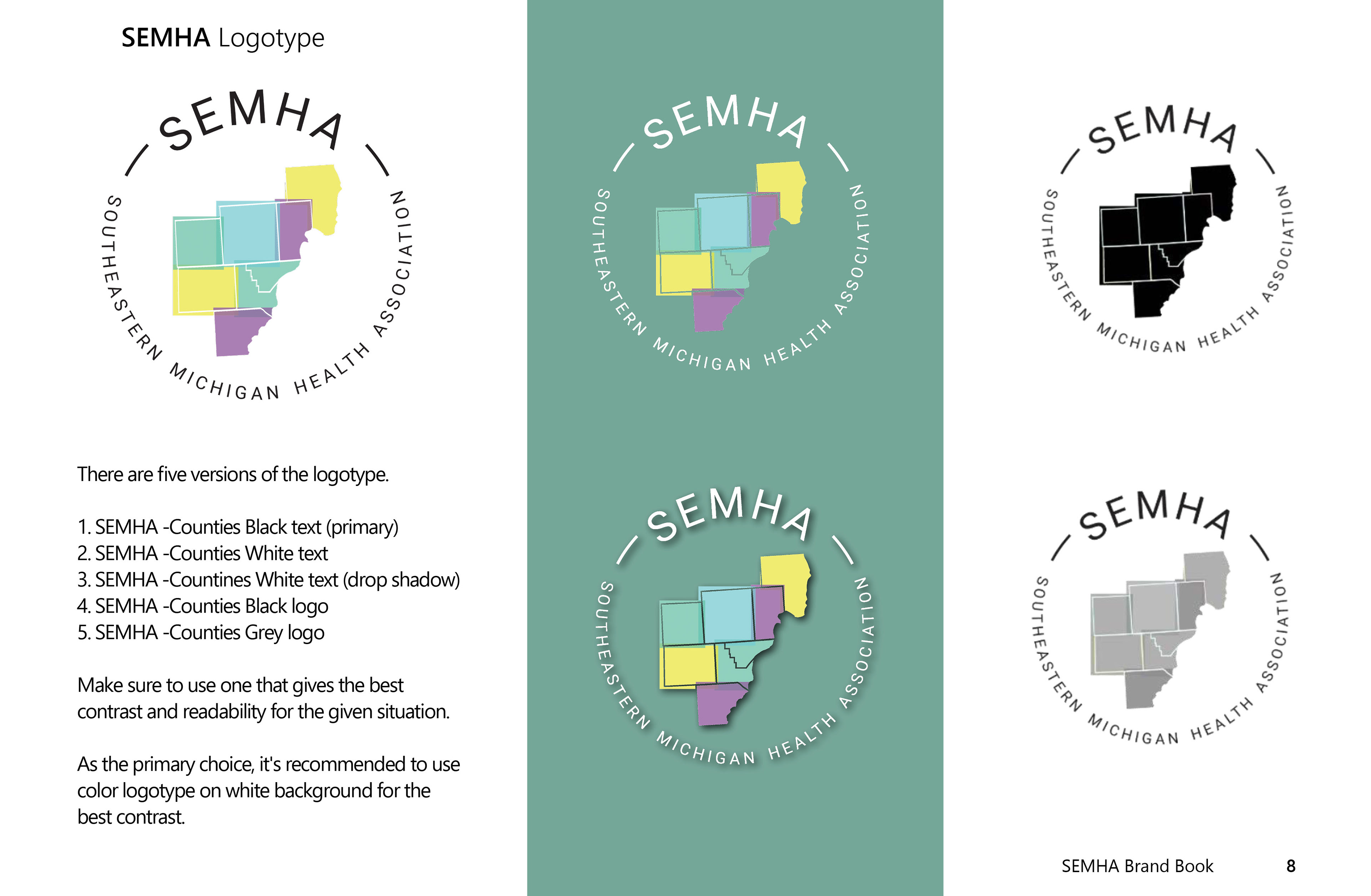
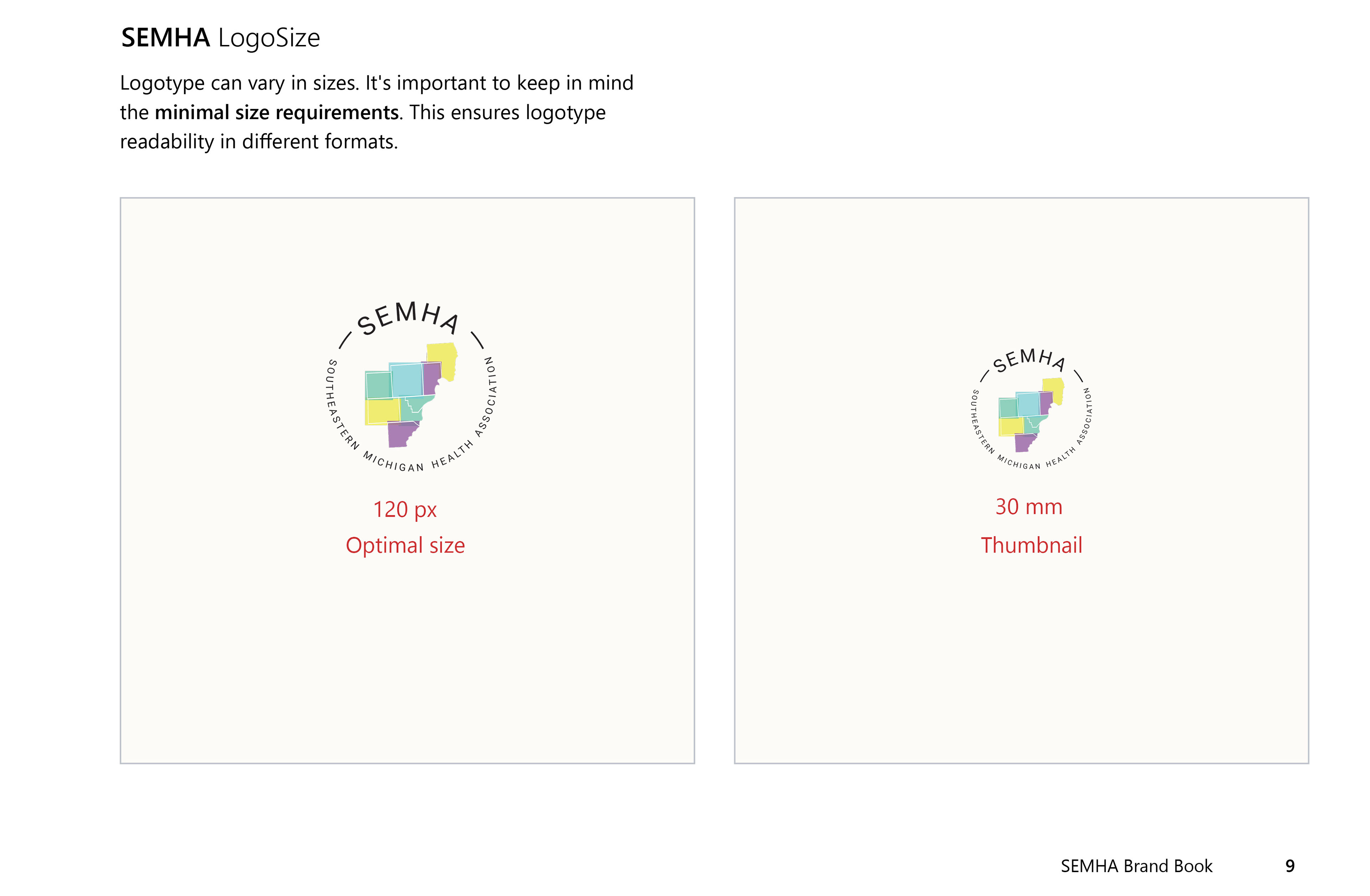
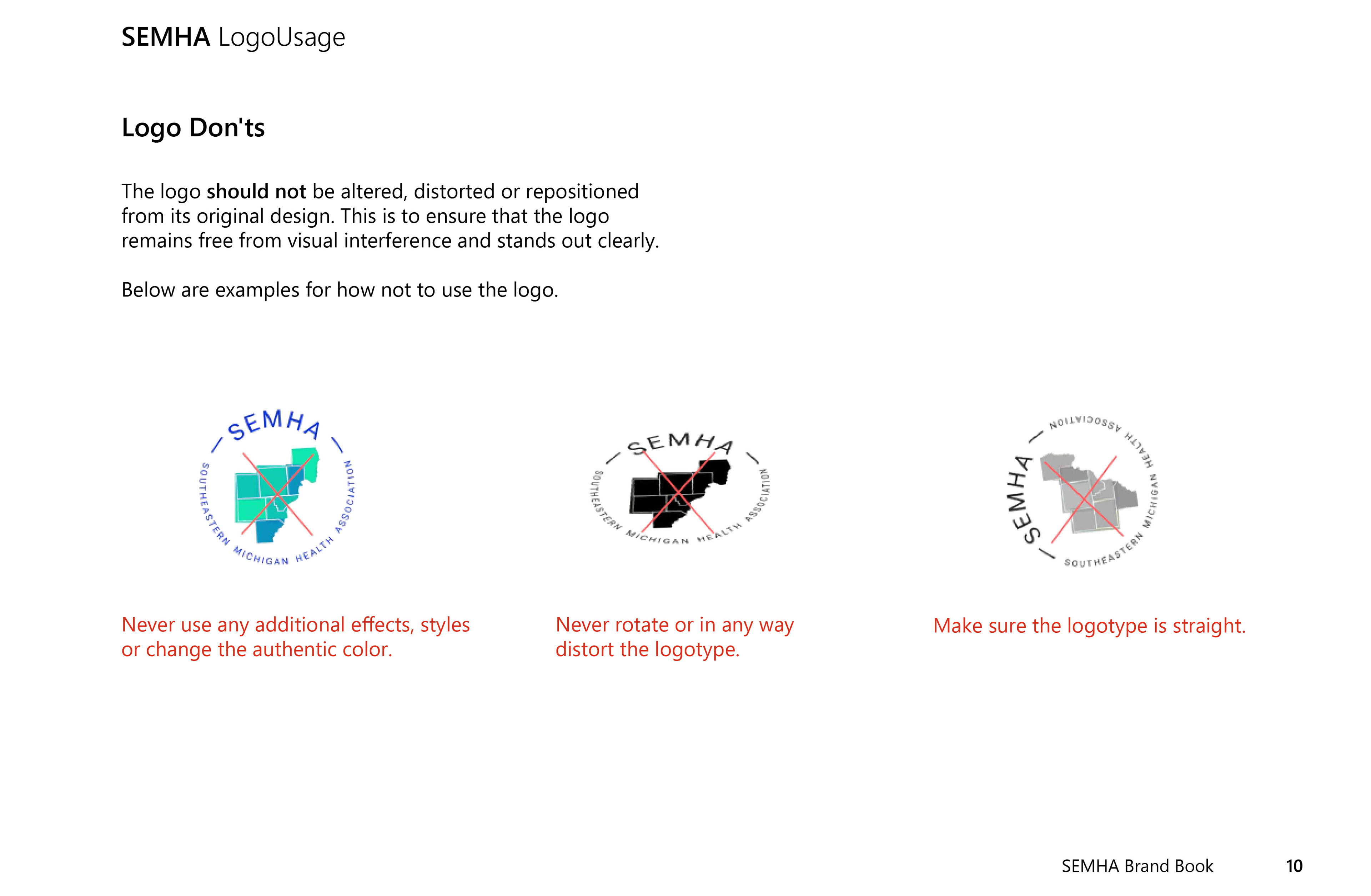
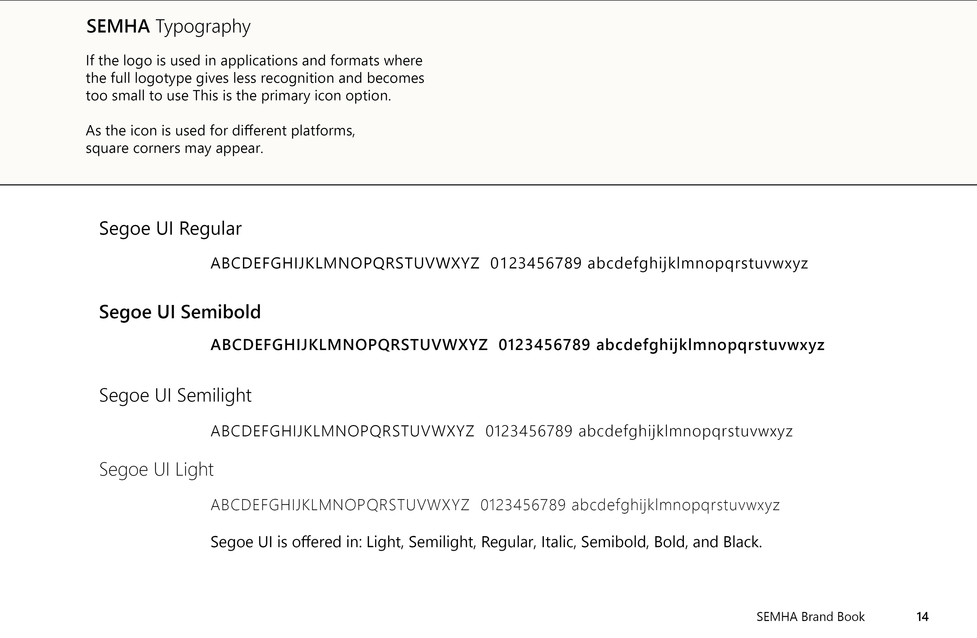
My task for SEMHA--also known as the Southeastern Michigan Health Alliance--was to convert their brand book, which was an online-only document, to a printable book. I had to maintain the content of the pages and their style while making changes to improve readability--such as outlining white type on a yellow background with black--and I emphasized the brand colors.
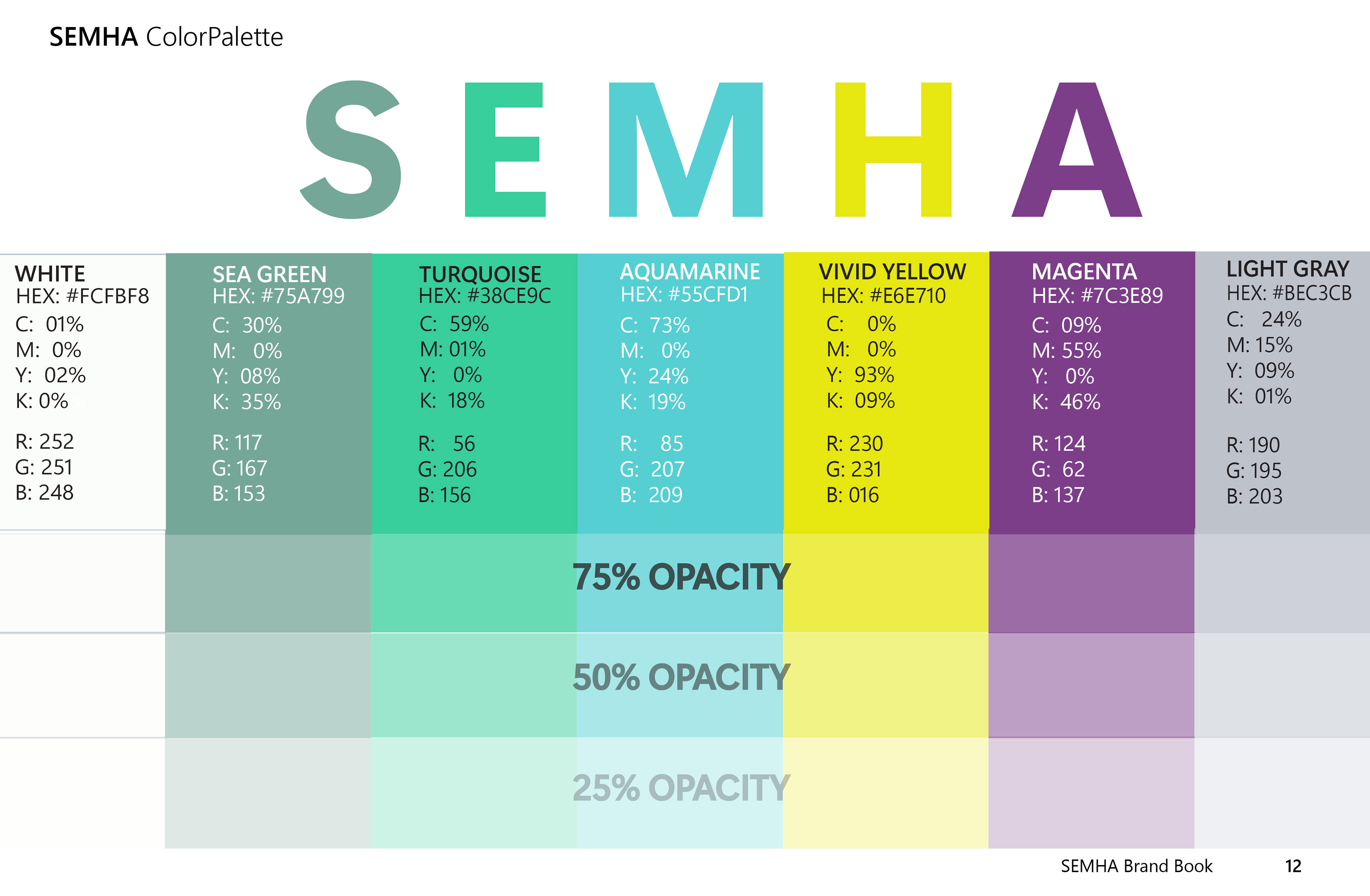
SEMHA Color Palette
At their request, I redesigned their color palette using the letters S-E-M-H-A as a heading and adding levels of opacity. These changes pulled the document together and reinforced the SEMHA brand.