"goodSTUFF"
[G]oodSTUFF is a magazine that may one day be produced by South Central College in North Mankato, Minnesota. The purpose of this magazine is to promote the college's Graphic Communications, Multimedia Technology, and Fine Arts programs by showcasing the work of students and alumni. As a Graphics Intern, I designed the covers, the logo, and the layout template.
Process
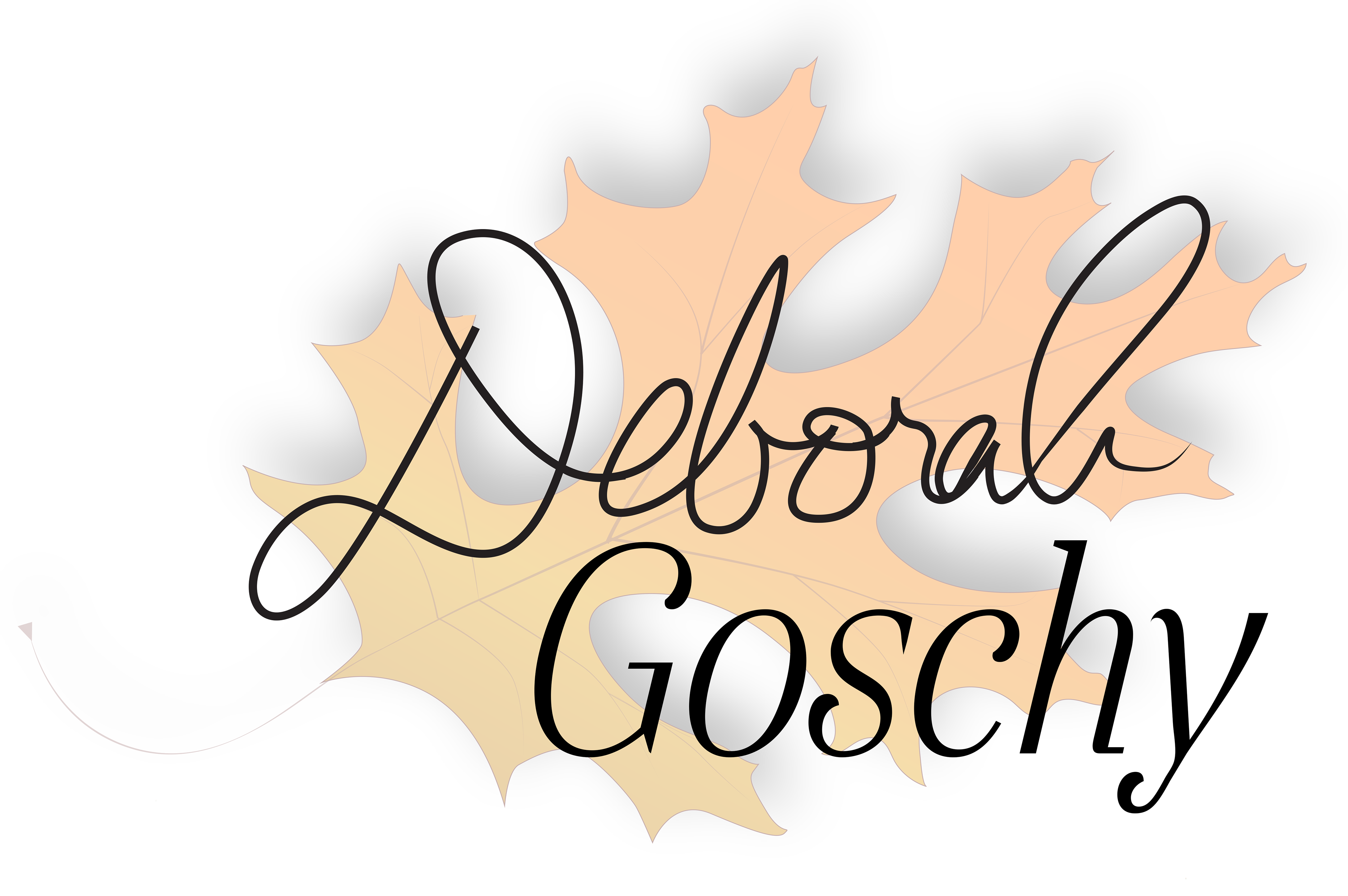
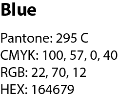
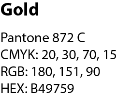
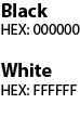
Logo Development & Colors Used
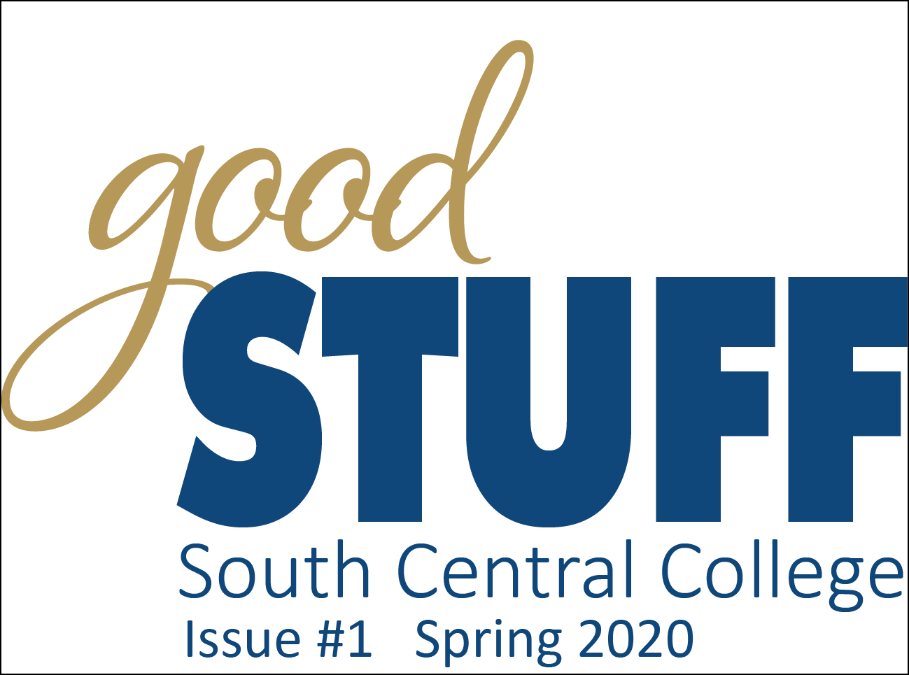
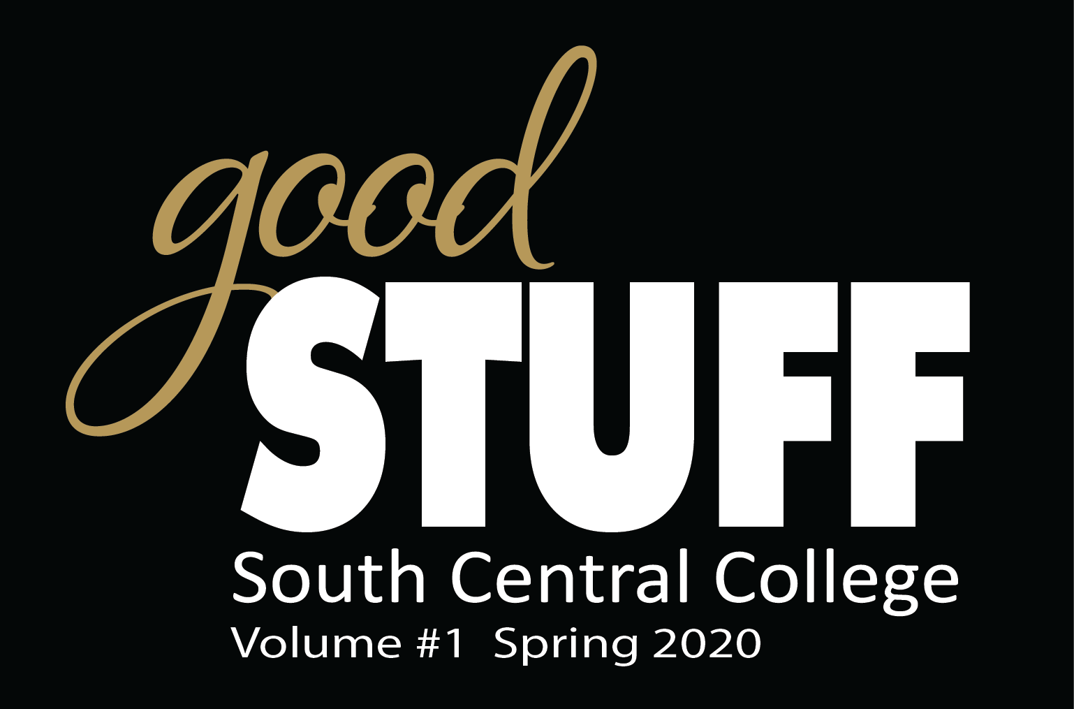
I designed a wordmark logo of the magazine’s name. After doing research, I decided that I wanted there to be a stylistic difference between the words of the name, emphasizing the adjective good before the noun, STUFF. I used Alana Smooth for 'good' and Futura Bold for STUFF. I made two versions of the logo, one for light backgrounds and one for dark backgrounds. The logo on the light background uses blue and gold, and the logo on the dark background uses white and gold. The information beneath the logo is in Calibri. Both Futura Bold and Calibri are specified in the brand style guide. The colors, listed below, are also specified in the brand style guide:
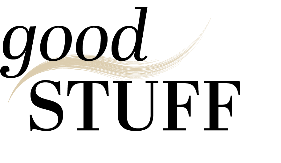
Other Logo Possibilities
Here are some of my other takes on the magazine's wordmark logo. I took four potential logos to my supervisor, which gave her a range of options to consider. It also let her know that I had given the logo development ample thought and attention.


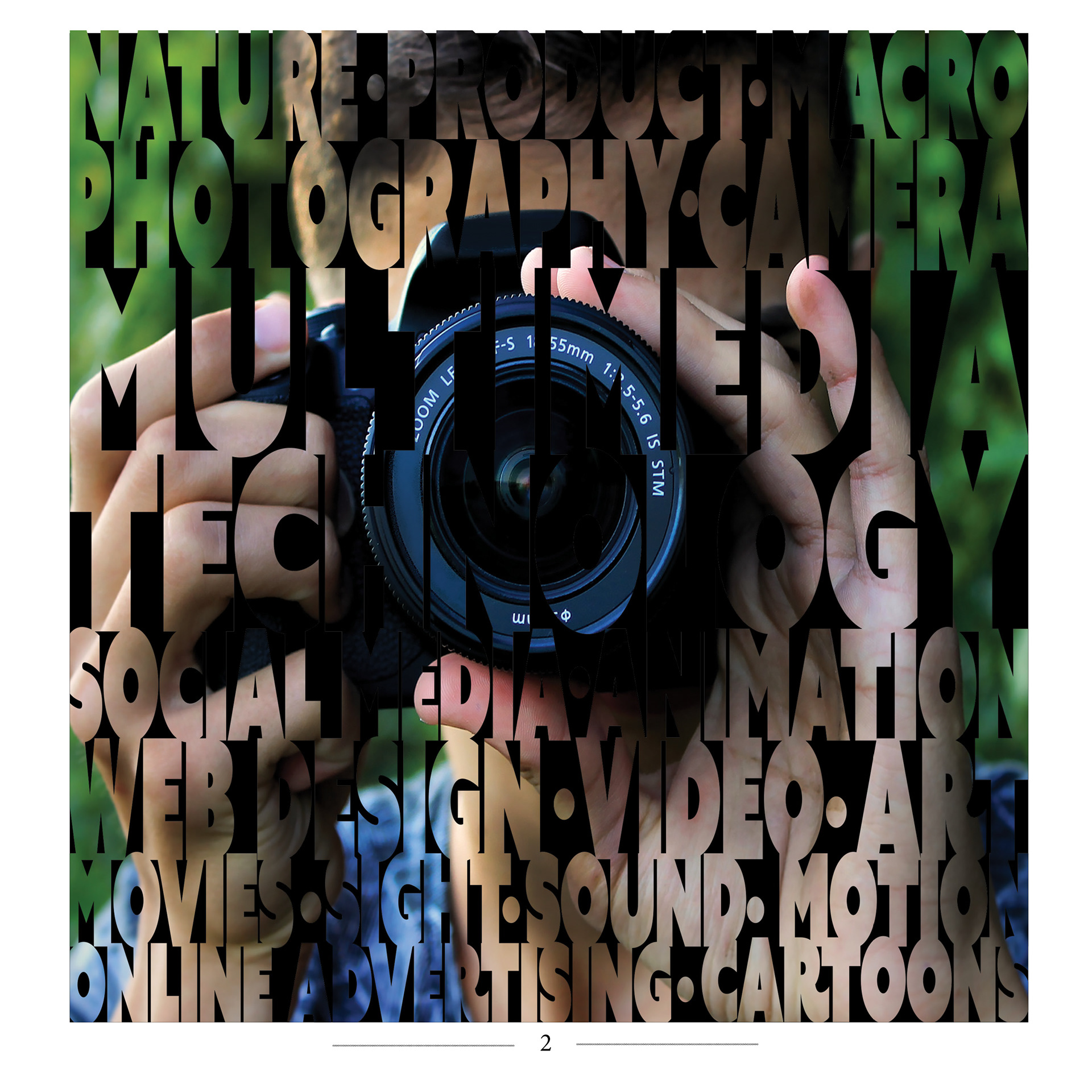
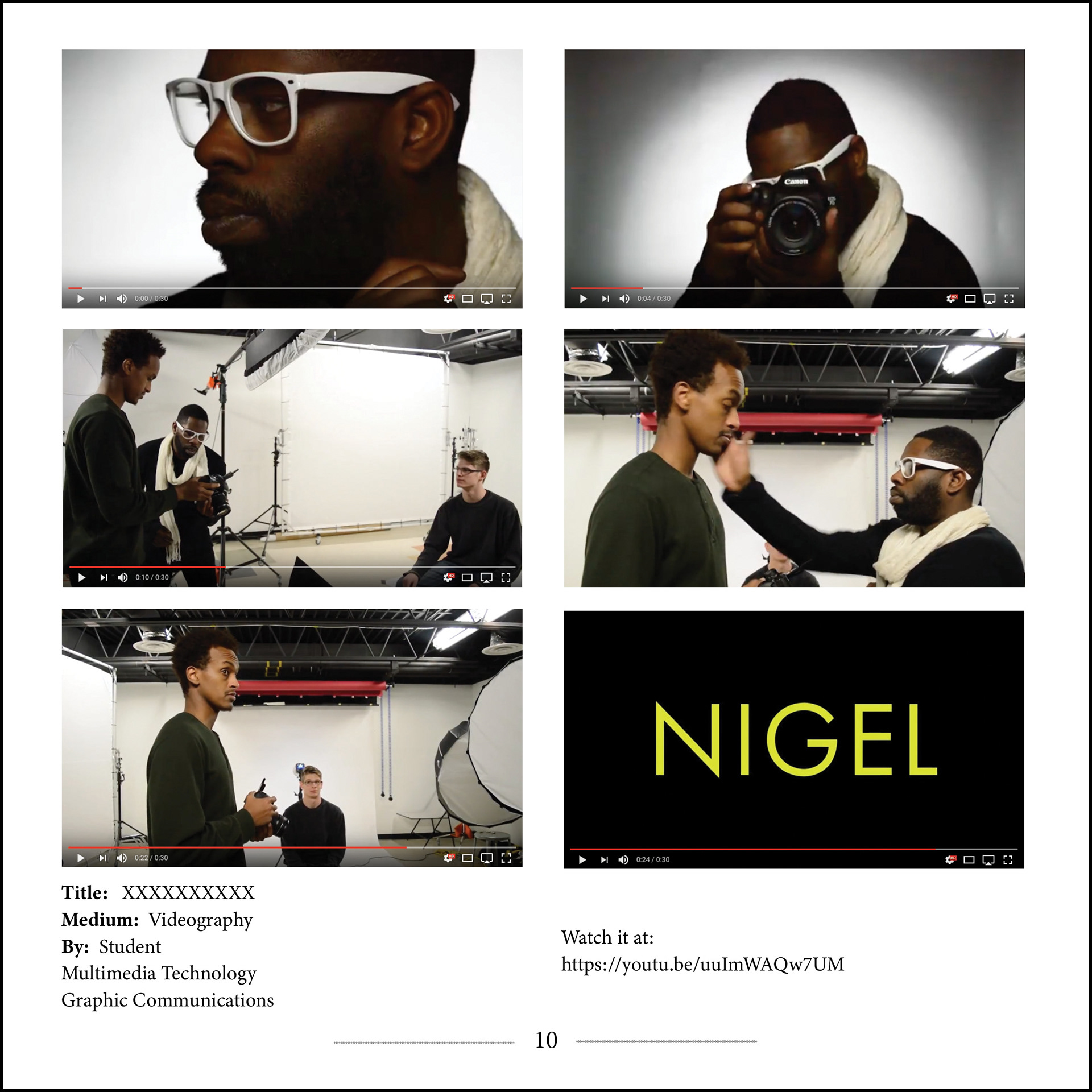
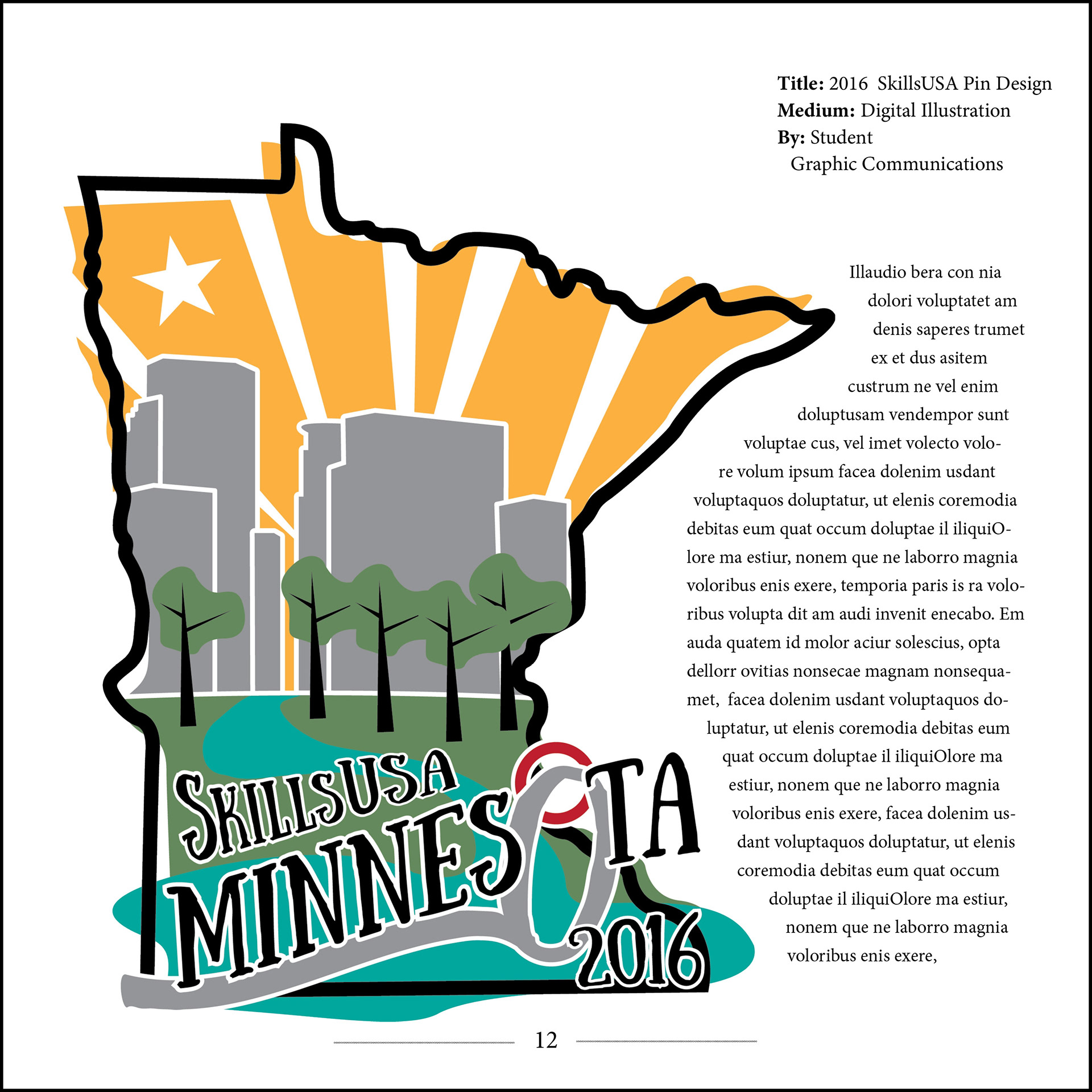
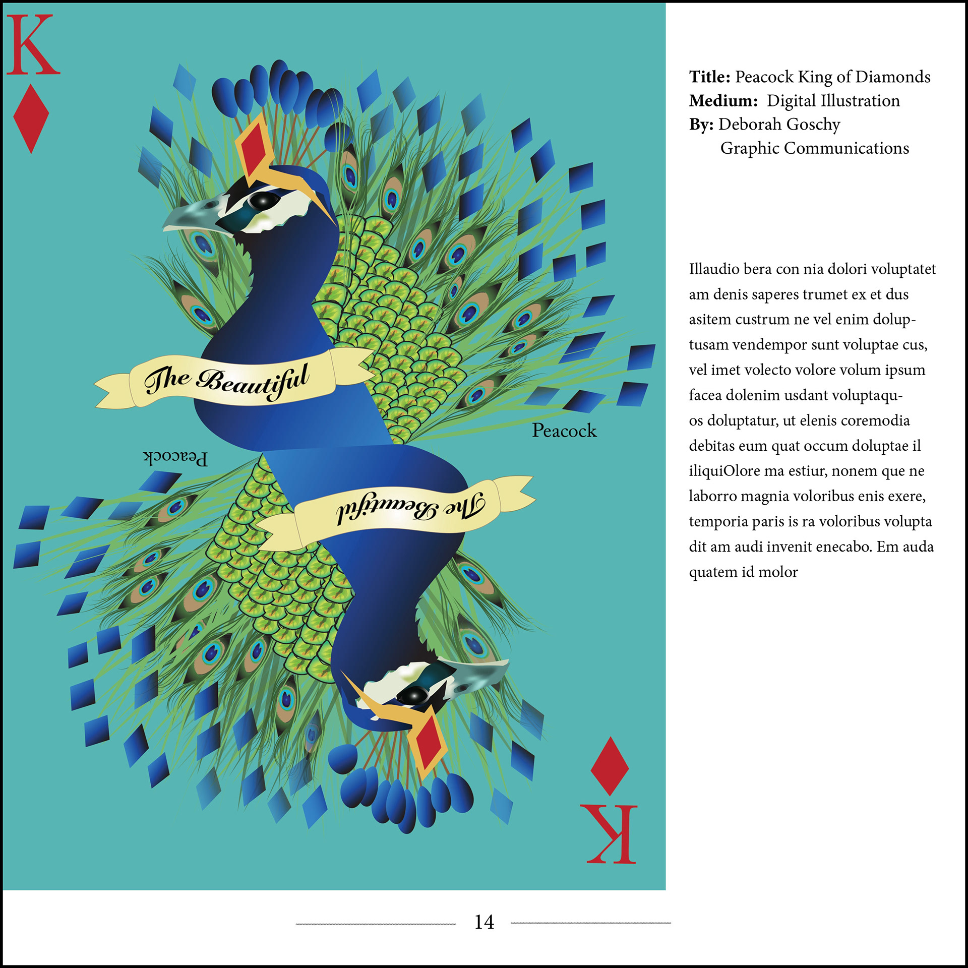
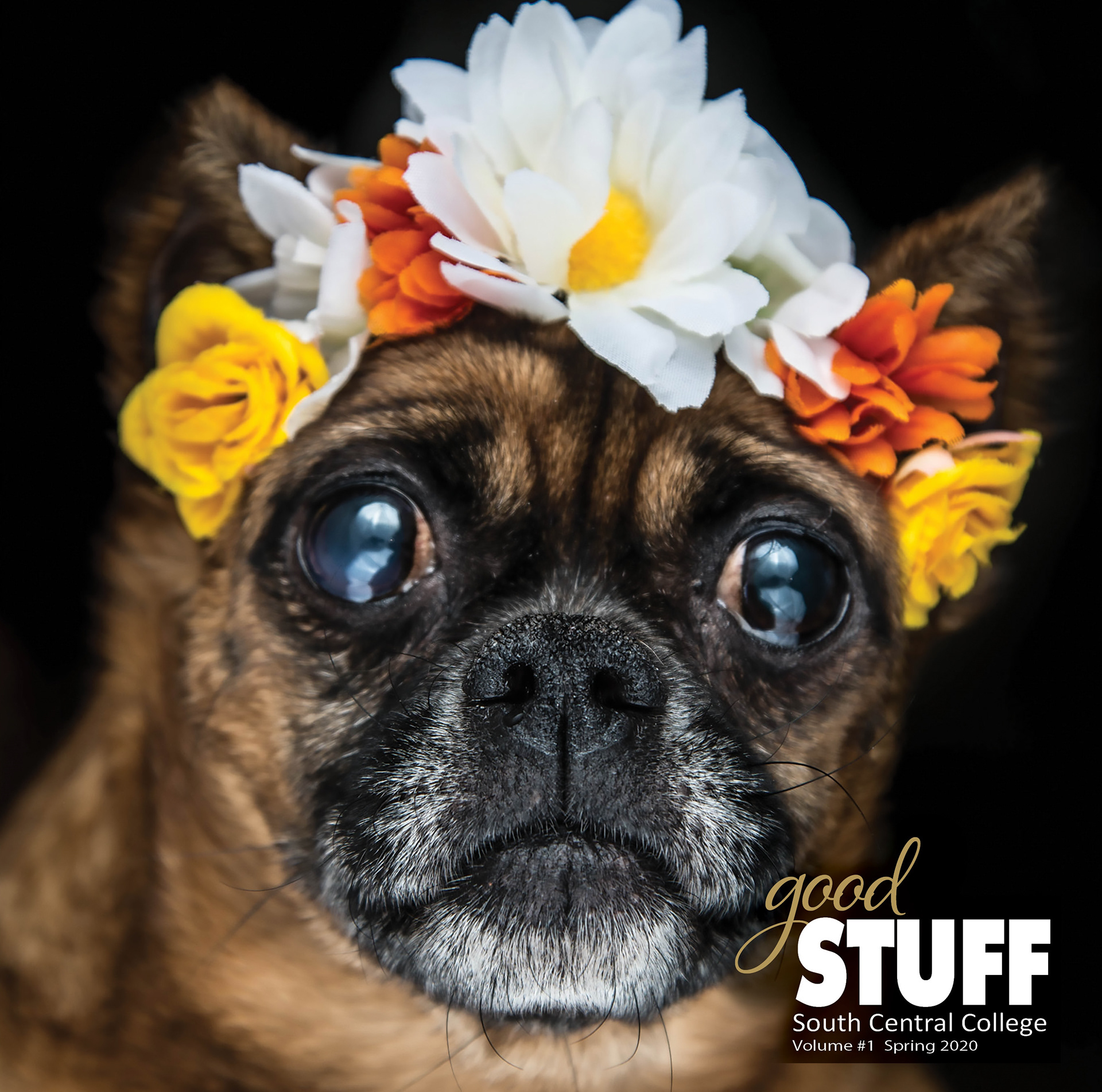
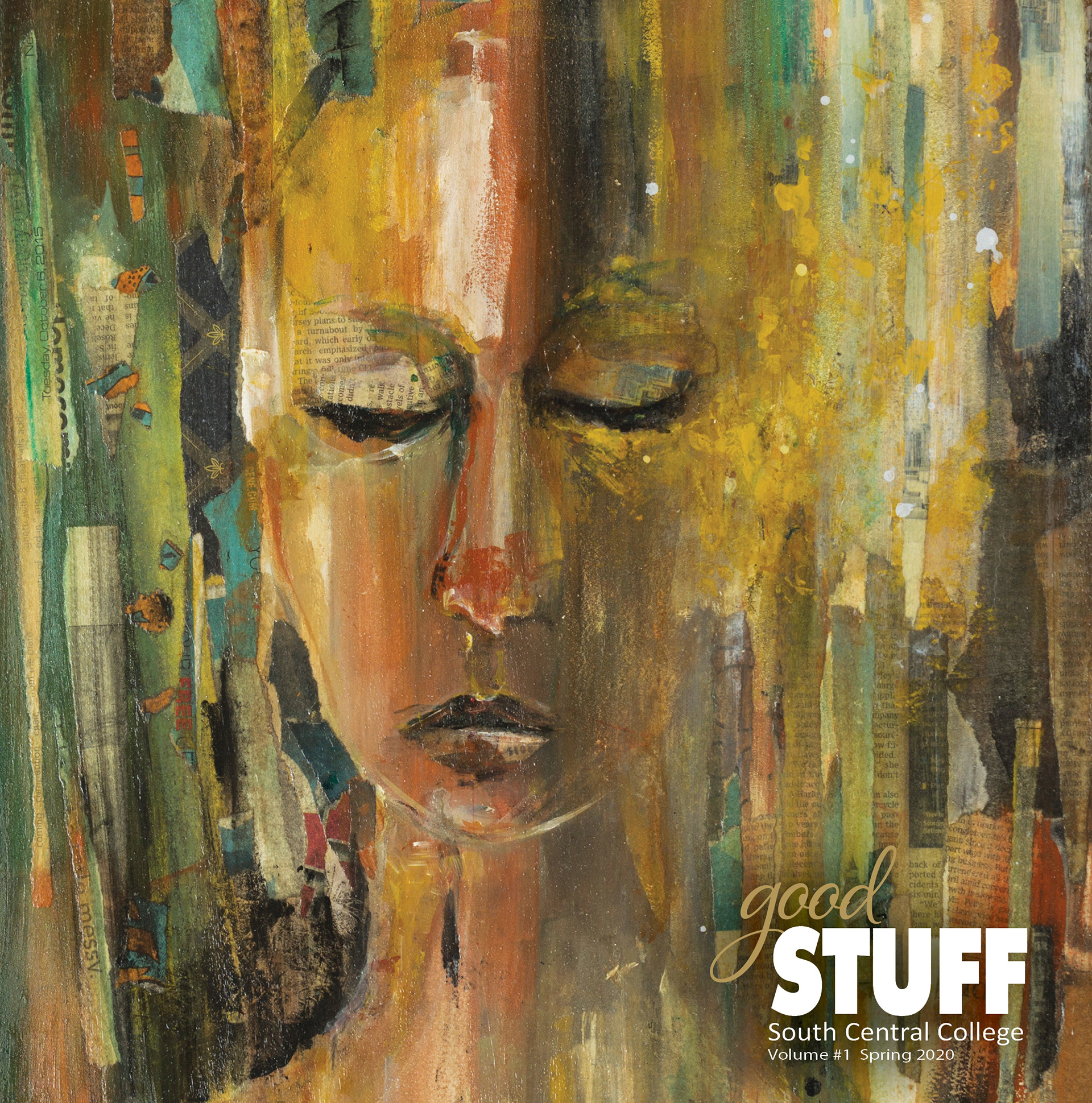
Covers
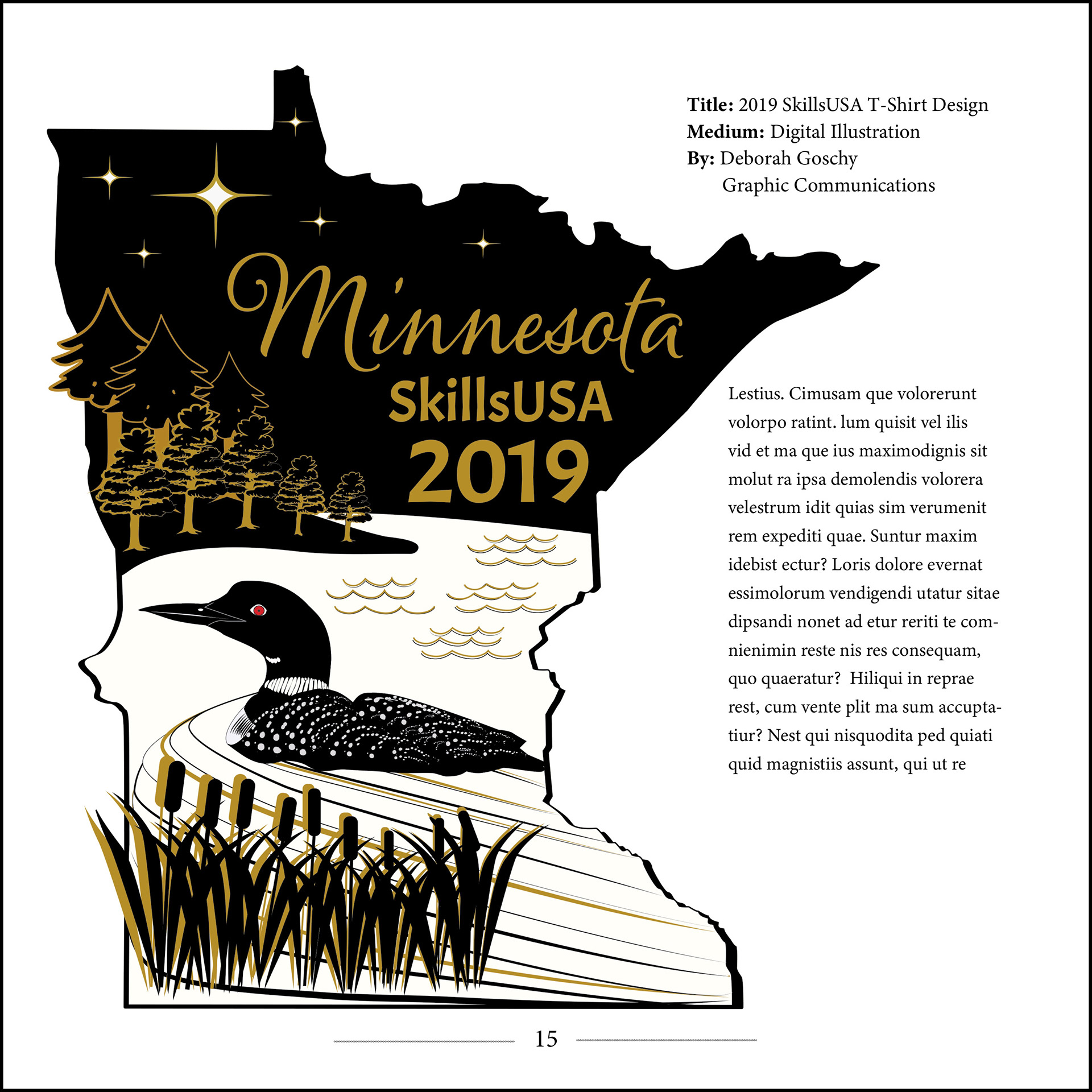
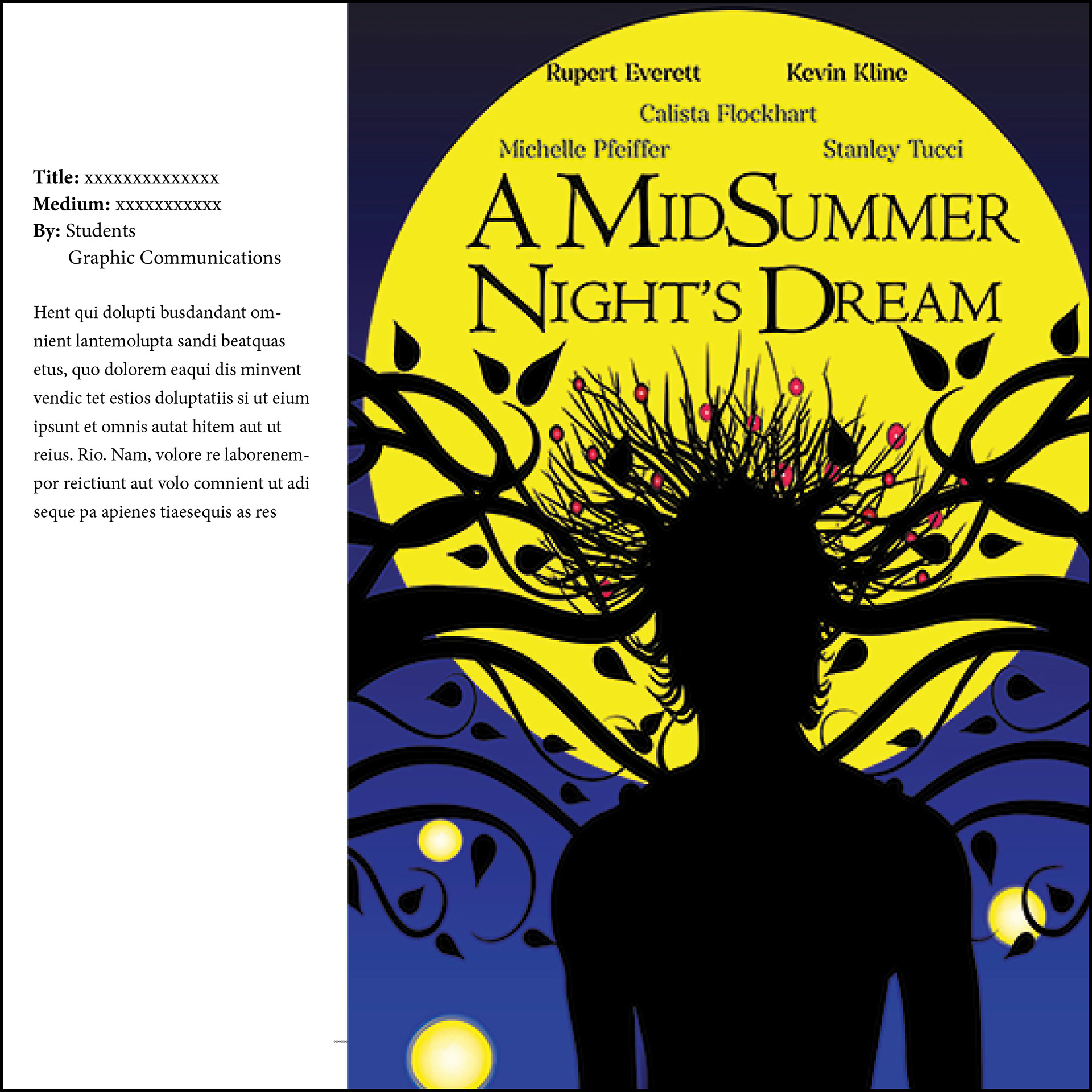
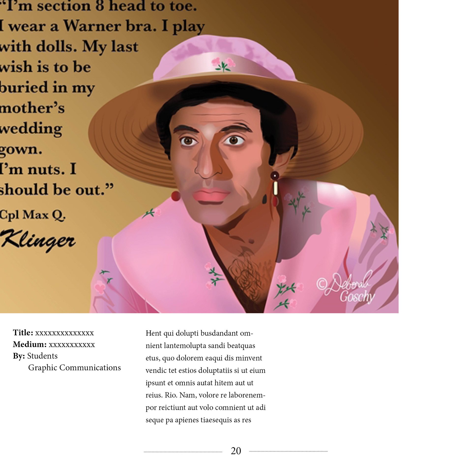
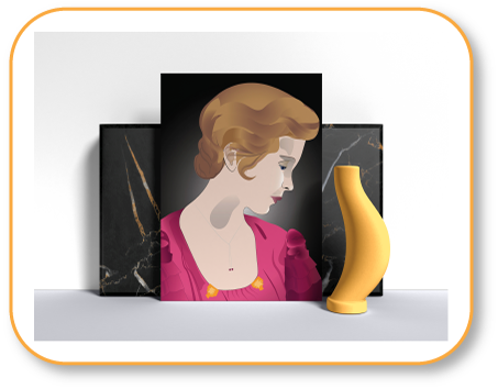
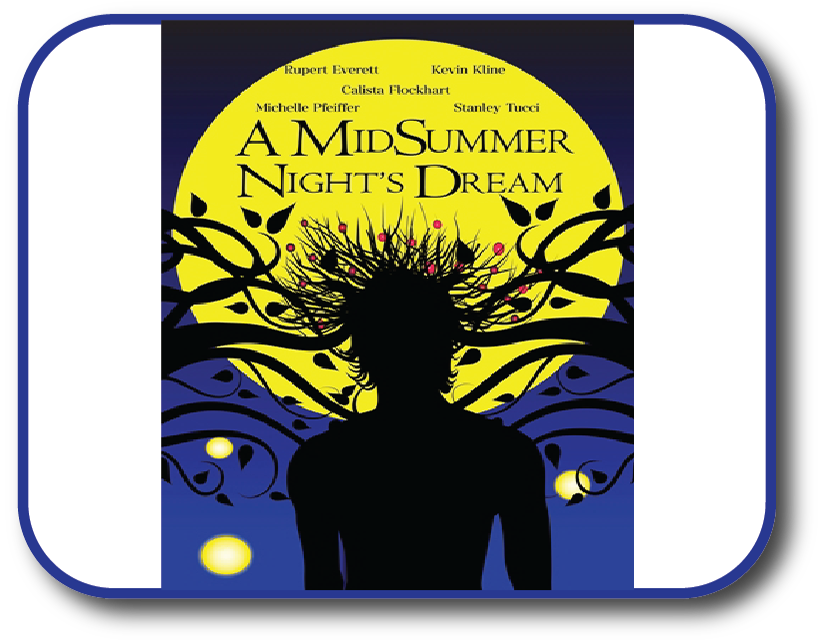
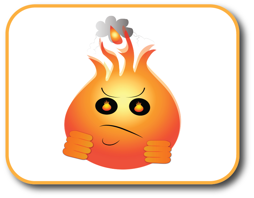
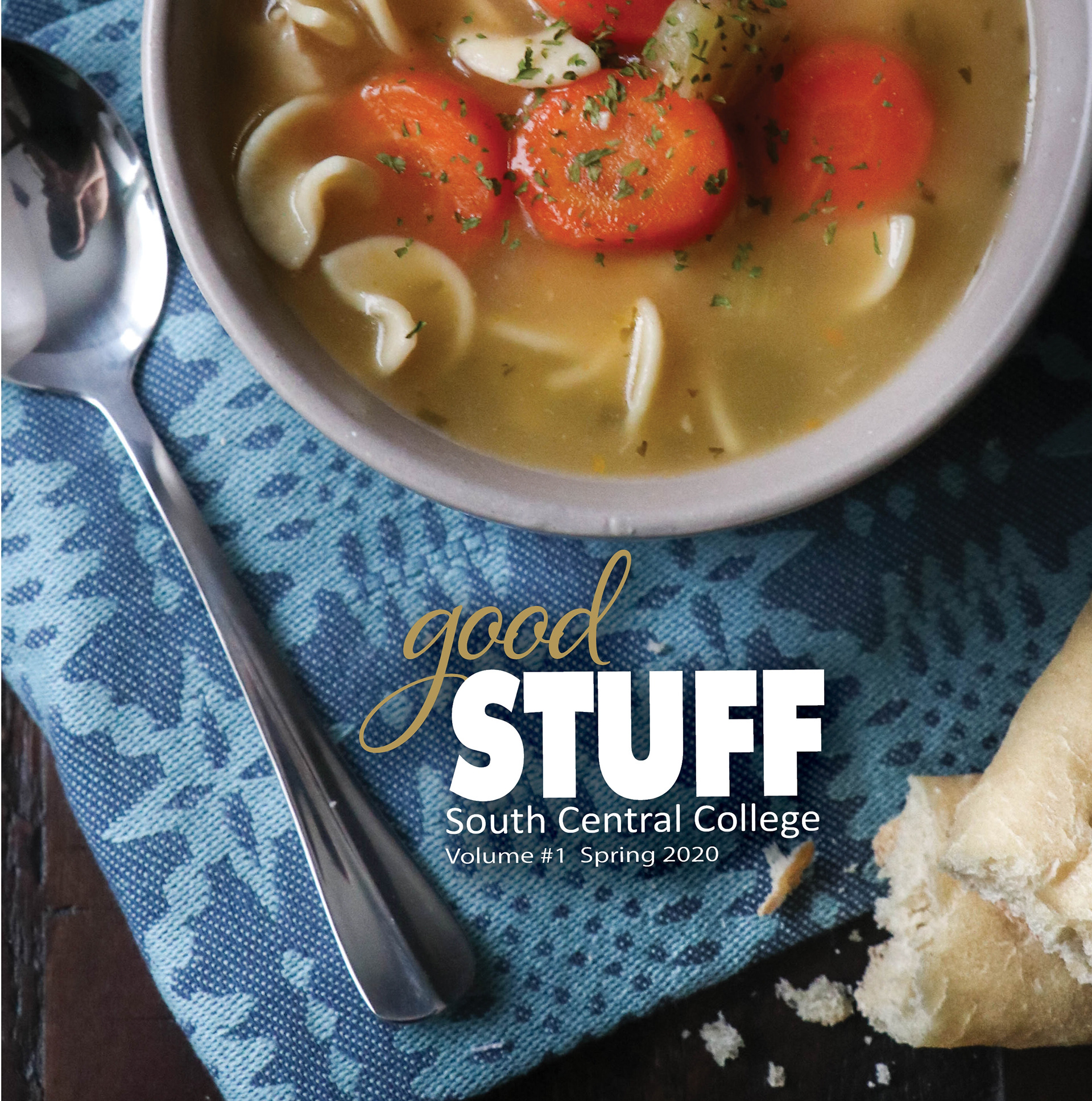
The college wanted to have a non-standard size so the magazine would stand out, so I chose 9 x 9 inches. All three covers feature student works. I kept the logo small to let the art "speak for itself," except for the first cover, where the logo is larger and centered.
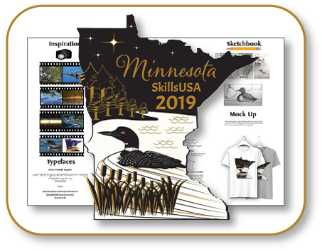
The Layout
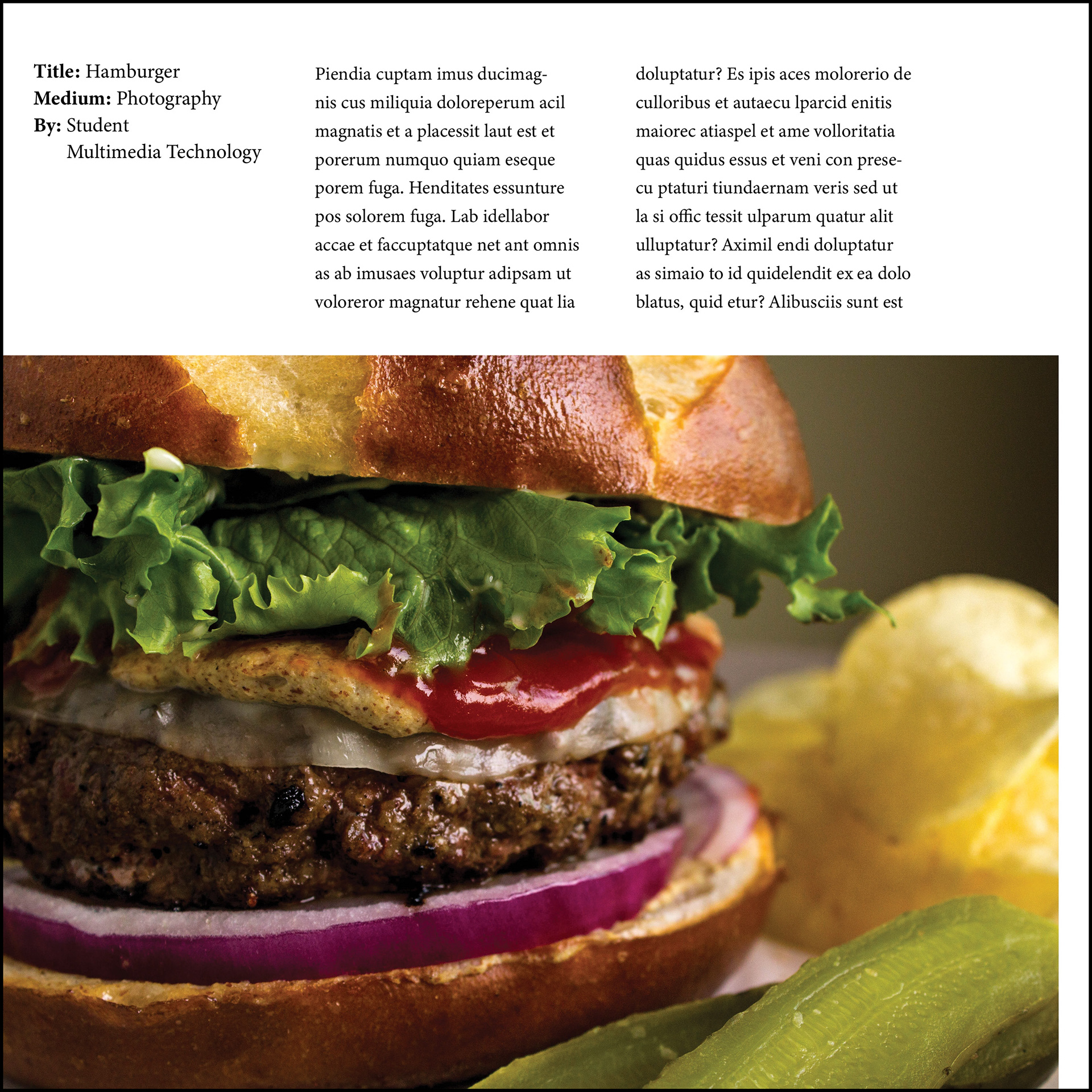
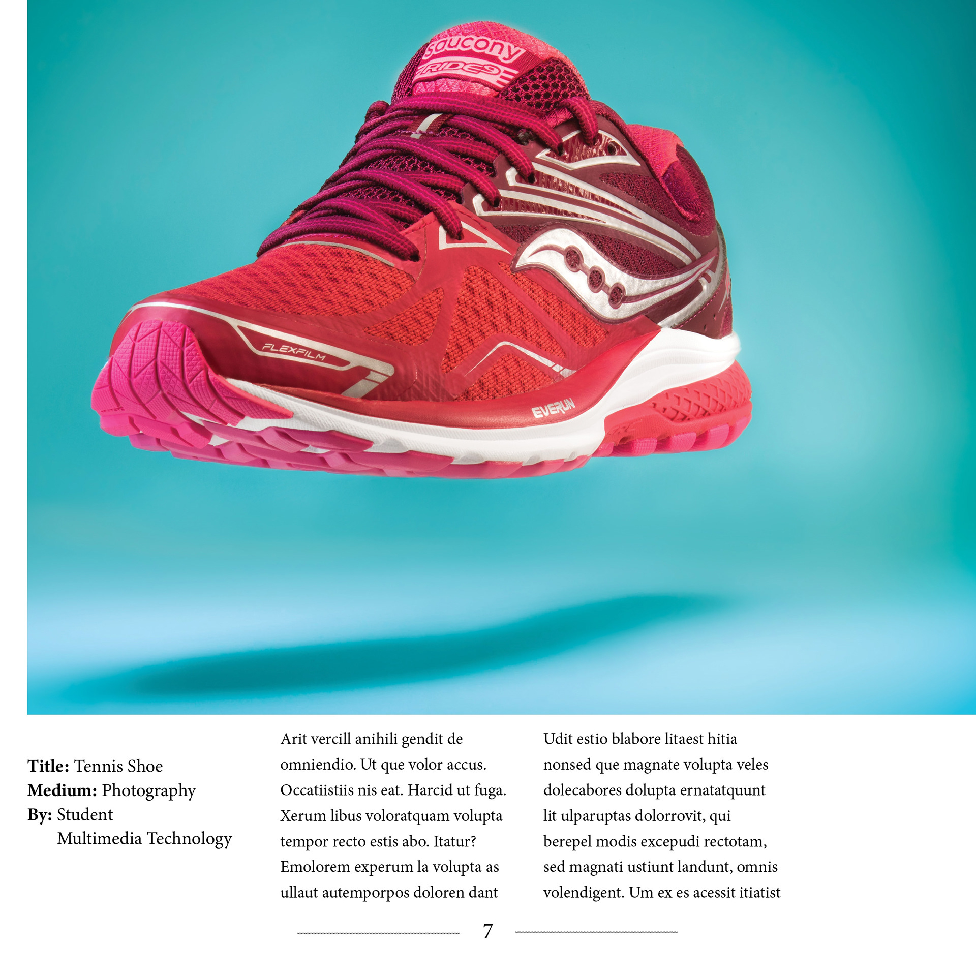
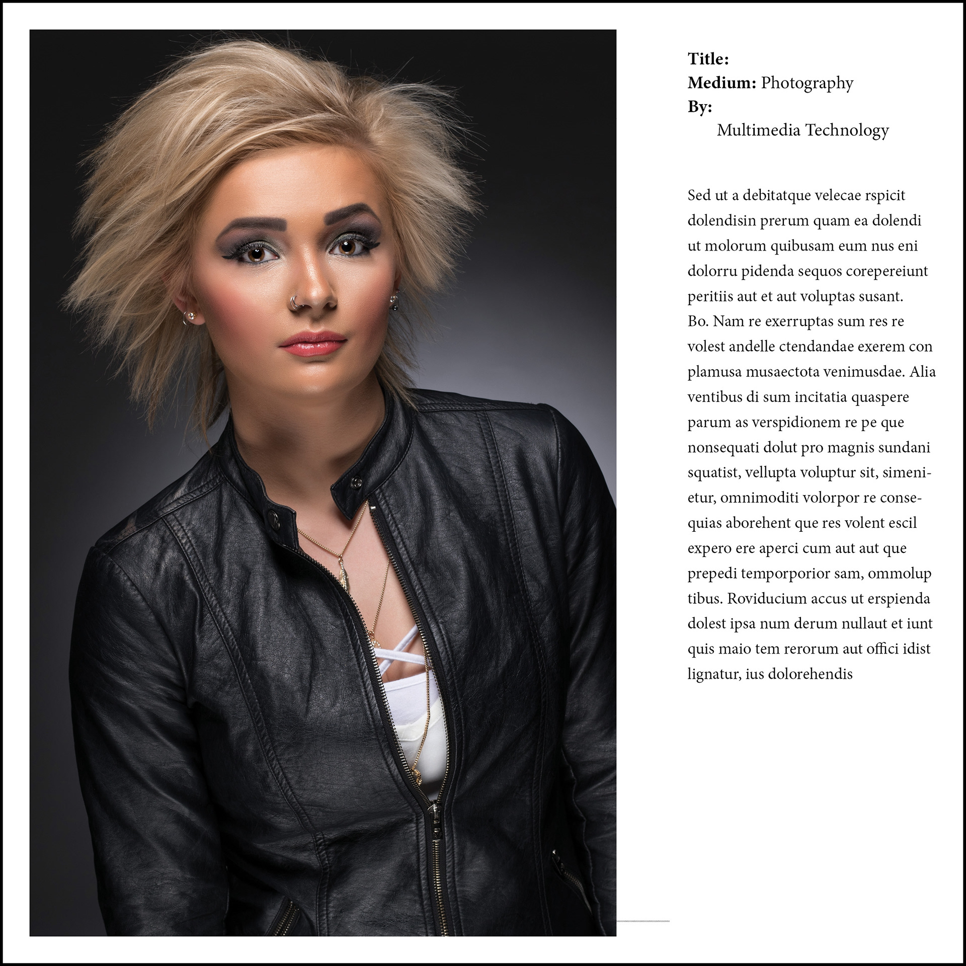
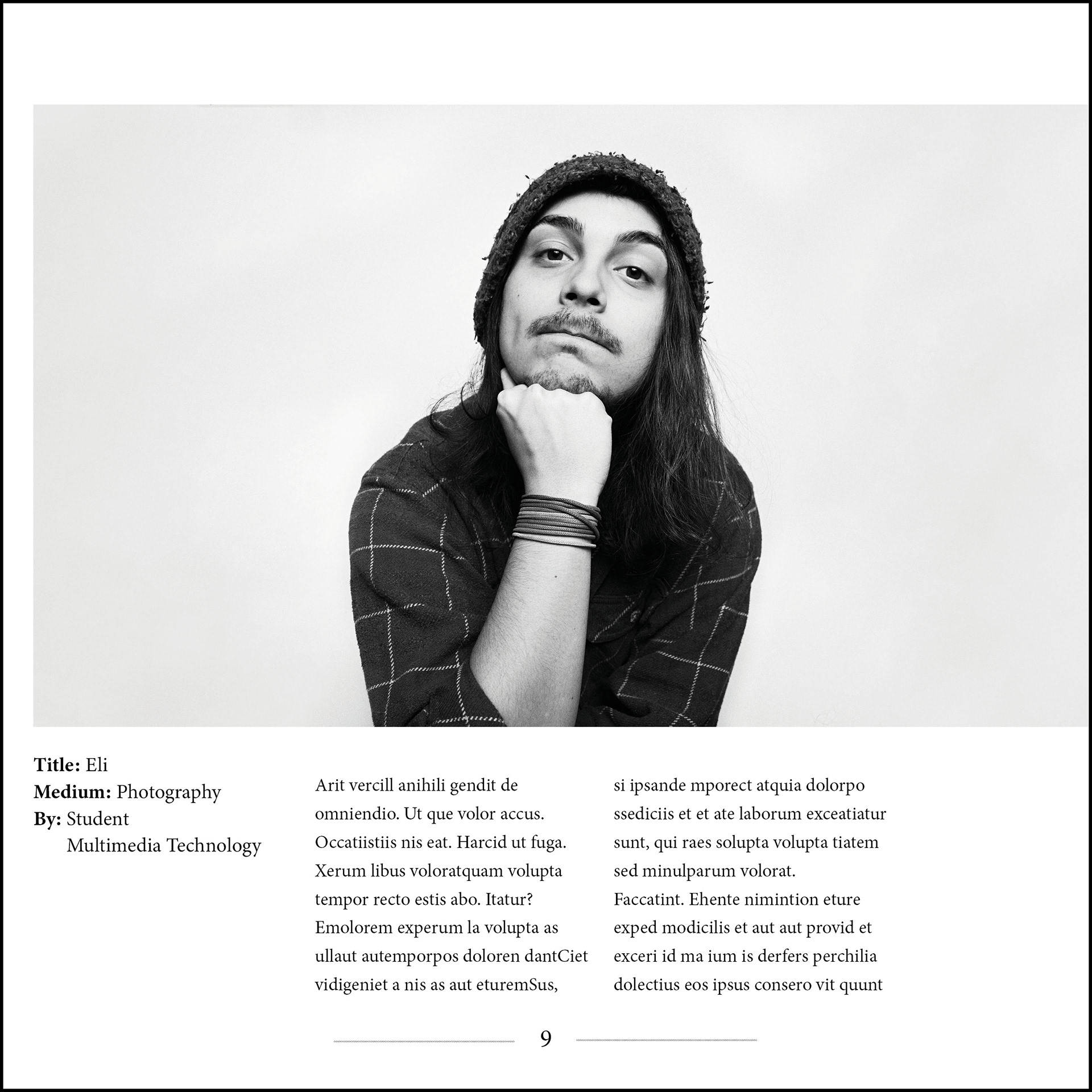
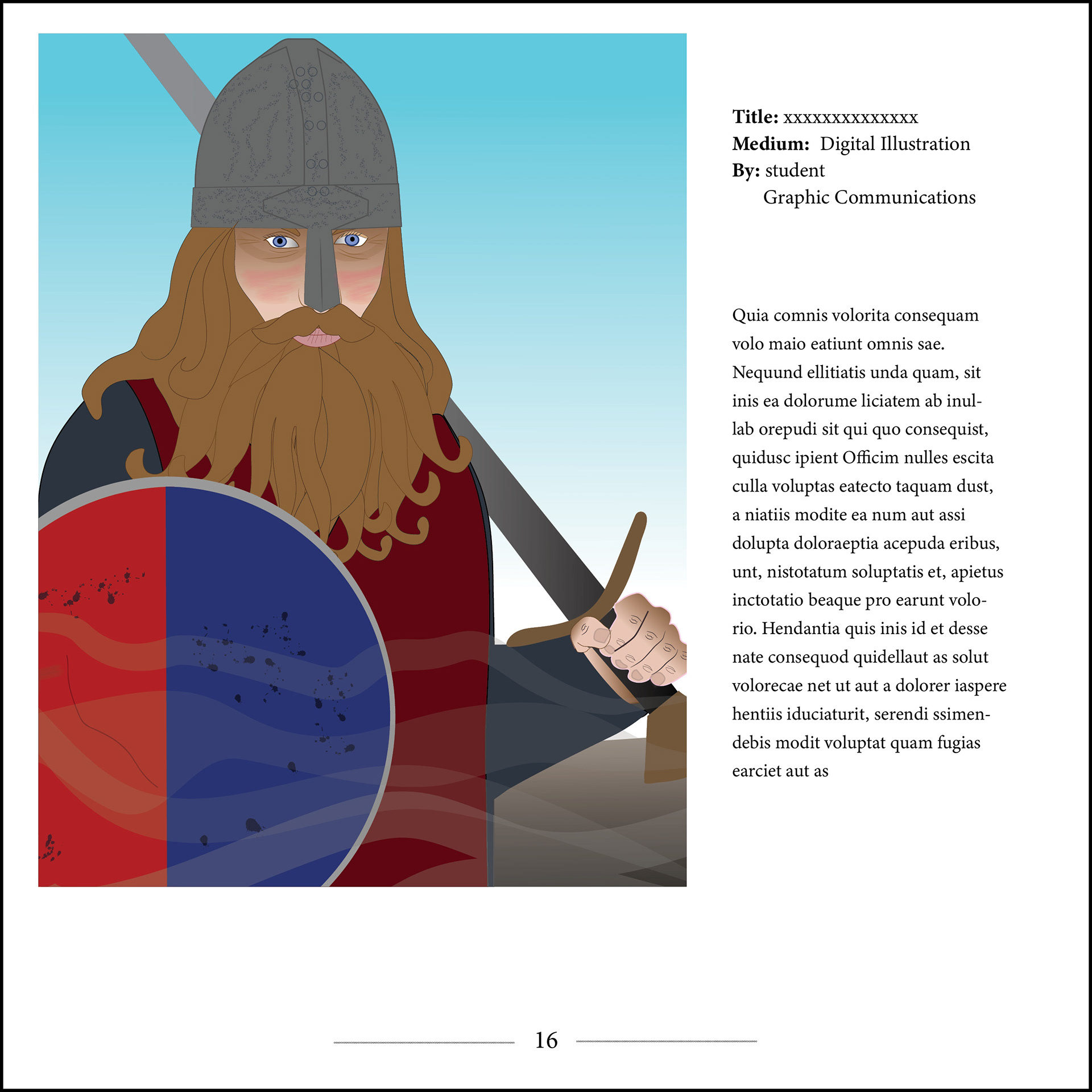
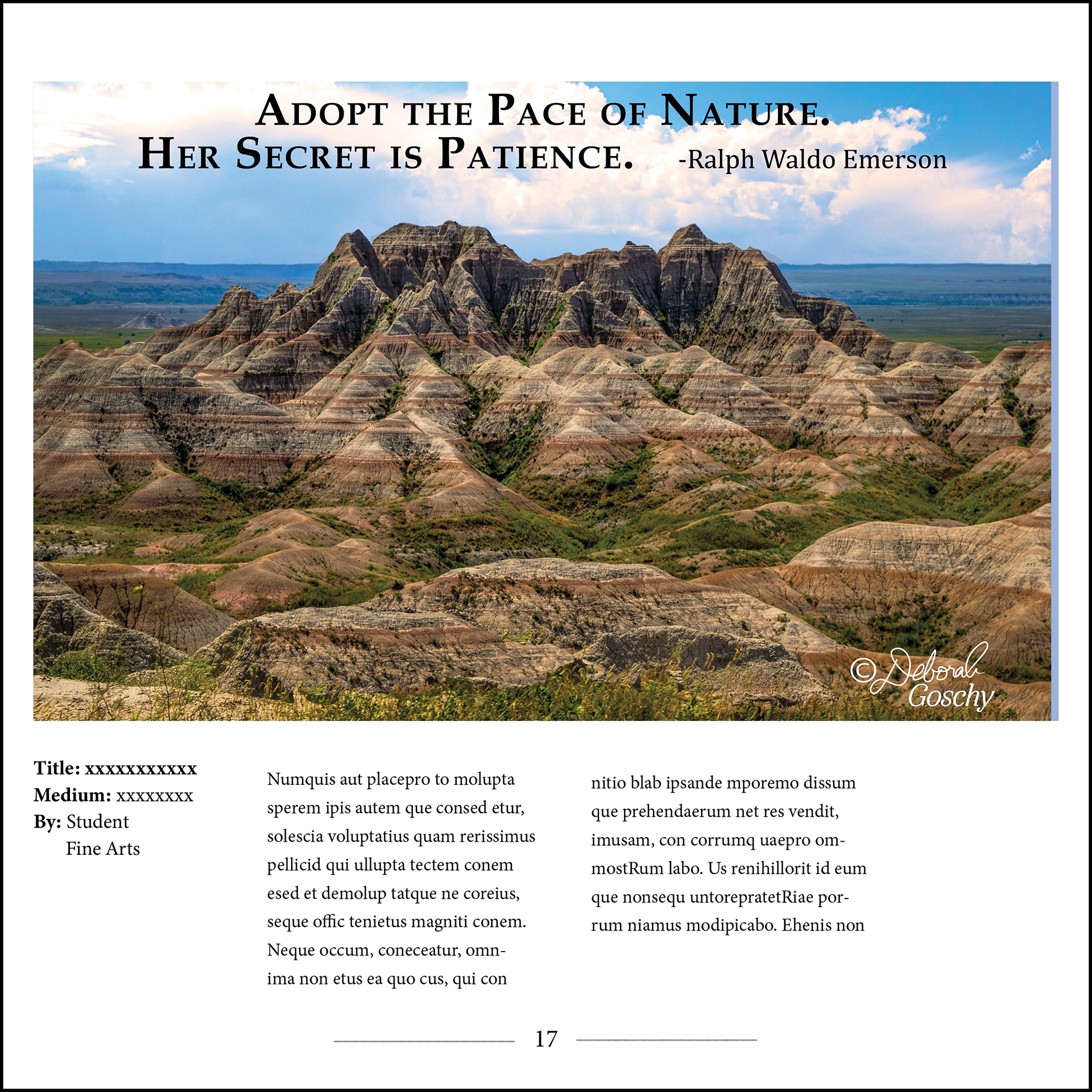
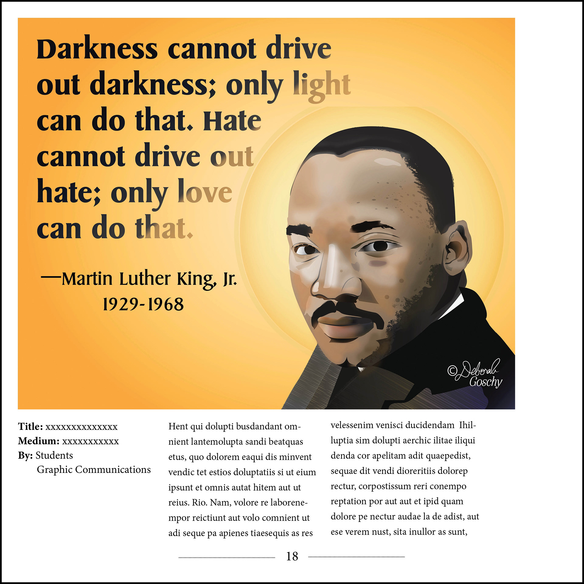
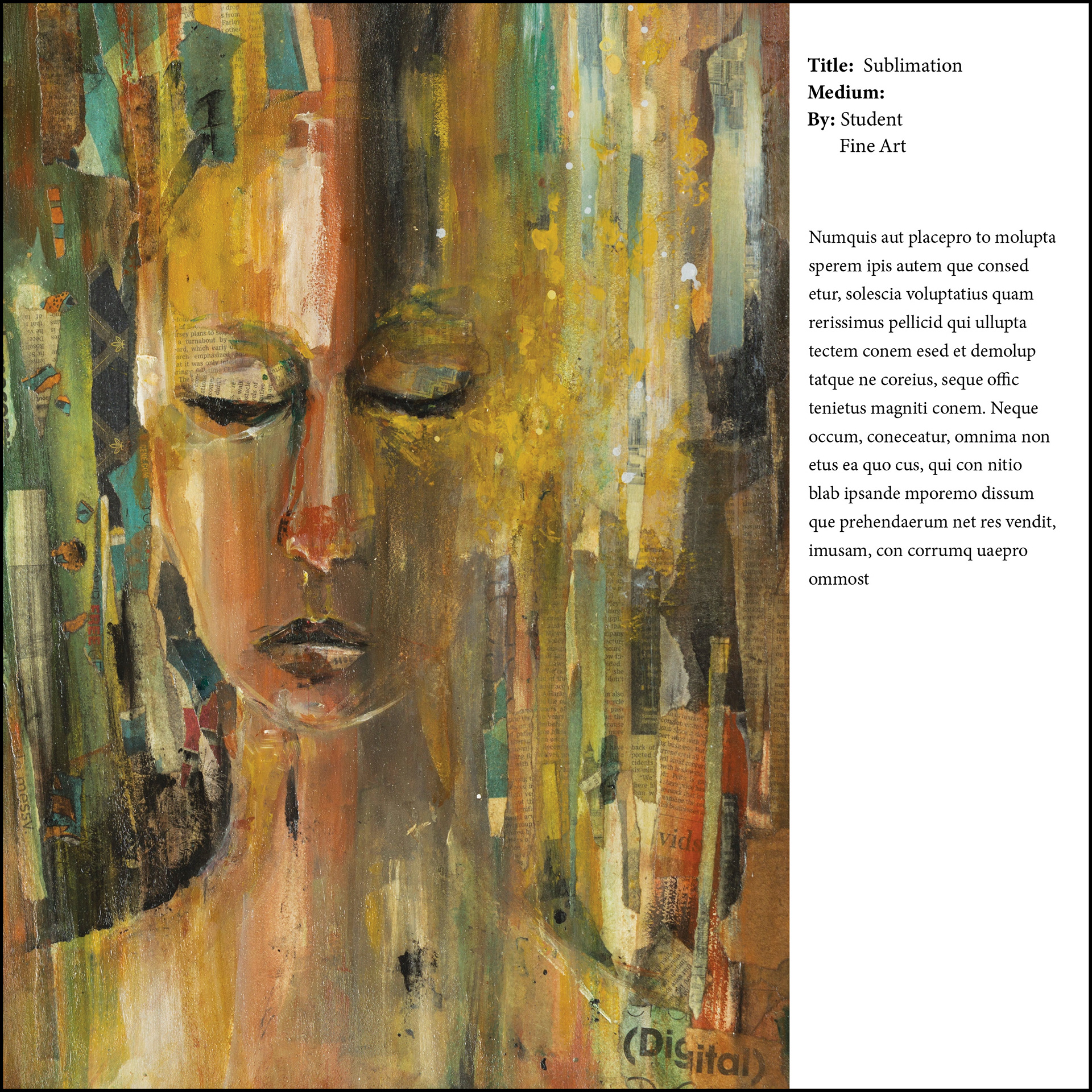
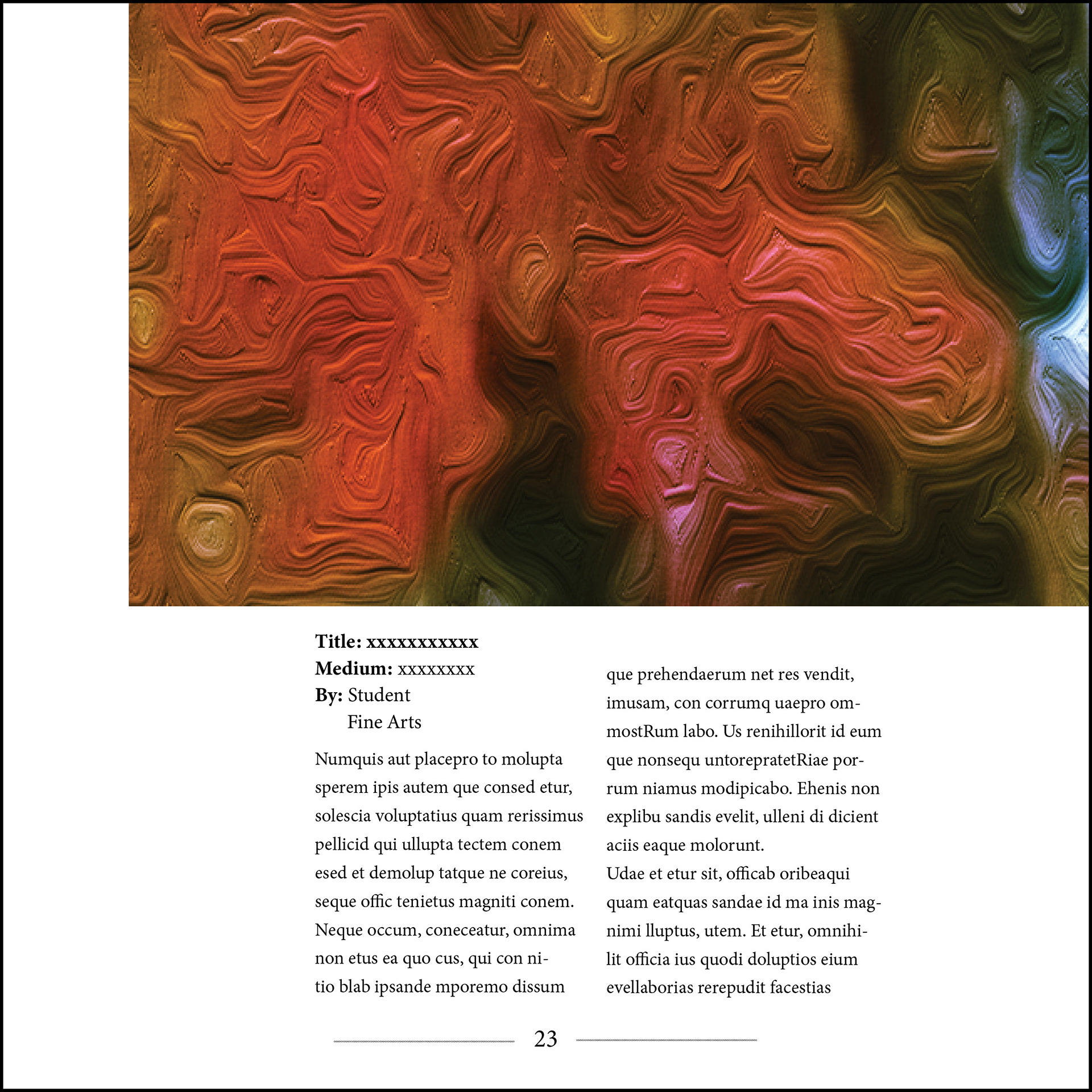
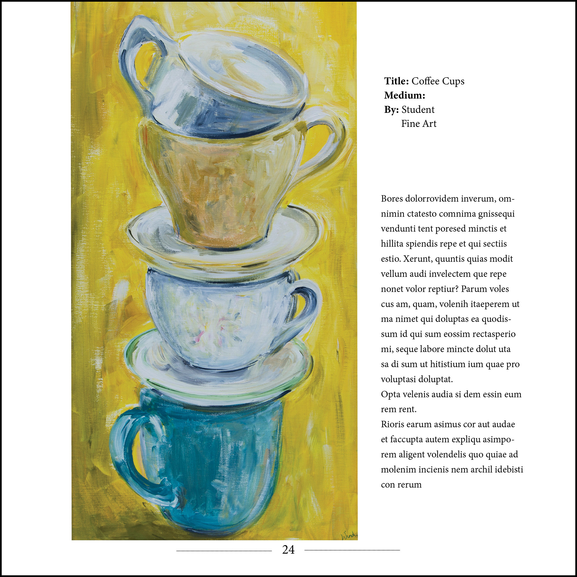
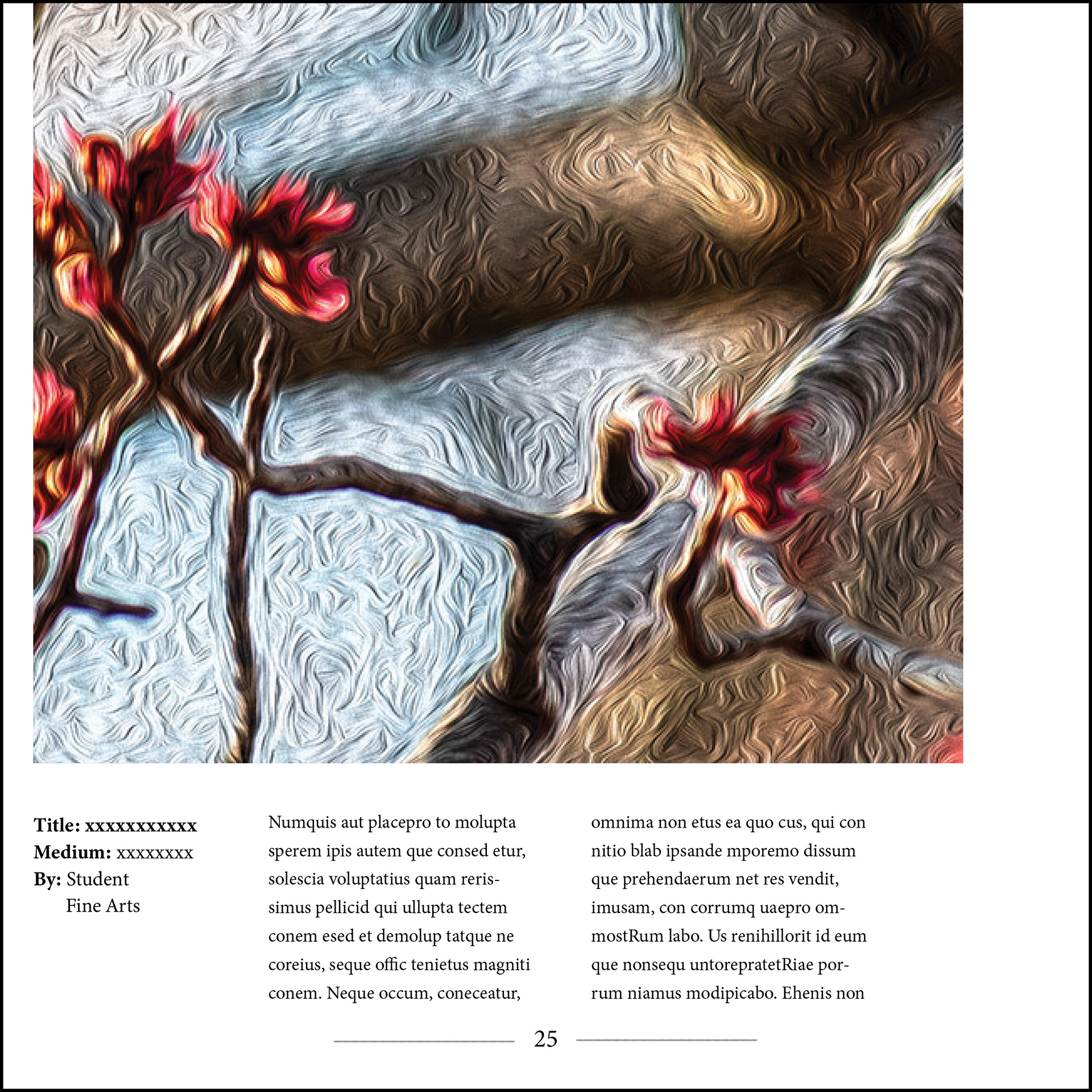
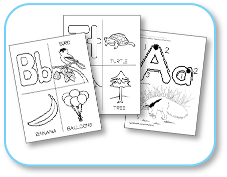
As Good Stuff is an art magazine, I kept the design minimal so that the images got top billing on every page. I also made sure that my layouts had variety, using bleeds/no bleeds, varying image sizes, and types of placement to keep it visually engaging. Color bars are the same color as the gold of the logo. Headings and subheadings are in Helvetica Bold Condensed and Helvetica Medium Condensed, and the body copy is in Minion Pro Regular, per brand style guidelines.
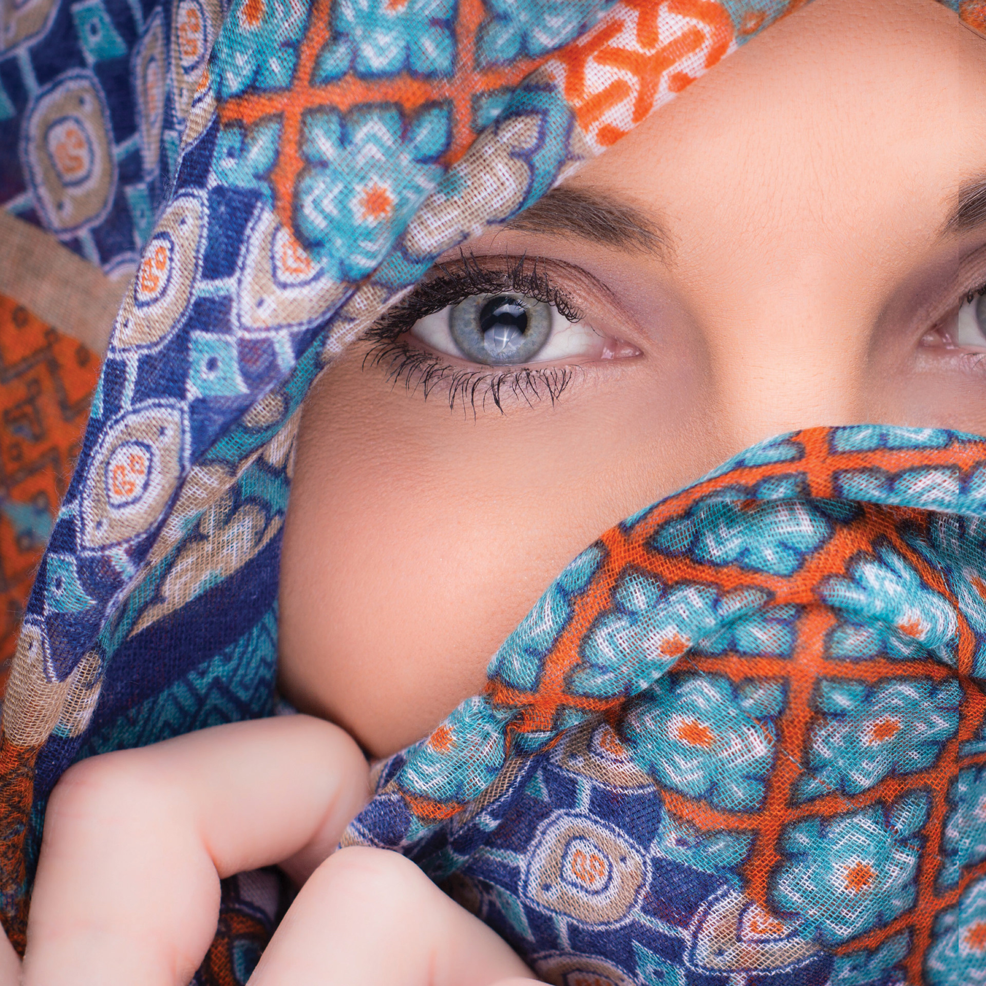
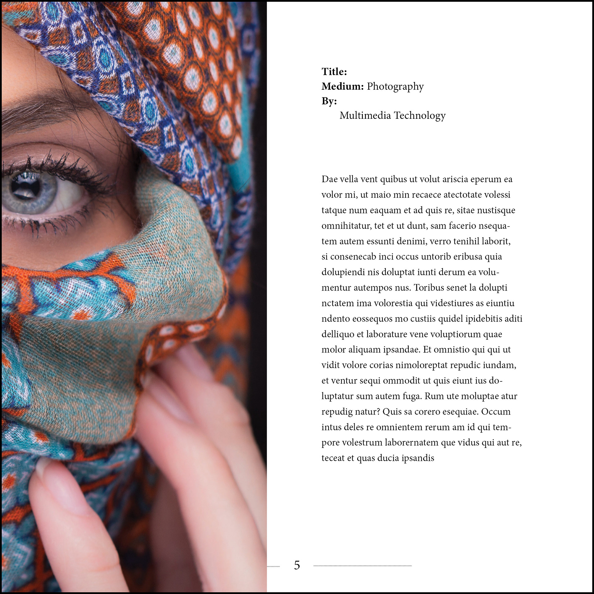
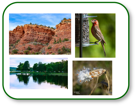
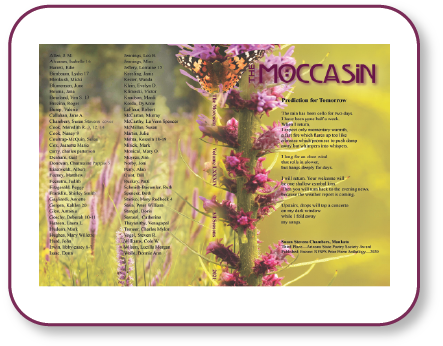
The art on these pages is student work, in accordance with the purpose of the magazine. Some of the pieces below are my own digital artworks, added as placeholders.