Designing Time2bus 1.0
It's time to catch the bus!
Try the high-fidelity prototype!
Overview
Summary
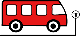
Time2bus is a transit app that tracks the arrivals of city buses at bus stops. Bus riders can look up the buses that will arrive at their bus stop and find out when to expect them. This app helps to minimize confusion for riders at bus stops served by many routes, such as the very busy stop at Washington and State Streets.
Roles and Responsibilities
I am the UX designer for Time2bus and my responsibilities were competitive research, user research, information architecture, designing user flows, visual design, prototyping, and usability testing.
Tools Used: I used Figma for wireframing, prototyping, and deliverables; Adobe Illustrator for select illustrations; pen and paper for sketching.
Project Goals:
*To create a clean UI design and a clickable prototype for Time2bus 1.0.
*To address the business concerns in order to create the minimum viable product (MVP) for the customer.

Problem
The client for this project is a transit agency that runs a bus company. Due to the recent expansion of bus routes, bus riders were experiencing confusion and frustration while waiting for buses. They were unable to anticipate which bus routes were due to arrive at the stop and whether those buses were on time, delayed, or pulled for maintenance. In response to this situation, the bus company wanted an app that would track the arrivals of buses at their stops, especially the busy stop at Washington and State St.
Scope & Constraints
Scope: The Business Requirements
*To complete a user interface and clickable prototype that will assist users in finding out which buses will come next to their stop.
*To create the color palette and branding for launch.
Constraints
*Time: It was important to complete tasks successfully while keeping up a good pace.
*Tools: Learning to use a new program (Figma) and new apps (Google Forms, Google Slides) while learning how to create deliverables.
Users, Audience, & Personas
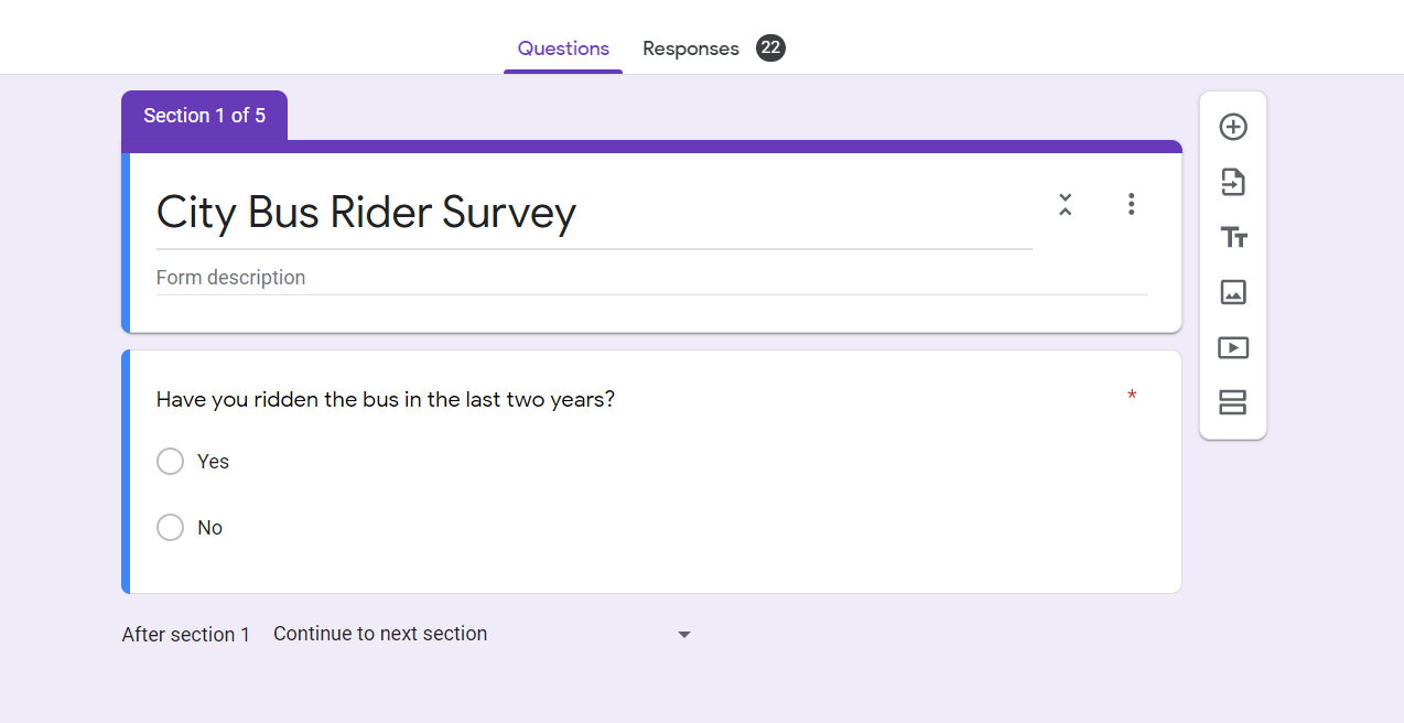
Survey for Target Audience
In order to define the target audience for Time2bus, I created a user survey with Google Forms. As bus ridership was down in response to COVID limitations, my mentor suggested that I begin my questionnaire by asking whether respondents had ridden the bus in the last two years. The other questions, examples of which are listed below, covered things like sources of busing information, transit apps, and bus service. Knowing these details will help me to design a better product for my users.
Some of the questions asked:
*Have you ridden the bus in the last two years?
*How difficult was it to find accurate route and arrival information?
*How often did your bus arrive late?
*Where do you get your bus information?
*What transit apps do you use?
The Target Audience
The target audience is made up of people who ride city buses.
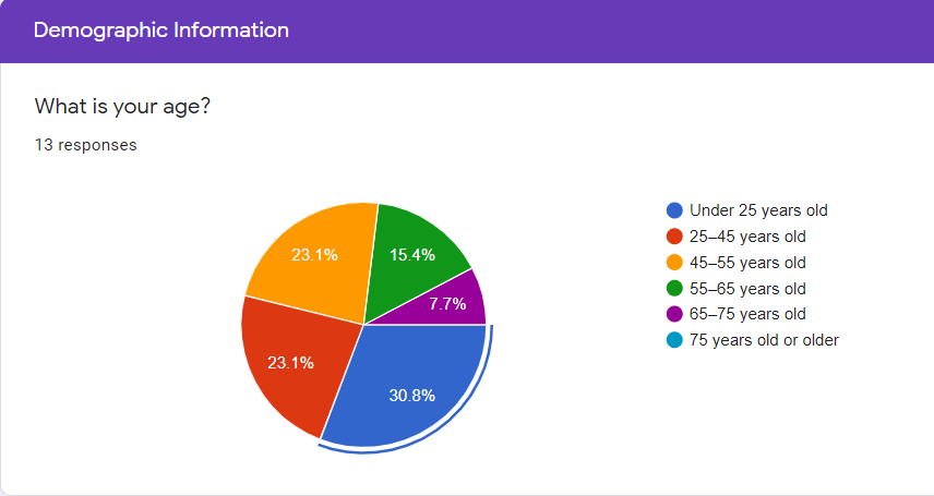
*They range in age from 19-65 years, with the highest concentration of bus users in the under 25 age group.
*They live in the Minneapolis/St. Paul metropolitan area or in Greater Minnesota (living outside the Minneapolis/St. Paul metropolitan area).
*Their bus use ranges from a few times a year to weekly.
User Pain Points
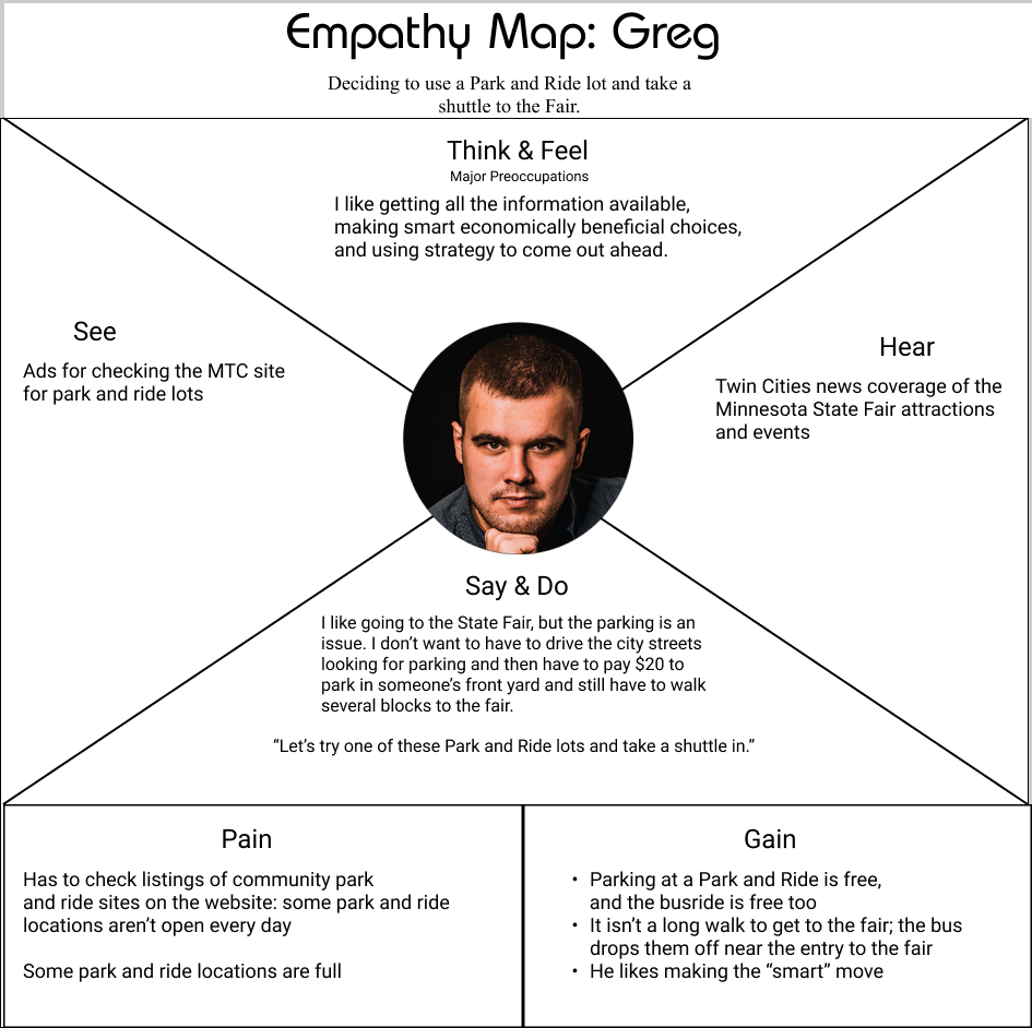
After the user research and competitive research, I was able to create personas and empathy maps. Tools used: I edited the user photos in Adobe Photoshop and I constructed the persona tiles and empathy maps in Figma.
Getting to know the thoughts, practices, wants, and needs of prospective app clients is a critical step in creating an app. I am designing my product for them and the more I can empathize, the more I care about getting them a product that they can use, the better the app will be. The information on an empathy map is organized around sensory data (what they see/hear), behaviors (what they say/do), their mental life (thoughts and feelings), and finally, why they need the app and how they would benefit from it.
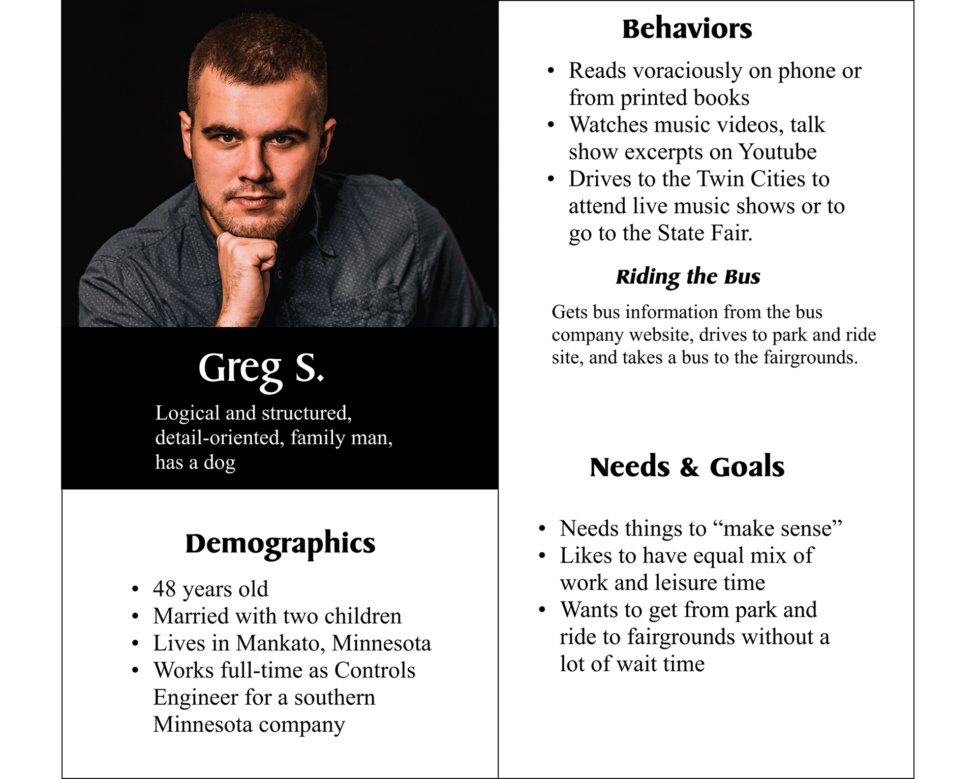
Persona #1: Greg S.
Greg is a working professional in his late 40's. Residing in Greater Minnesota, he limits his bus use to late August, when he attends the Minnesota State Fair. He gets his information from the bus company website, which tells him where to find a Park and Ride location. He drives to the Park and Ride lot, parks, and then takes a bus to the fairgrounds. Gain: Taking a shuttle from a park and ride lot is a simple way to get to the Fair, the parking is free, the ride is free.
Pain Point: I need a source of accurate information that I may refer to while on the go to reduce the amount of time that I am looking for an open Park and Ride location or waiting for a bus to arrive.
photo credit: Dmitry Vechorko, Unsplash
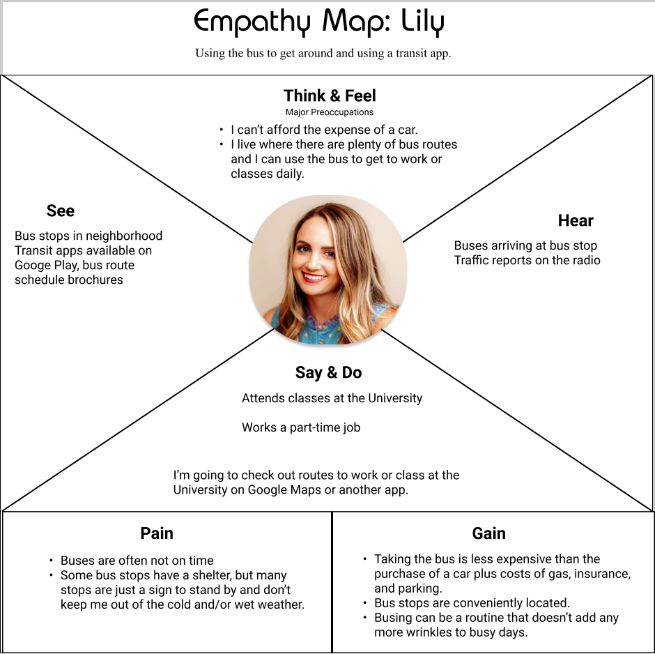
Persona #2: Lily
Lily, who is in her 20s, is a full-time college student and a part-time employee. She is living in Minneapolis and has no car, so riding the bus is an absolute necessity. Because of her college courses and her job she needs plenty of flexibility in her schedule. She uses Google Maps to plan her routes and to check for bus availability. Gain: buses give her a way to get around the city and it's cheaper than buying, maintaining, and finding parking for a car.
Pain Point: I need to have bus information that I can count on so that I am not left standing outdoors for long periods in cold or inclement weather. Not all bus stops have a shelter; some of them are just a sign stuck into the ground.
photo credit: Meritt Thomas, Unsplash

Solution
The answer to my client's problem was a transit app that informs users about available bus stops, bus routes, and tracks the arrivals of buses, reporting whether they are on time, delayed, or pulled for maintenance.
_____________________________________________________________
PROCESS
Discovery and Research
Competitive Research Findings
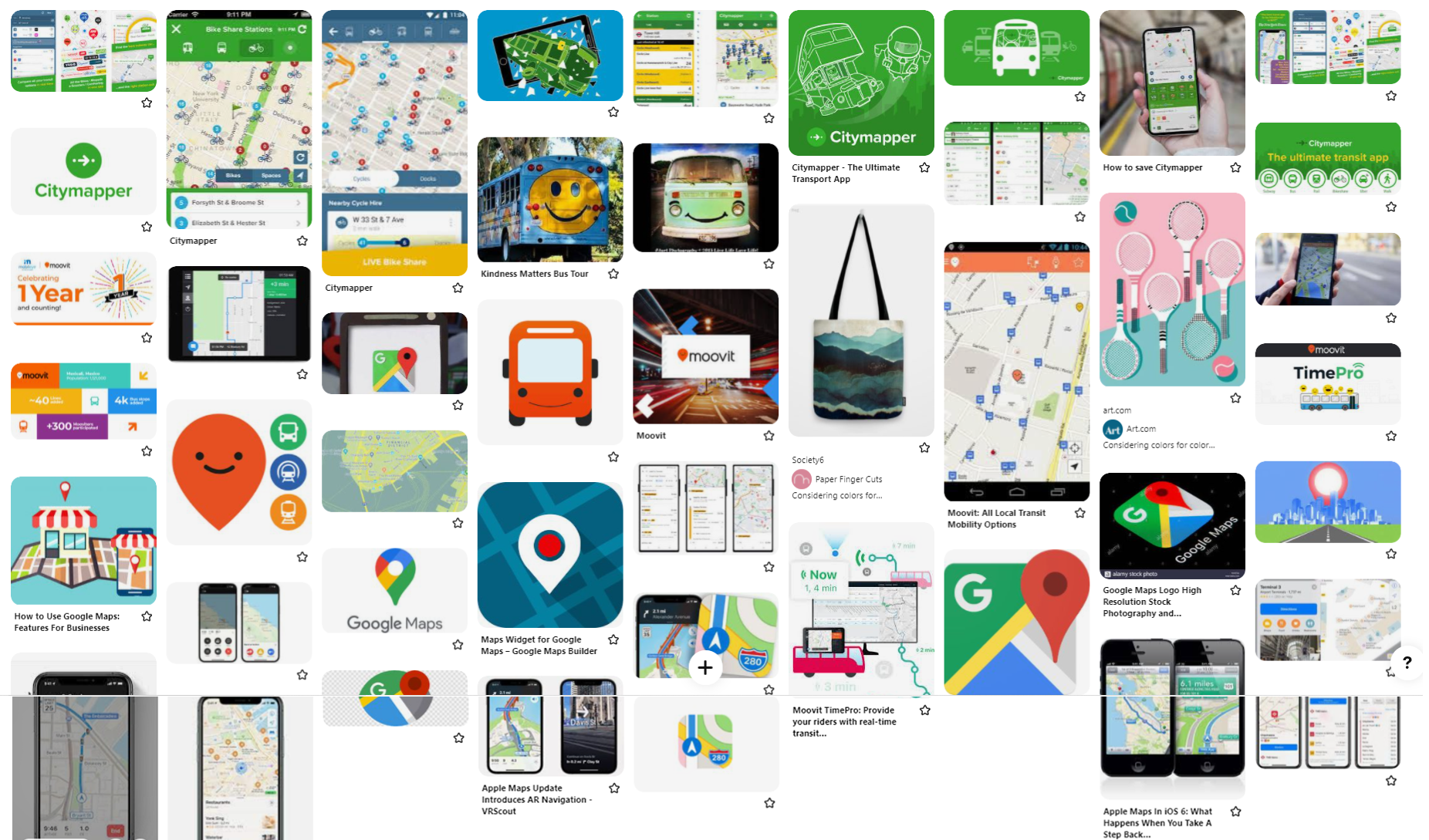
A key part of the process of creating Time2bus was familiarizing myself with the competition. What features did other transit apps offer? What types of travel did they support? I studied three other transit apps: Citymapper, Google Maps, and Moovit.
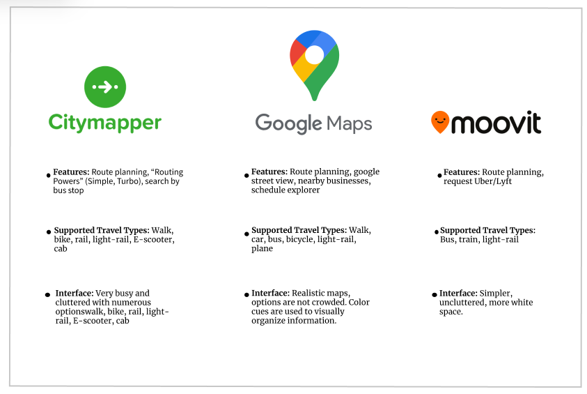
All three of the apps that I researched included route planning, a feature that is not asked for in the business requirements. I initially reasoned that my competitive research had little if any bearing on my development of the app because of the project's narrow scope.
Information Architecture
User Stories
With target audience research, personas, empathy maps, and business requirements in mind, I crafted user stories, imagining scenarios in which users engage the Time2bus app, and assigning priority. Once written, the user stories would define the structure, the foundation for the rest of the app.

User Flows
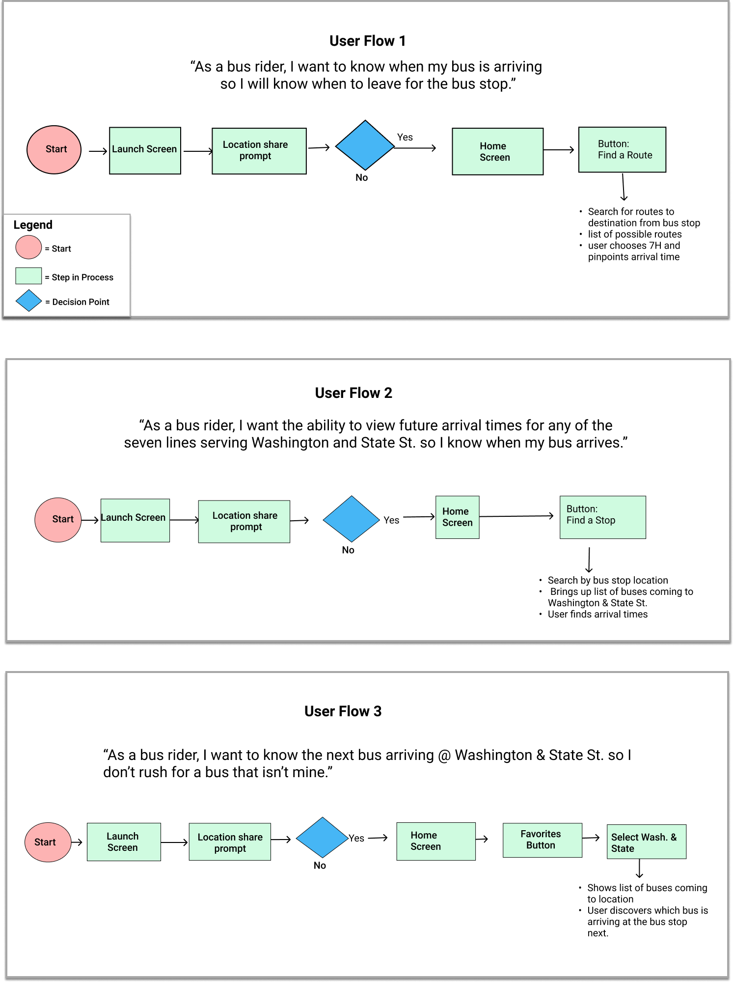
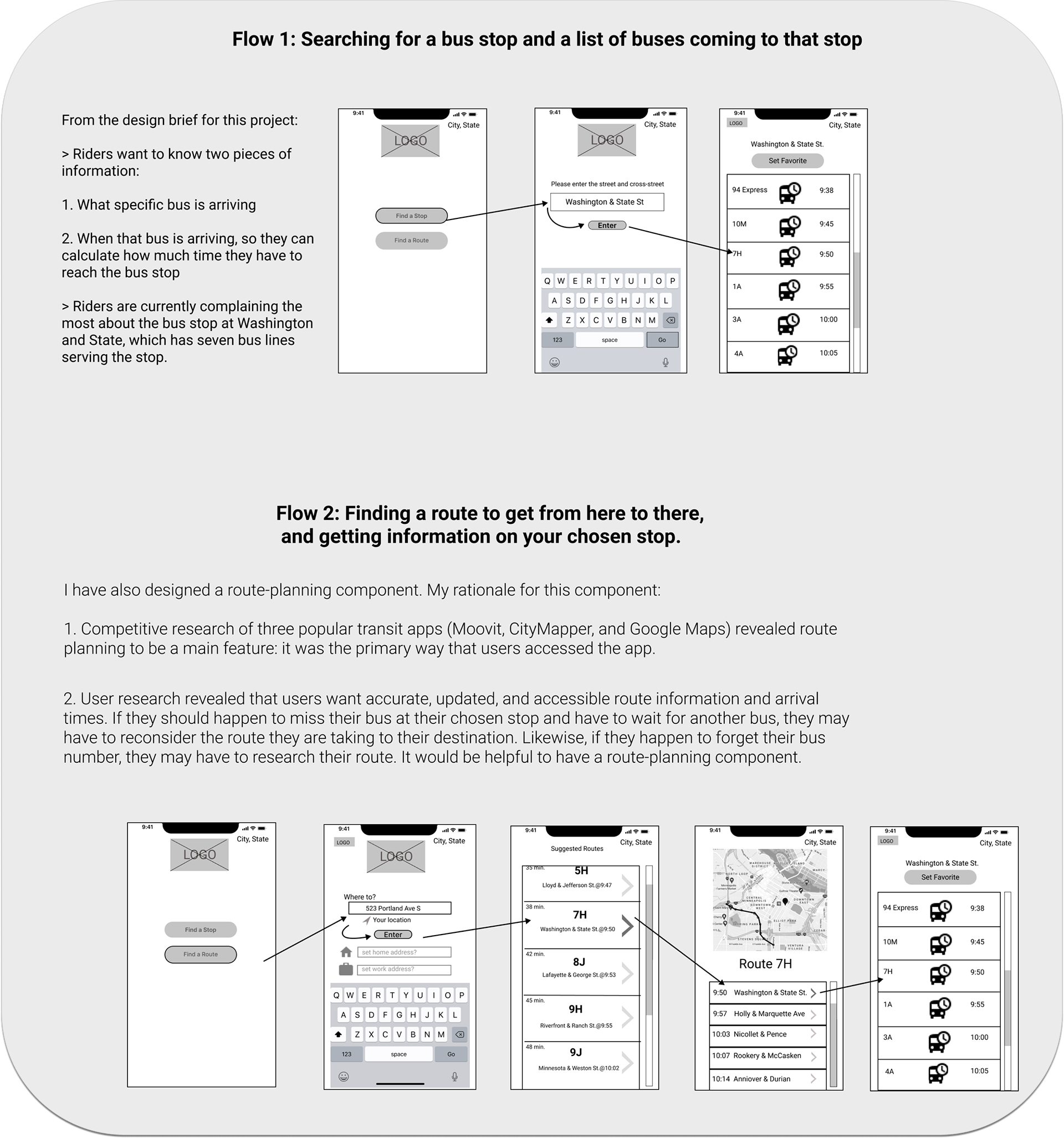
I created user flows of the three user stories that I wanted to address with my app, learning a new language of shapes as I adapted user stories to the design process. Once I had sketched the user stories, I created them digitally.
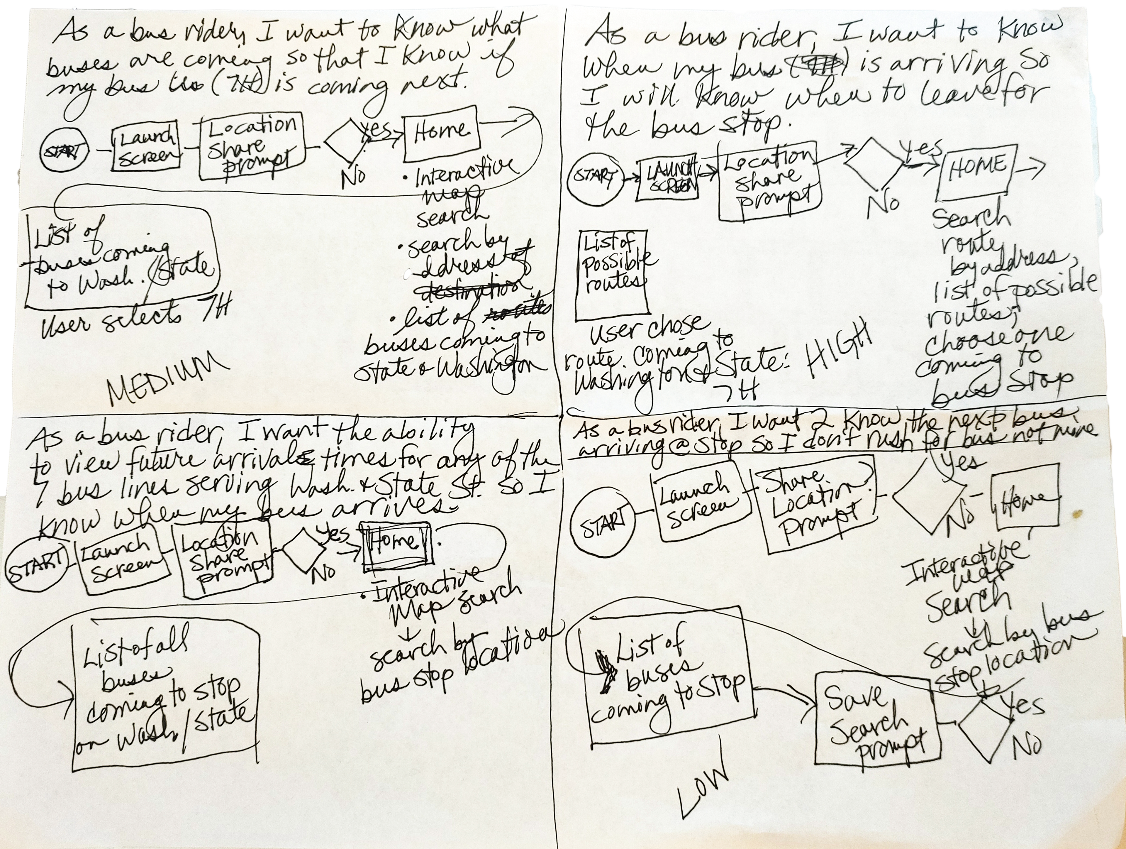
Digital User Flows
Wireframing
It's Time to Make Wireframes!
With the user stories and user flows established, I could start constructing wireframes. I began the process of designing wireframes with pen-and-paper sketches. My reasoning? I knew from my other visual design experience that it would be a waste of time to start my wireframes in the software without doing that preliminary work, especially since I was still very new to Figma.
Wireframe Sketch for the first iteration

My first wireframe sketches are rough, yet they communicate complexity--the concept of an app that would help users find a bus route or specific bus stop, based on their location. The first set of low-fidelity wireframes (below) is no less rough than the sketches that preceded them. I was an experienced user of Adobe Illustrator, but I had just started using Figma. I was feeling the pressure of time constraints, so I decided to learn as I went along. As I didn't yet know how to select frames for my wireframes, I simply drew them in Figma, resulting in a first attempt that reminds me of flip phone Communicators from the first Star Trek series.
Low-Fidelity Wireframes, 1st Iteration
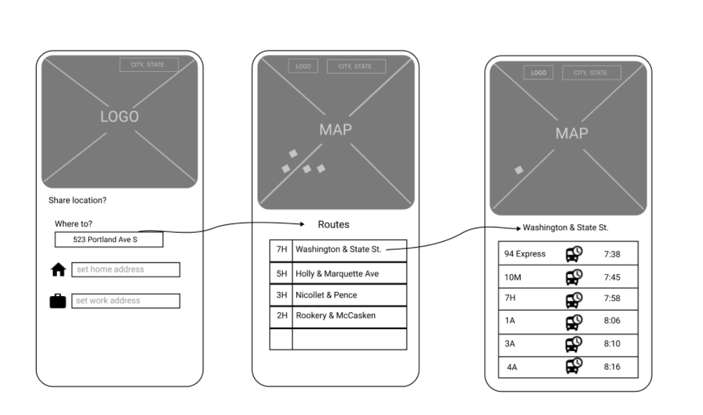
The consequent iterations of low and high-fidelity wireframes improved as I found my bearings with Figma over the following days and weeks. I explored the possibility of route-planning and formulated a justification for adding that feature to Time2bus:
"I have also designed a route-planning component. My rationale for this component:
1. Competitive research of three popular transit apps (CityMapper, Moovit, and Google Maps) revealed route planning to be [the] main feature: it was the primary way that users accessed the app.
2. User research revealed that users want accurate, updated, and accessible route information and arrival times. If they should happen to miss their bus at their chosen stop and have to wait for another bus, they may have to reconsider the route they are taking to their destination. Likewise, if they happen to forget their bus number, they may have to research their route. It would be helpful to have a route-planning component."
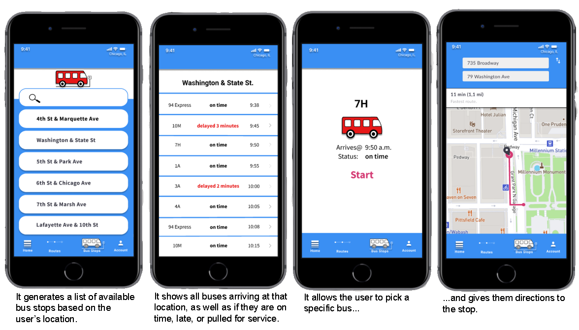
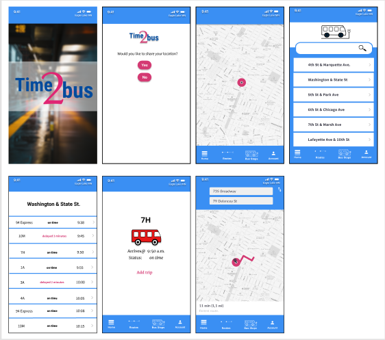
High-Fidelity Wireframes
_________________________________________________________________________
Usability Testing
Image source: Icon made by Eucalyp, www.flaticon.com.
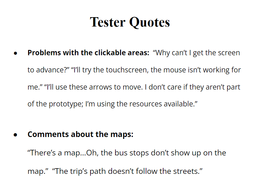
I had the prototype connected and it worked...for me, which actually meant little since I knew how it was supposed to work. Now I had to have some other people try it out. My new app was tested by three adults: two males, one in his 50s, and one in his 20s, and a female in her 20s. They tried the prototype on my HP Envy laptop computer, which has a touchscreen and a rollerball mouse.
Tasks: Enabling the location, selecting a bus stop, and selecting a specific bus.
Findings: There were issues with clickable areas: not everything that was supposed to advance the screens worked. The respondents also thought that the maps should be better, showing the locations of bus stops and displaying the path to a bus stop that followed the streets.
Next Steps:
Fix Clickable Areas: Make sure that clickable areas are large enough--larger clickable areas are easier to use--and make sure wires are connected correctly.
Improve the integration of maps into the app: Plot available bus stops on a map: showing the locations graphically will help the user plan their trip; fix the final screen so that the trip's path follows the streets.
Image Credit: Icon made by www.freepik.com
Brand Development
Moodboard
I began the brand development of Time2bus with a moodboard of images such as screens and icons from similar apps, as well as images that had color palettes that I was considering for the app.
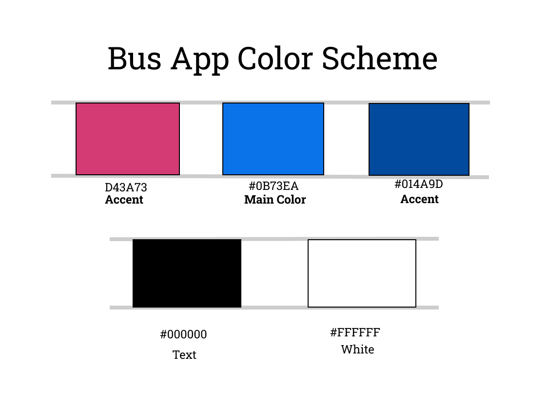
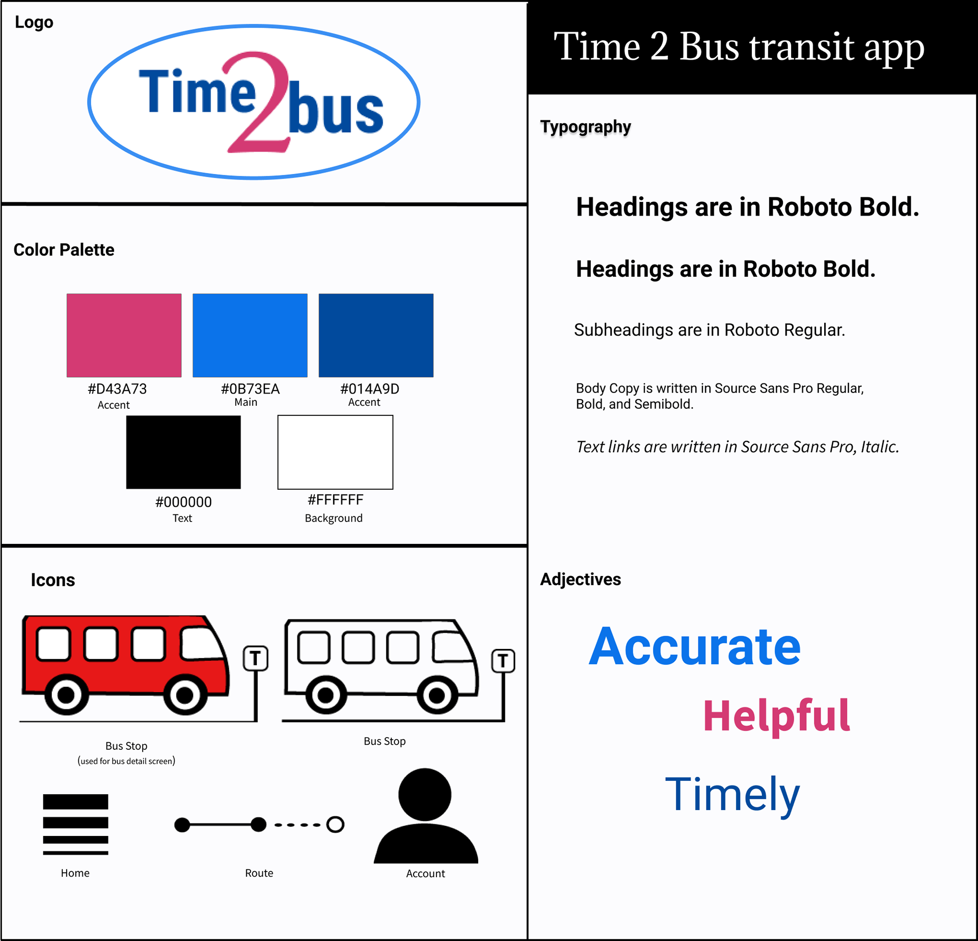
The Time2bus Color Scheme
I considered the colors for Time2bus carefully, finally choosing to use a medium blue for my main color with a dark blue and a reddish pink as accent colors.
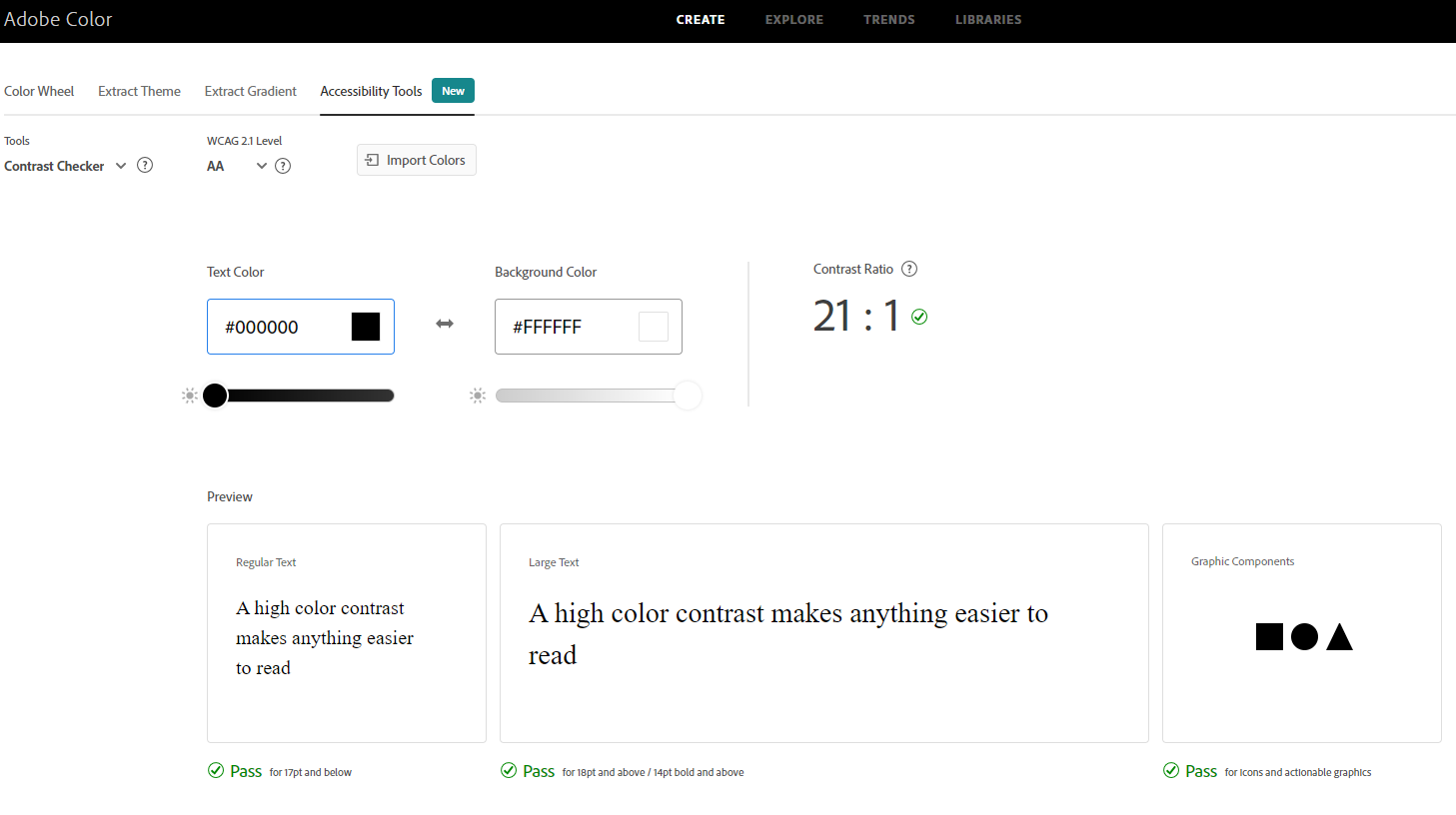
Accessibility: I checked the app's color palette for accessibility on Adobe Color (https://color.adobe.com/create/color-accessibility). The color palette meets guidelines for contrast and is colorblind safe.

First a Name, then a Logo
I originally wanted to call my app Where to? a common question that is asked of someone who is getting a ride to someplace. I liked the brevity of the name and relished the opportunity to incorporate the numeral 2 for the word 'to' in the manner of a text message. However, as the primary focus of the app isn't route planning, that wasn't practical. Instead, I chose Time2bus, which emphasizes the app's focus on providing bus arrival times to users. Being able to substitute the number 2 for the word 'to' was another bonus. Once I had the name for the app set, I was able to give attention to developing a logo, which involved sketching before going to the software.
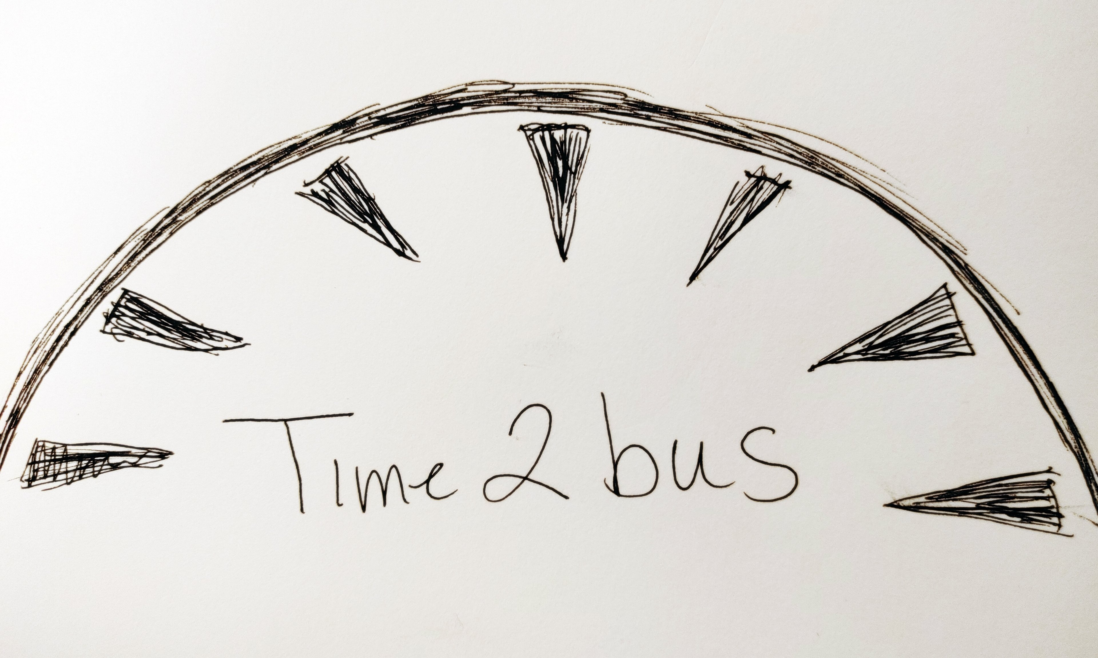
Time2bus logo sketches.

Keep it Simple: I soon learned that it would be better to design a logo that was simple and free of a lot of detail; the logo would be displayed at a small size and it would need to be readable. That didn't mean that I couldn't be artful, however. I enjoyed manipulating the size and placement of elements.
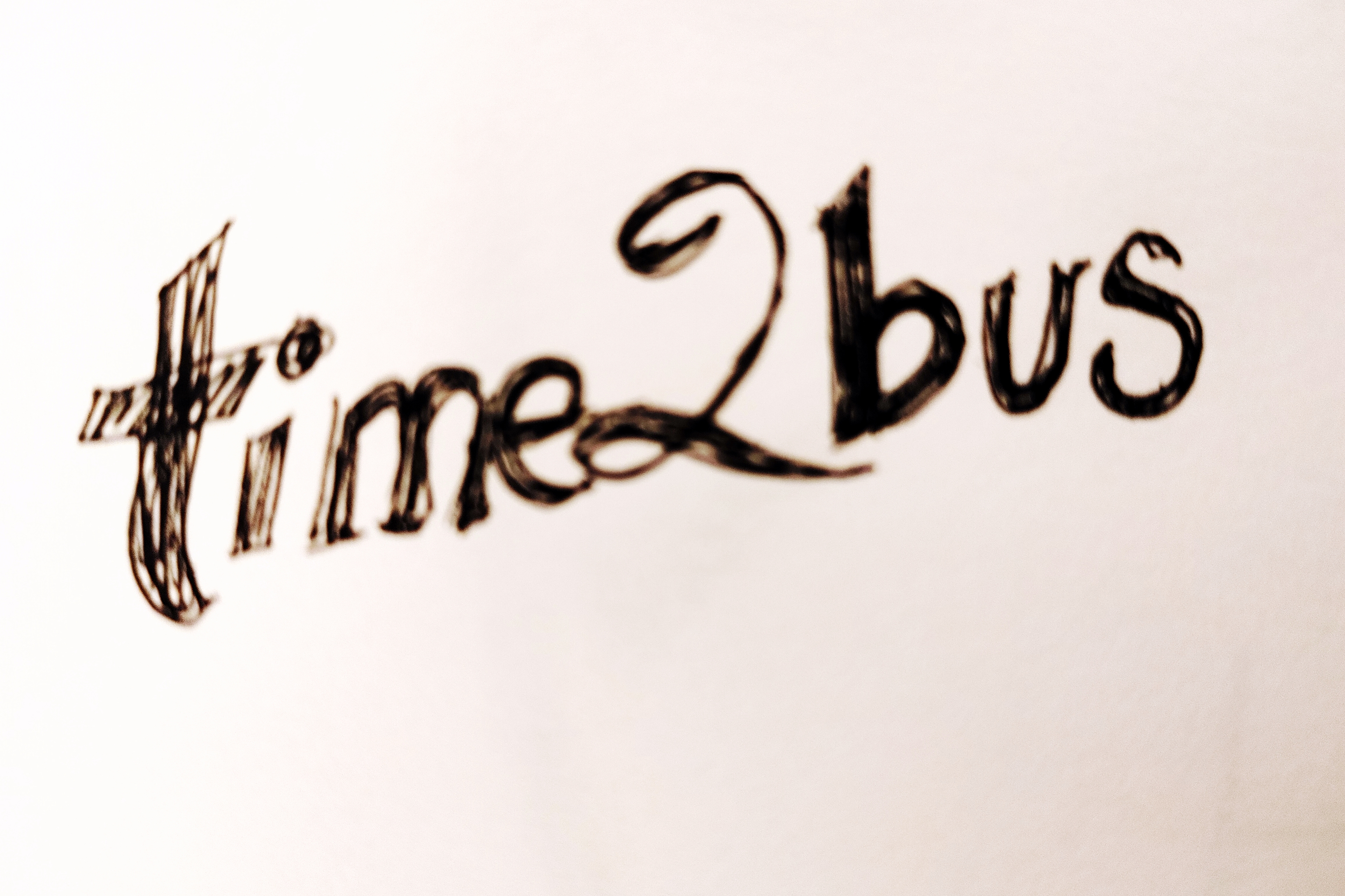
A sketch for my first Time2bus logo idea, which had way too much detail to be practical.
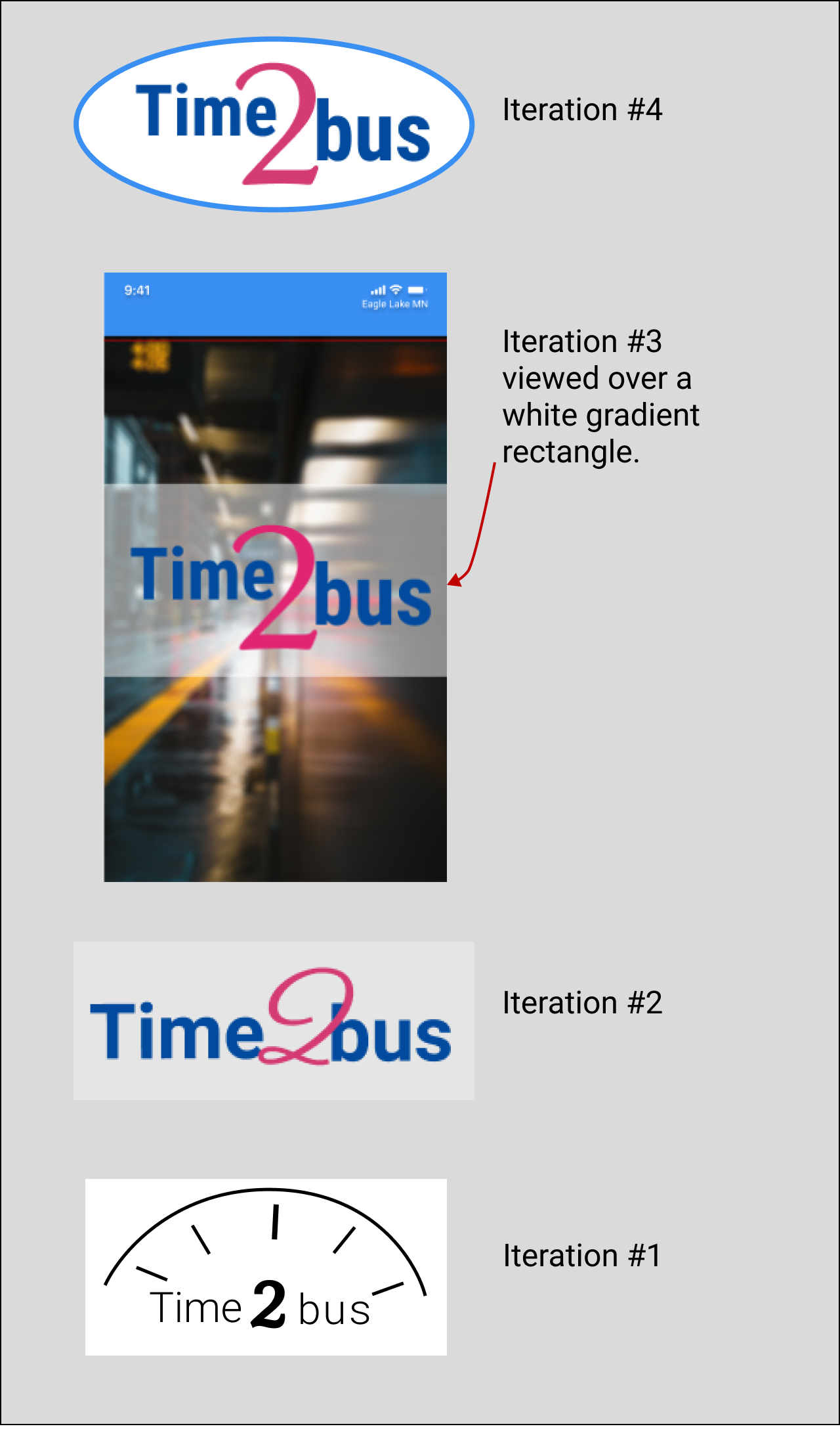
Digital Iterations of the Time2bus Logo
The Time2bus logo has improved as I've gone along. Iteration #1 was too complicated to communicate brand identity, and Iteration #2 was better, but the 2 was a little too free-flowing to be clear. Iteration #3 was clean and clear, but I had to place it over a white gradient for it to stand out against the splash screen. In Iteration #4, I've made the color white a part of the logo, enclosing it within a distinctive shape that is outlined by the main color of the color scheme.
Typography
I chose Roboto for the headers and Source Sans Pro for the body copy, as it is a smaller font and fits more neatly in the fields. Both were chosen because they are sans serif fonts, modern looking with nice clean lines.

Style Tile
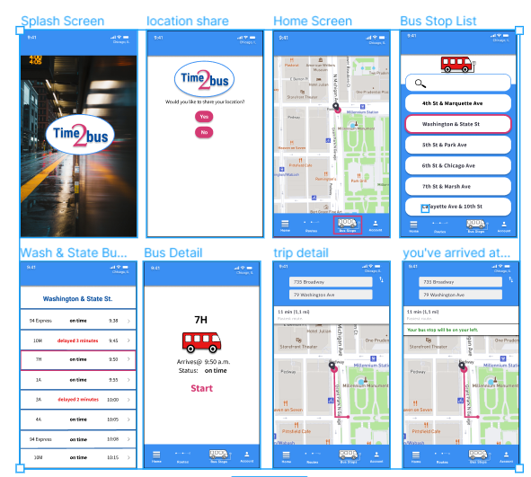
Prototype
Taking the recommendations from the Usability Testing and applying my branding choices along with other refinements, I constructed a final high-fidelity prototype.
Video Capture of the High-Fidelity Prototype
Key Images
Final Thoughts
Successes
*Succeeded in creating the minimum viable product for the project and a clickable prototype.
*Gained valuable experience in creating a survey, interviewing, developing wireframes, and a clickable prototype.
*Created a logo and a clean UI design.

Learning Opportunities
This entire project was a learning opportunity.
*I learned aspects of the UX/UI design process: user research, information architecture, competitive research, branding, wireframing, prototyping, user testing, and synthesizing the experience for a presentation.
*I learned how to use new programs and apps: Figma, Google Slides, Google Forms, Notion, and Adobe Color.

Mistakes
1. Because I was concerned about time constraints I didn't take enough time going over the Figma basics and so cost myself more time trying to figure out how to create the wireframes and how to get the prototype to work properly.
2. I added the route planning component even though it was outside the business requirements. It seemed natural to me to add route planning to the app and I didn't realize that I needed to add a rationale for the addition, a lesson I soon learned.