Creating ColorCat
Discover ColorCat!
Try out the high-fidelity prototype.

OVERVIEW
Summary
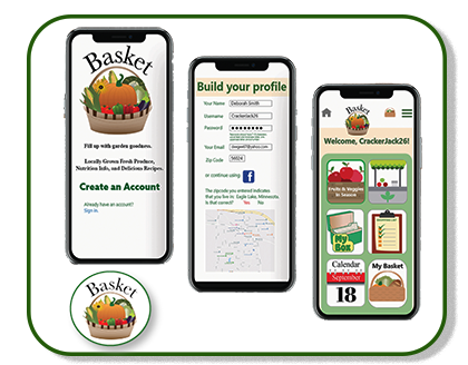
ColorCat is a mobile app for detecting colors, allowing users to capture, identify colors, and then save their findings. This app is an easy place to set up color palettes for projects.
The polished high-fidelity wireframes and the high-fidelity prototypes in this case study were the end result of many hours of work researching, sketching, designing, and just plain thinking.

Roles and Responsibilities

©Deborah Goschy
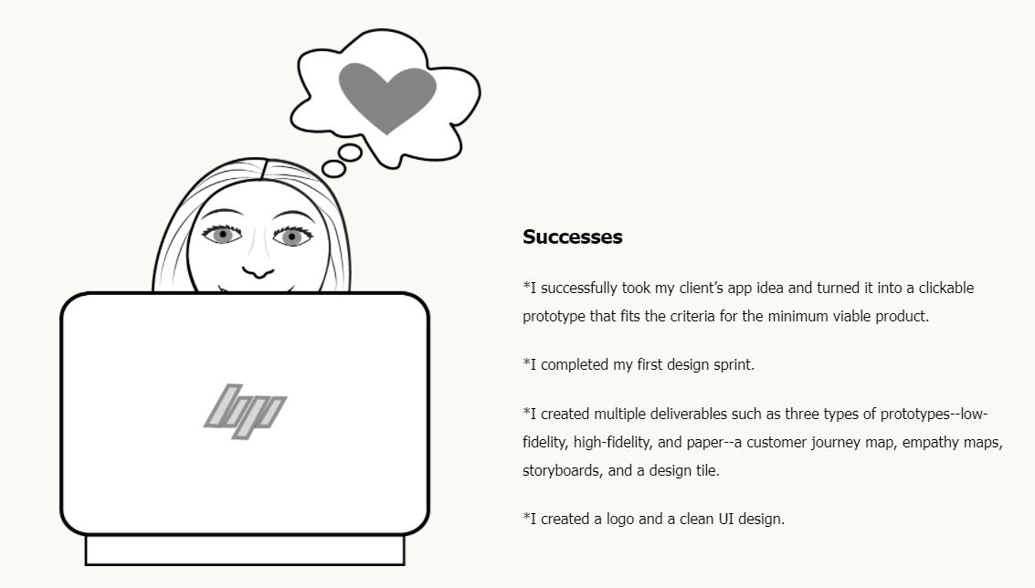
I am the UX designer for ColorCat and my responsibilities were competitive research, user research, information architecture, designing user flows, visual design, prototyping, and usability testing. In short, I was responsible for the whole enchilada.
Tools Used: Figma for wireframing, prototyping, and deliverables; Adobe Illustrator for select illustrations; and pen and paper for sketching.

©Deborah Goschy
Problem
Here's the story:
It all started with a client and a wish...
As an artist, my client is very interested in colors. She often looks up colors she would like to use in her art online. She writes down the color name for her reference, but she doesn’t always remember where she has put her notes to refer to them later. Her wish for a color-detection app began during her high school years when she would look at student artwork posted on the walls. Wondering aloud about the colors she looked at invariably ended in disagreements with her friends as they struggled to pin down the identity of a color.
Her mission for me was to design an app that would detect colors through the viewfinder of her phone and would allow her to save the detected colors in the app. As she is a cat lover, my client requested that the logo for the app include a cat. From my interview with my client, I was able to define the business requirements for this project.

©Deborah Goschy
©Deborah Goschy
The Business Requirements
To create a user interface and a clickable prototype that will:
•detect colors in images
•provide names and codes for colors
•save detected colors in the app
•To create the color palette and branding for launch, including a logo that involves a cat.
©Deborah Goschy
Target Audience
Through my conversation with my client--and through competitive research--I was able to define a target audience for ColorCat:
•Teens and Adults
•Students and others who use digital art programs like Adobe Illustrator, Figma, Photoshop, etc.
•Professionas working as graphic artists, graphic designers, UX/UI designers, digital illustrators, etc.
Solution
The answer to my client's problem was a color detection app that will recognize colors through the viewfinder and photos in the camera's gallery. The app can also save detected colors, or colors found in the color library, to projects.
The logo has a cat.
___________________________________________
PROCESS
Discovery and Research
Competitive Research Findings
In an effort to accomplish my product goals I took a look at what the other guys are doing when it comes to color detection or color matching apps. There are many such apps out there. I browsed several of them and studied three with greater depth.
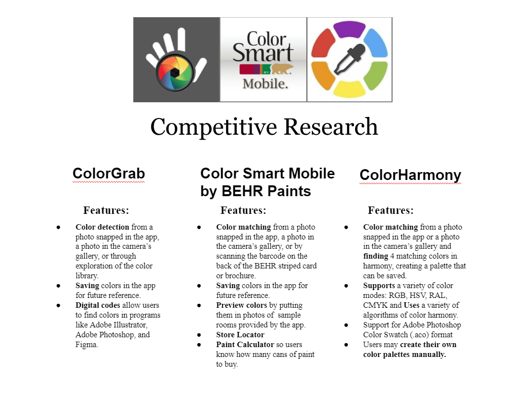
As I stated previously, competitive research helped me to infer my target audience. Something many of these apps do is give the codes—such as RGB, CMYK, HSB, and LAB—for colors detected, a valuable feature for users of programs like Figma, Adobe Illustrator, and Adobe Photoshop. That fact influenced my decision to include codes in my color detection results. ColorHarmony occupies a niche among color detection apps, with its ability to generate color schemes such as analogous, monochromatic, and complementary.
One of the color detection apps I studied has a different focus—selling paint. I included Color Smart by Behr Mobile because it was the first color detection/matching app that I ever saw. Several years ago I encountered this app while I was shopping for paint at Home Depot. I thought it was the coolest thing ever as I practiced placing colors beneath its scanner. For color detection, Color Smart does a good job, but it's all about Behr Paints. The color library is Behr Paints colors, and users can preview them by placing them in photos of sample rooms provided by the app. This app has a different focus from the app that I wanted to create, but it was a singular focus, and I knew that I wanted to create something as simple and direct.
User Pain Points
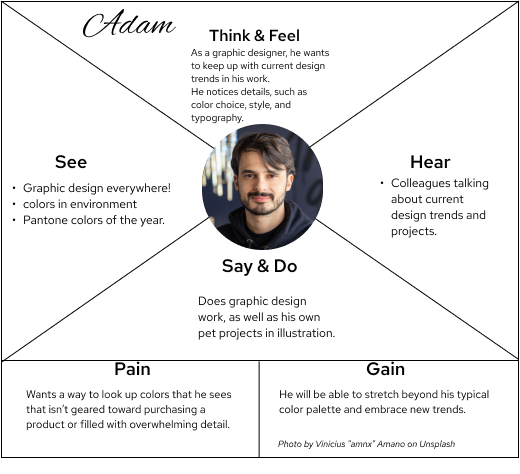
From the competitive research findings, conversations with my client, and my own knowledge as a designer, I was able to create personas and empathy maps. Getting to know the thoughts, practices, wants, and needs of prospective app clients is a critical step in creating an app. I am designing my product for them and the more I can empathize, the more I care about getting them a product that they can use, the better the app will be. Below, you will see the empathy maps that I made from my information about persona #1, Melissa, and persona #2, Adam. I created both of these empathy maps in Figma. The information is organized around sensory data (what they see/hear), behaviors (what they say/do), their mental life (thoughts and feelings), and finally, why they need the app and how they would benefit from it.
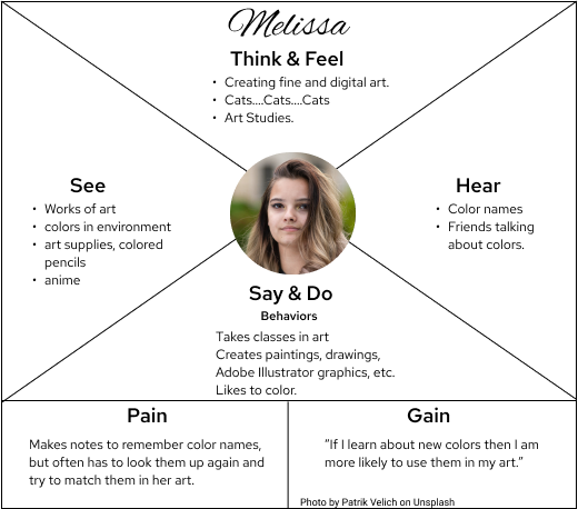
Persona #1: Melissa
Pain Point: I need to be able to look up colors and save my findings.
Melissa is a person very similar to my client. She is a young woman, a student, and an artist. She studies art and creates it in both traditional and digital methods. She likes to acquire knowledge of colors that she sees. She does her best to match colors that she sees by looking them up online and writing them down, but it's hardly an efficient system and she often misplaces her notes on color names. Gain: She's very interested in a color-detection app because she knows that if she learns about new colors she is more likely to intentionally use them in her art.
Persona #2: Adam
Pain Point: I need to get colors and codes without overwhelming detail.
Adam represents the ColorCat users who are working as graphic artists, graphic designers, UX/UI designers, digital illustrators, etc. An adult professional, he is concerned about staying abreast of current trends, such as color choice, style, and typography in his design work. He wants to use a color detection app that will give him colors and codes without information for features that he will not use. Gain: He will be able to stretch beyond his typical color palette and embrace current trends.
INFORMATION ARCHITECTURE
User Stories
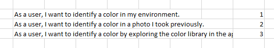
My Competitive Research informed the development of User Stories, which describe how the prospective user will engage the app. User stories are the critical component behind user flows. For this project, I came up with three user stories, which I ranked in order of importance.
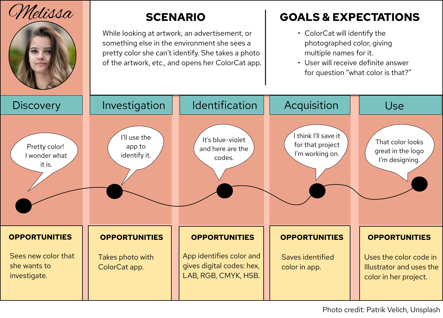
Thinking about my client and the personas I developed, I was able to conceptualize the highest priority user story in this customer journey map for Melissa. In this customer journey map, Melissa discovers a pretty color, investigates what that color might be, identifies it, saves it to favorites--thus acquiring it--then uses it.
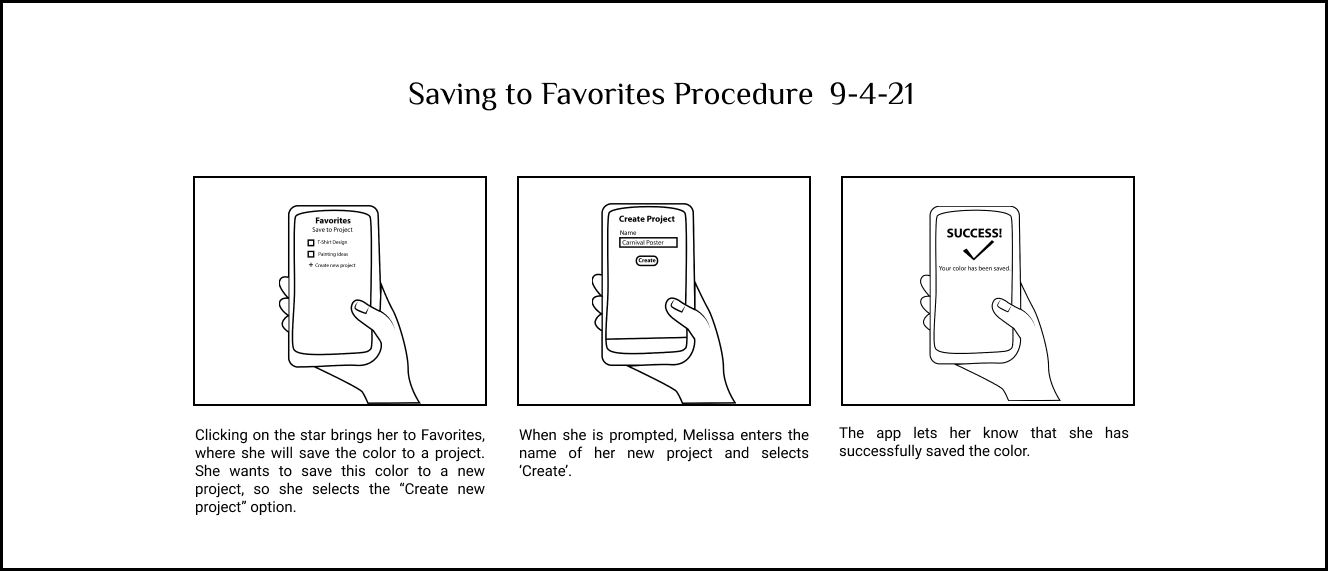
I further visualized Melissa's user journey in a storyboard. By visualizing the user journey, I was able to imagine the setting in which Melissa might use the app and the user interface display.
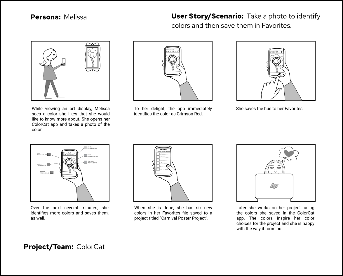
I later elaborated on the procedure for saving with a few more squares.
User Flows
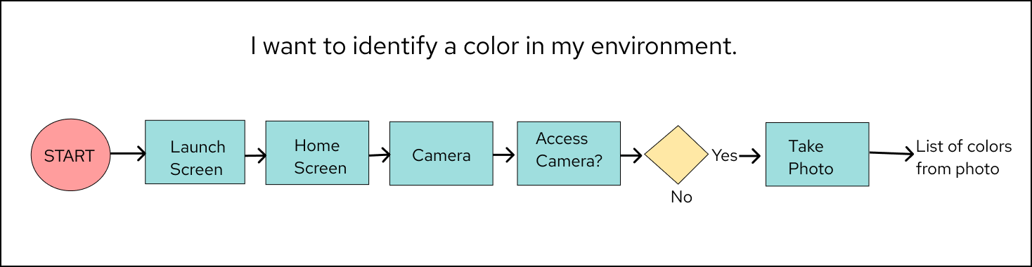
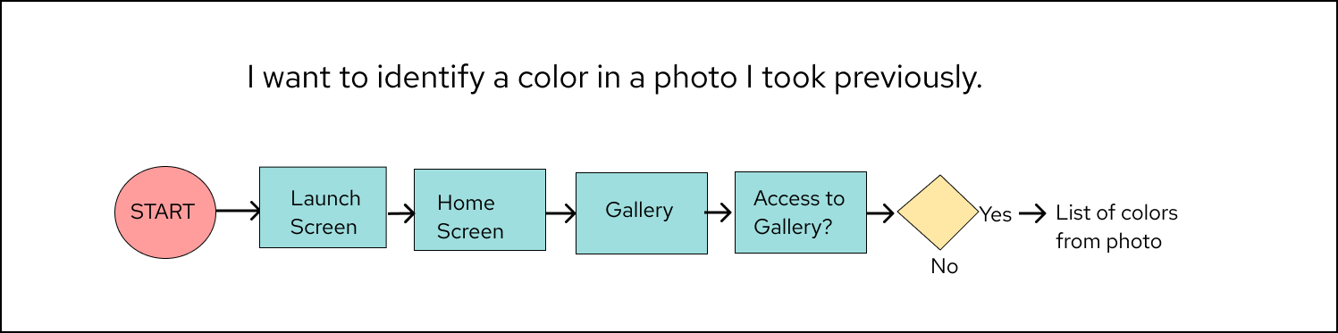
I created user flows of the three scenarios (the user stories) I wanted to address with my app: using the camera to identify a color in the environment, identifying color in a previous photo, and exploring the color library to identify a color. While creating the user flows I imagined the different screens in the flow's cycle.

Sketching, Sketching, and More Sketching
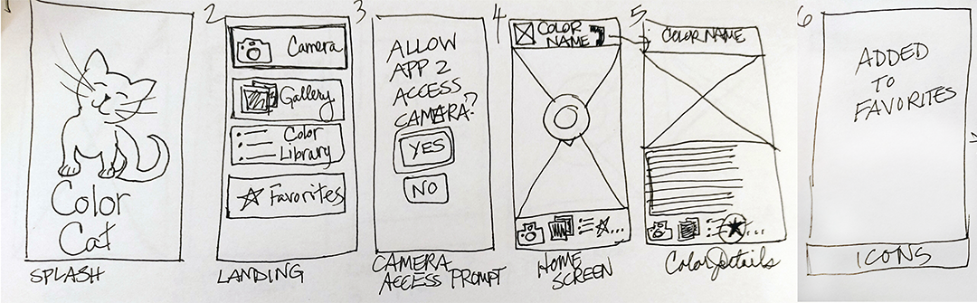
Wireframe Sketches
I've known the value of sketching for projects for a while, but the design sprint for ColorCat reinforced that knowledge. The intensive sketching activities helped me figure out how to organize the wireframes.

Crazy 8's Sketch
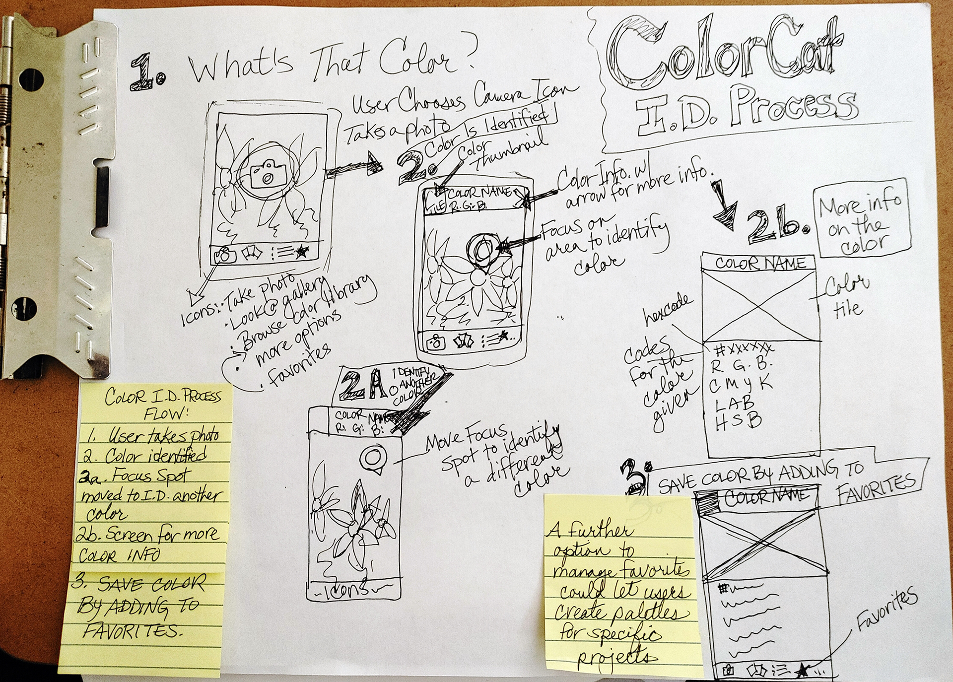
Solution Sketch
After tackling the wireframes in the Crazy 8's and Solution Sketches, I created a more structured wireframe sketch.

Paper Prototype
Once I had created and refined the wireframe sketches, I was able to create a paper prototype. The paper prototype allowed me to have a low-tech preview of the app.
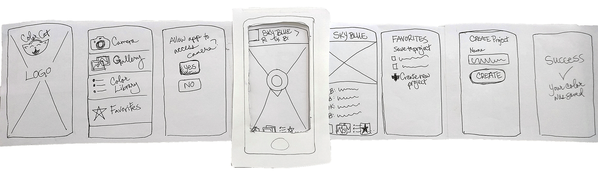
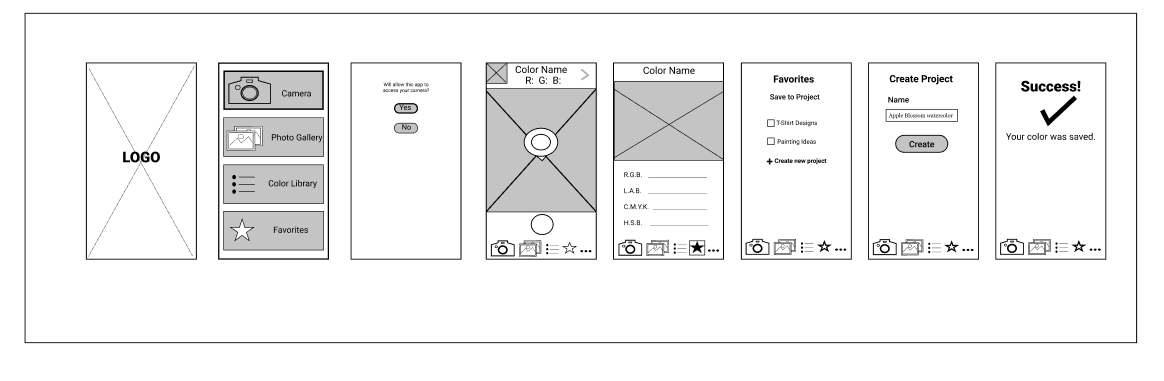
Digital Low-Fidelity Wireframes
After the paper prototype, I created low-fidelity digital wireframes in black and white. I was on my way to a working prototype, usability testing, and designing the user interface.
Usability Testing and Findings
I took my working prototype and proceeded with usability testing. Usability testing is a good way to find out if the app works the way I want it to when operated by people other than myself. I conducted testing in person, giving prompts and taking notes while respondents went through the high-fidelity prototype and completed tasks.
Tasks Tested
*Take a photo/use viewfinder
*Choose a color for detection.
*Save color to favorites.
*Create a new project in favorites.
Usability Test Capture
This is a capture of a usability test performed by one of my respondents.
Below are the notes that I took while respondents went through the steps of the test. I created the table in Figma. I was not surprised when my respondents found places in the app that needed further work; as the app's creator I know how I intended for features to work, and that's knowledge my respondents didn't have.
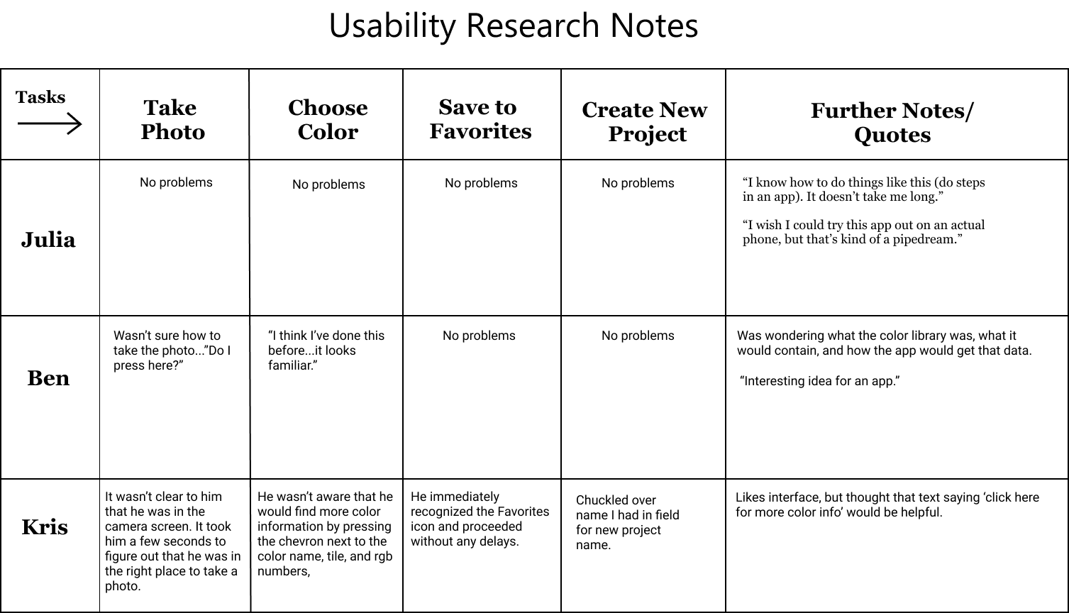
Problems
Usability testing revealed problems with the prototype:
1. How to take the photo was unclear.
2. How to use the pointer to select a color was confusing.
3. How to find more color info was unclear.
Solutions
The solutions for the problems were fairly simple.
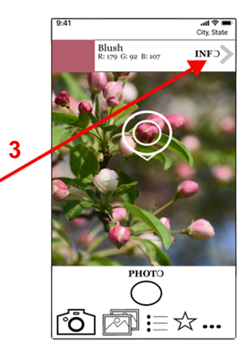
Problem #1: How to take a photo was unclear.
A circle to press on to take photos is pretty common on mobile phones, but when I looked at my phone, I noticed that there were words on the interface where I could choose an action. I added the word 'PHOTO' to give users the same opportunity to choose.
Solution #1: Add a prompt—the word PHOTO—over the button for taking a photo.
_______________
Problem#2: How to use the pointer to choose a color was confusing.
Solution #2: I changed the process and added a prompt to move the phone—rather than the pointer—to select a color.

Problem #3: How to find more color info was not clear.
Solution #3: I added the word info to the chevron leading from the color tile, color name, and RGB. values.
BRAND DEVELOPMENT
Moodboard
I created a moodboard of images of cat logos as well as images from other color apps. I decided early on that I wanted the logo to incorporate prismatic or rainbow color. Not only was prismatic color thematically appropriate, but I know from personal experience that it elicits positive reactions.
Sketches
I worked on the user interface design, icons, and layout when I sketched my wireframes.
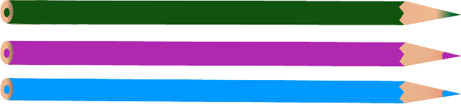
Color Palette & Typography
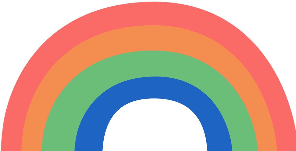
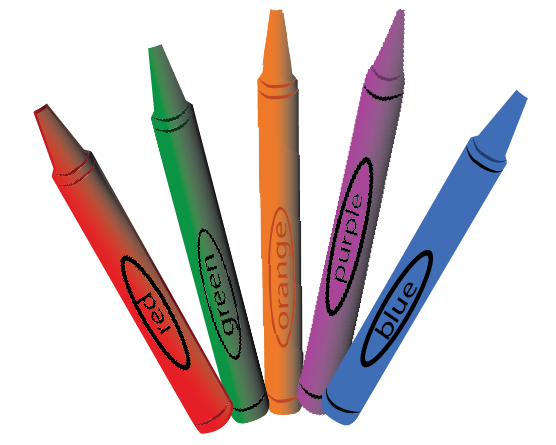
A rainbow of ColorCat hues.
Style Tile/Guide

The color palette for the UI is based on a prismatic color scheme. Rather than having the intensity of the traditional rainbow of primary colors, however, these colors are comparatively muted. I checked these colors on color.adobe.com to ensure that they would be "color blind safe". As they are muted the colors will not overwhelm the icons. I used color sparingly in the UI because I didn't want the colors of the UI to affect the user's perception of detected colors.
I chose Georgia for the typeface because it is a serif typeface like the Gwyner used in the logo. Serif typefaces are also easier to read.
Logo Design and Process
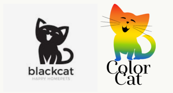
From left to right, the image that inspired the logo and the logo I created.
Logo Sketches
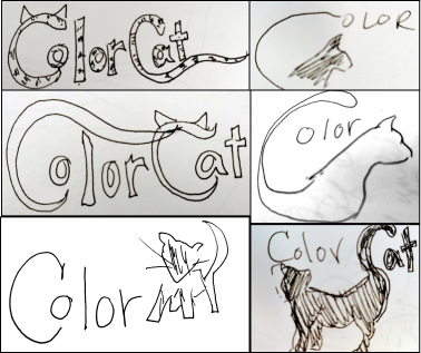
A logo with a cat was one of the required deliverables for this project. Like the other deliverables for this project, the logo didn't just suddenly appear. It was the result of research and sketching. Out of all of the images of cat logos on the moodboard, one logo inspired me more than others.
I used the general form of that image to create my logo, but I made it my own. It has a positive, playful feel that appeals to users like my client. That playfulness is echoed in the type, which is Gwyner.
Previous Logo Iterations
I played with the idea of using a cat's profile filled with only one color or a color gradient, like the logo on the right. That one just didn't do it, however. I knew that I needed to inject a bit of personality into the ColorCat logo, as I did in the logo on the left. I mixed up the order of the colors in the gradient, though, resulting in a murky area. I redid it later and adjusted the type.


PROTOTYPING
Low-Fidelity Prototype
I conceptualized how the app might work with a wireframe that became a clickable prototype.
High-Fidelity Prototype
Don't feel like trying the prototype?
Watch this 30-second preview of how the app functions.
Key Images
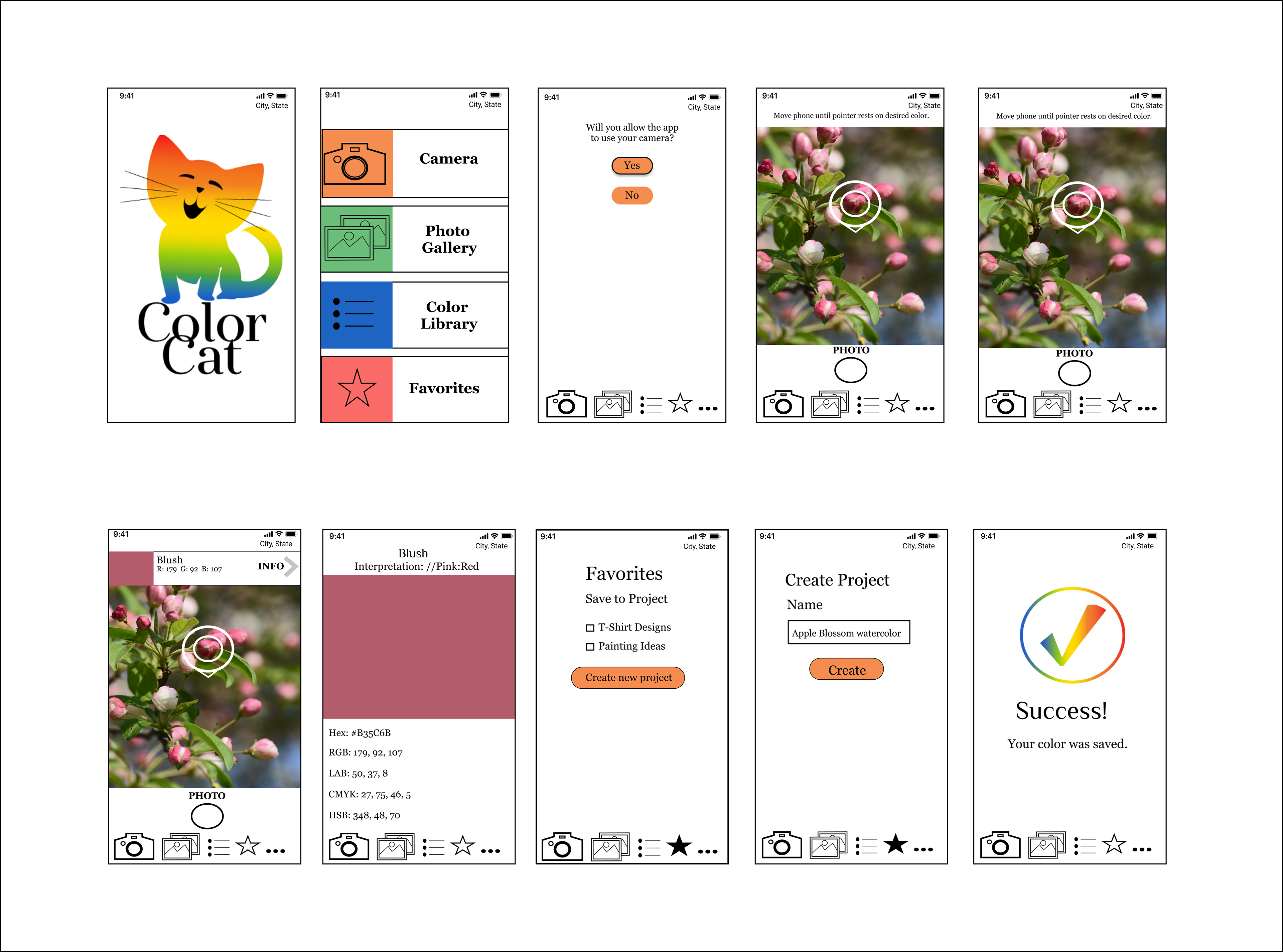
ColorCat high-fidelity prototype screens.
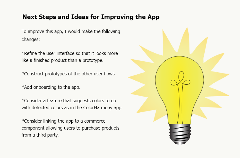
FINAL THOUGHTS:
Successes, Learning Opportunities, and Mistakes
Learning Opportunities
*This project was rife with learning opportunities. In this project I worked as an “agile” designer, fixing problems when I encountered them (Please see the section regarding Usability Testing/Problems and Solutions).
*Much of the process of this project took place during a design sprint. I got “hands-on” experience in following a design sprint regimen. I learned (again) the importance of sketching; the intensive sketching of the design sprint helped me to think through my user flows.
*Working on problems during the course of this project helped me to learn that discussion with other people helps to refine ideas. While discussing the confusion over moving the pointer to select the color, the user suggested that the pointer remain static, leaving the user to move the phone instead.
*Doing this project gave me the opportunity to reflect on how well I was communicating what actions I wanted users to perform in the prototype. Sometimes a chevron in a field isn’t enough information for the user looking for more color details, for instance. They might need a text prompt or a button to tell them what to do.
"...bad mistakes,
I've made a few."
--Queen, "We are the Champions"
Mistakes
*My client, in our initial interview, created a little doodle of her logo idea. Her attitude about it seemed offhand when she gave it to me as if it were an idea I could take or leave. I later discovered that my assumptions were wrong and my client, who was my daughter, became very angry with me. My other mistake in this matter was having my daughter as a client, an error I don't plan on making again.
*I did not do a survey and I really should have. As I went through the lessons I focused on the assignments. The survey was not assigned and I overlooked the task. When I learned that I was missing quantitative data I attempted to use CrazyEgg, which would generate a heat map for my prototype. That effort failed due to technical problems.

Thanks for reading!