History Around Me:
The trip from a creative concept
to a clickable prototype
Explore History Wherever You Are.
Try the high-fidelity prototype!
Overview
Summary
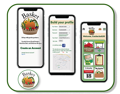
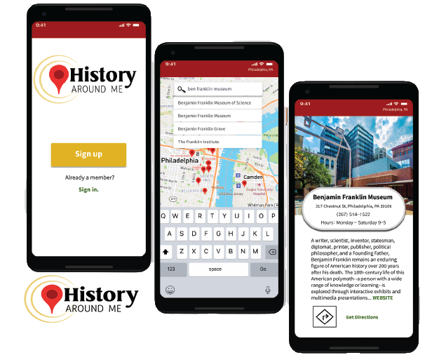
History Around Me 1.0 is an app with the specific purpose of finding historic sites/events.
• It allows the user to find historical sites/events in their area using their location.
• It allows the user to get directions to historical sites/events that they wish to visit.
• It allows the user to “check-in” at historical sites/events for social sharing.
Roles and Responsibilities
As the creator– and the sole individual associated with this project– my responsibilities included concept ideation, user research, information architecture, wireframing, visual design, prototyping, user testing, the interpretation of results, and the presentation of the final product.

©Deborah Goschy
©Deborah Goschy
Tools Used:
I used Figma for wireframing, prototyping, and deliverables; Adobe Illustrator for select illustrations; Google Forms for the target audience survey; Google Slides for the presentation; pen and paper for sketching.
Project Goals:
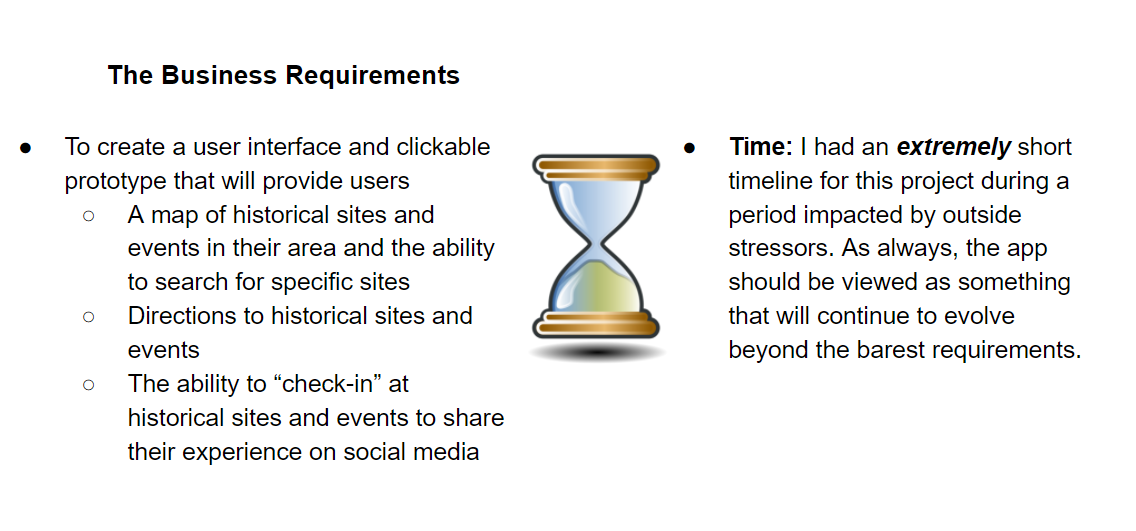
*To create a clean UI design and a clickable prototype for History Around Me 1.0.
*To address the identified business concerns to create the MVP (minimum viable product).
The Problem
Design Brief
• As a lover of history and stories, I am curious--not just about famous places--but in the area around me. A few months ago I got an idea for an app that would make it easy to find historical information, to have it at my fingertips when I reached for it.
•The app I was thinking of would enable users to find information on historic sites/events in one place, using the user’s location and linking that user to info about multiple historic sites and events in their area and directions to those places.
• I knew that my project would have to begin with user research to determine user needs and the target audience for the app, followed by competitive research to learn about existing history apps.
©Deborah Goschy
Scope & Constraints
Users, Audience, and Personas
Audience
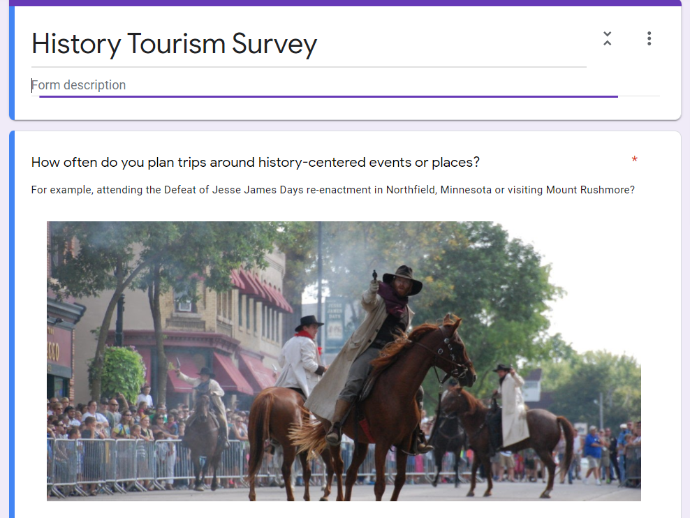
I began my user research by creating a survey in Google Forms to help define the target audience for my history app. I began my survey with a question that I thought would resonate with most travelers: How often do you plan trips around history-centered events or places? The following questions, some of which are listed below, covered areas like the preferred formats of information, interest in notifications of historic sites, and demographics.
Some of the questions asked:
*Would you like to be notified of historic sites that are around you?
*Would you like to be able to check-in and upload your picture at historic sites?
*How would you like to consume information about the historic site?

©Deborah Goschy
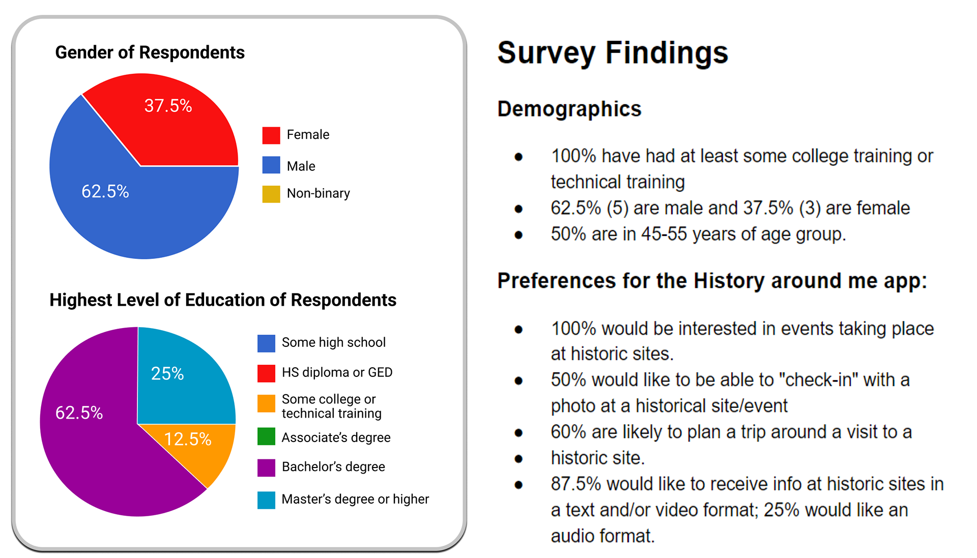
Survey Results
The survey revealed demographic characteristics as well as preferences for the app, which would inform my user stories.
©Deborah Goschy
The Target Audience
I was able to define the target audience through the user survey. I was also able to infer characteristics from my competitive research, which is coming up later.
©Deborah Goschy
Target Audience
• Teen and adult smartphone users and travelers.
• People who have an interest in history, visiting landmarks, museums, and attending history-based events.
User Pain Points
After the user research and competitive research, I was able to create personas.
Tools used: I found the user photos on Unsplash.com and edited them in Adobe Photoshop. I constructed the persona tiles in Figma. Getting to know the thoughts, practices, wants, and needs of prospective app clients is a critical step in creating an app. I am designing my product for them and the more I can empathize, the more I care about getting them a product that they can use, the better the app will be.
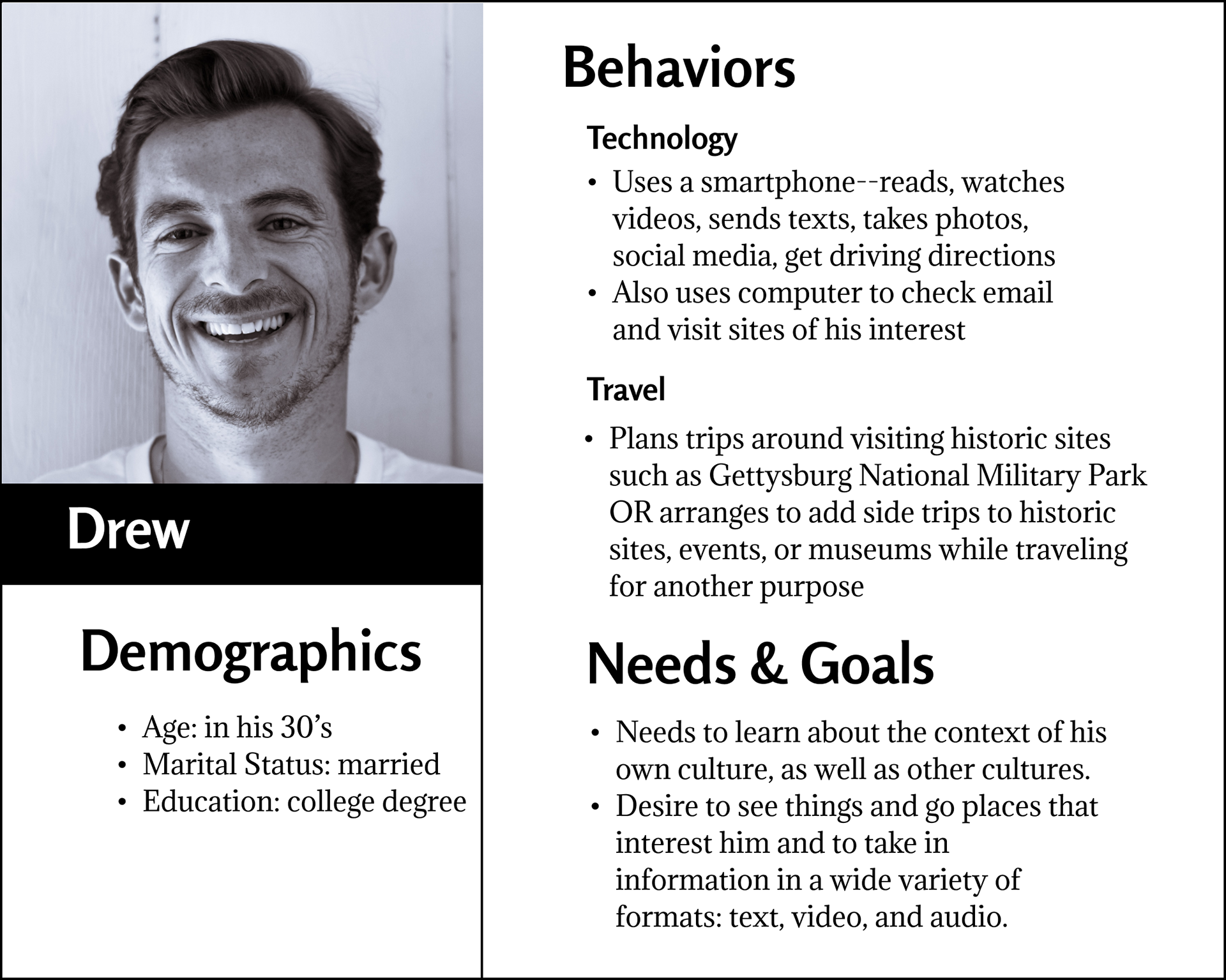
Persona #1: Drew
Drew is a college graduate in his 30's. He uses a smartphone for reading, watching videos, texting, taking photos, and using social media. Gain: Learning about history fills his need to learn about the context of his own and other cultures.
Pain Point: I need a source of accurate information that I may refer to while on the go to reduce the amount of time that I am looking for historic sites or history-based events in my current locale.
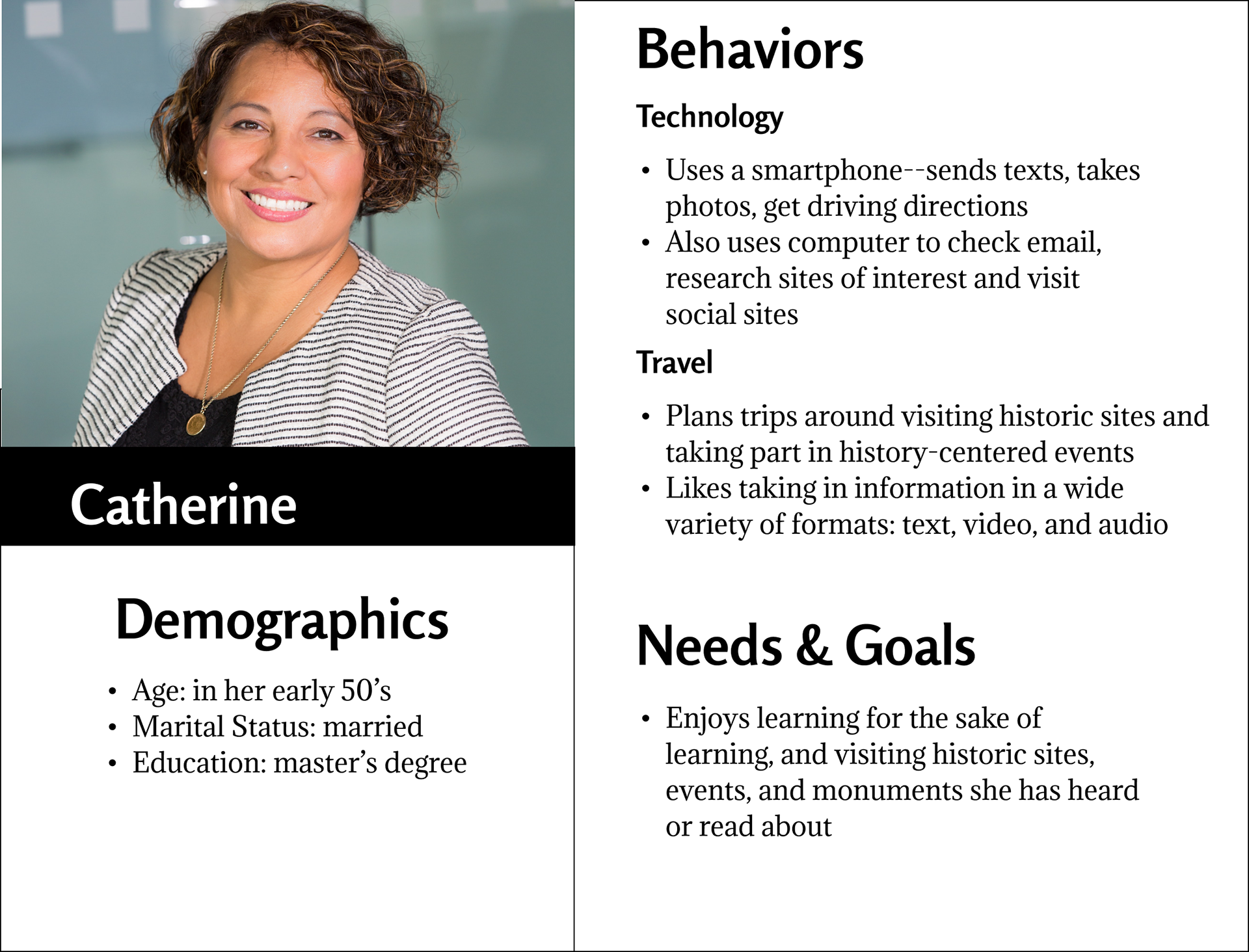
Persona #2: Catherine
Catherine is a college-educated woman in her early 50's. She uses a smartphone regularly, sending texts, taking photos, and getting driving directions, but not for social media. Gain: Visiting historic sites fills her need to learn for the sake of learning.
Pain Point: I need a source of information about the location of historic sites/events when I am traveling so I may add them to my trip plans and get directions.
Solution
The answer to the problem is an app that displays available historic sites/events based on the user's location, provides users with driving directions to these sites and events, and allows them to share their experiences with their friends.
______________________________
Process
Discovery and Research
Competitive Research Findings
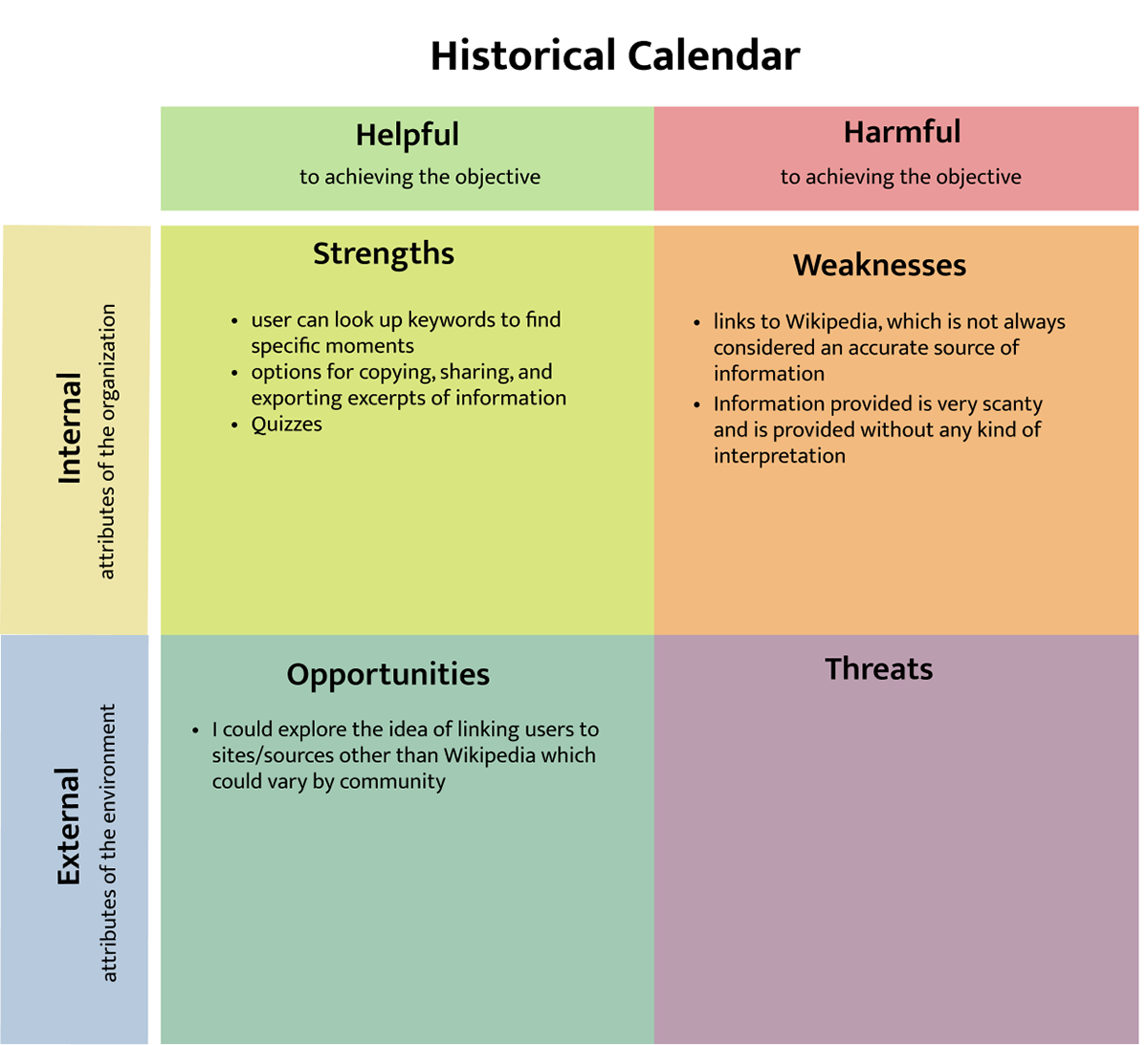
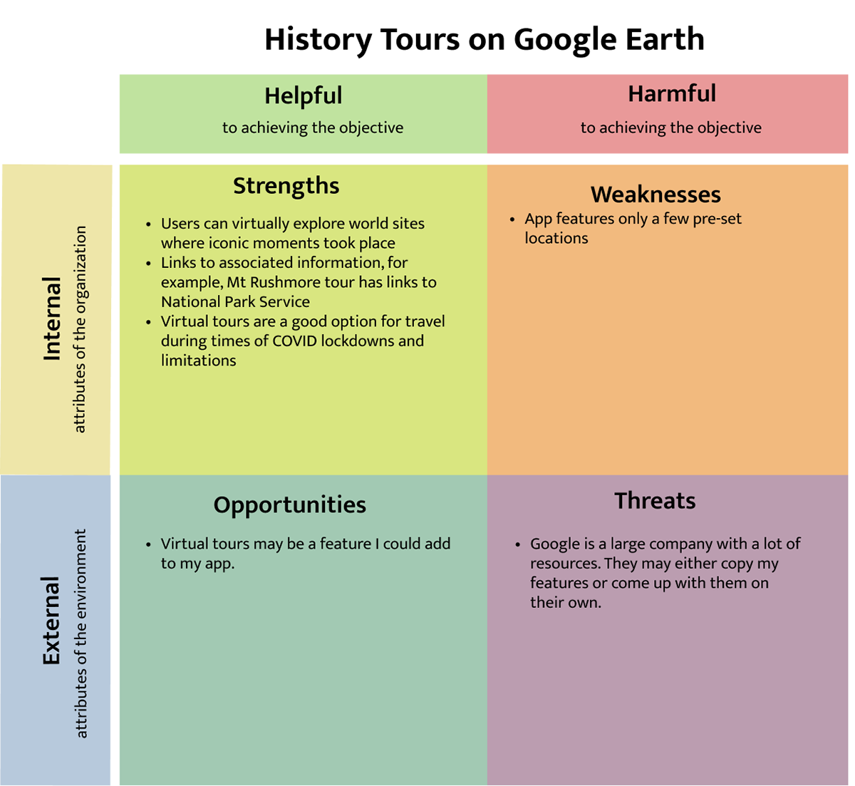
An important and necessary task in creating this app was competitive research. Are there other history apps out there? What do they do, what are their strengths and weaknesses, and what kind of competition do they represent for us?
For this task, I researched other history apps, studying three apps in greater depth. Each app I studied had things in common with the app I wished to create: Google Arts and Culture has a "Nearby" tab in their app that shows the cultural history in a user's area; History Tours by Google Earth allows users to explore historic sites around the world virtually and links users to information associated with the site they are "touring"; Historical Calendar lets users look up historical events by date or keyword. I did not, however, find an app that had all the features I was considering for my app.
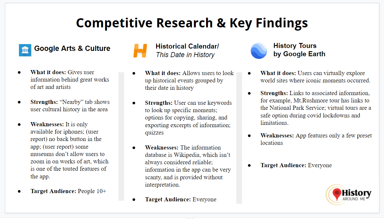
I also created a "SWOT" tile--a chart of strengths, weaknesses, opportunities, and threats-- for each competitor app.

______________________________
Information Architecture
User Stories
User stories are statements that describe how the app will be used. They follow this format: As a user, I want to ______________ so I can____________.
I wrote my user stories, considering the user survey, the personas I'd developed, and the competitive research that I'd done, initially coming up with six user stories. See them below.
©Deborah Goschy

The Top Three User Stories
I looked over the user stories that I'd written and ranked them by priority, choosing three that I would work on first. I prioritized the user stories for:
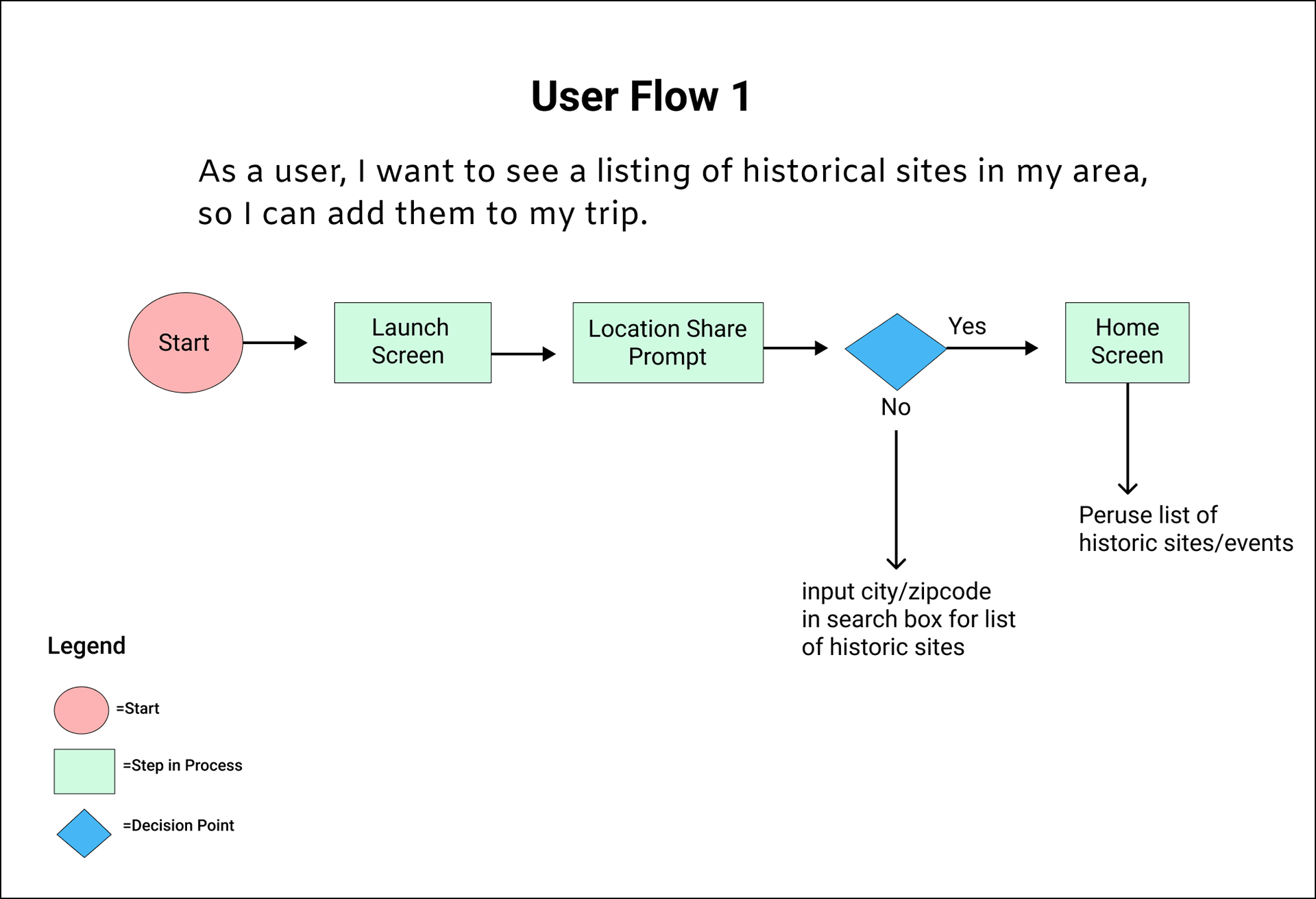
• finding a listing of historical sites
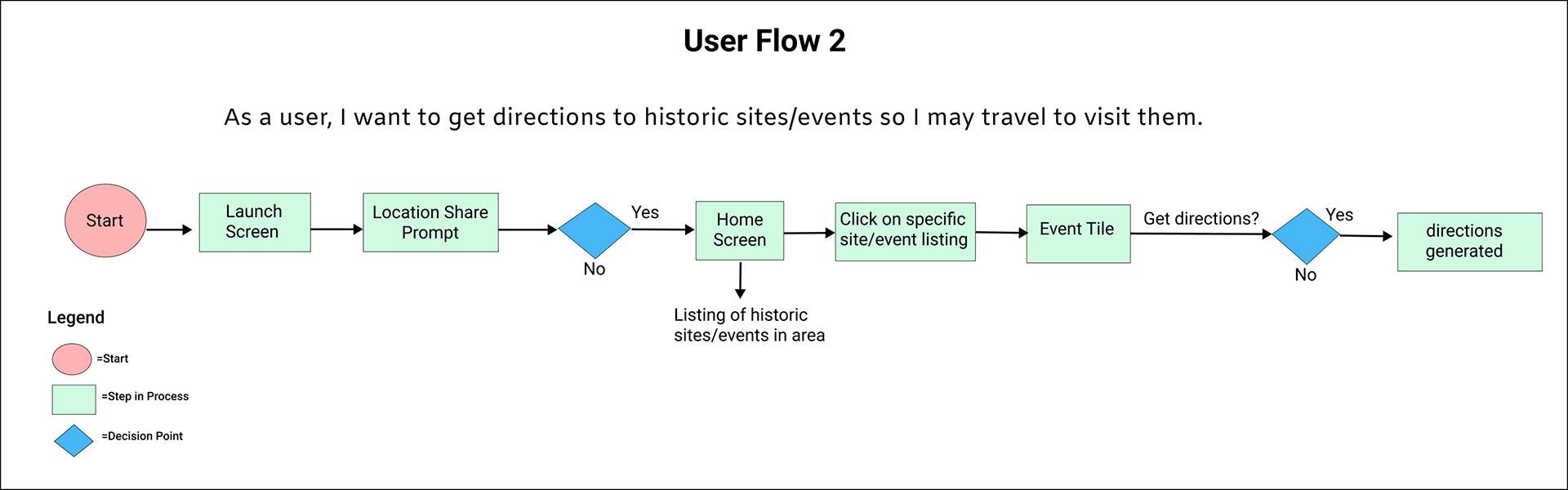
• getting directions to historic sites/events,
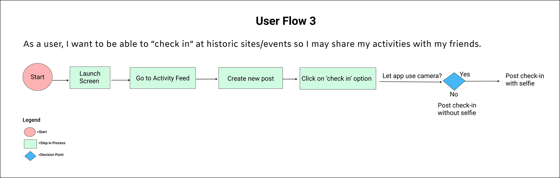
• doing social sharing at historic sites/events.
Once I had the user stories written and prioritized, I took the top three stories and created user flows. The colored shapes helped me to understand the elements of the user flow at a glance.
User Flows
Site Map
Creating a site map helped me to further conceptualize the app's structure.

Wireframes
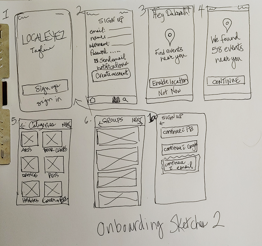
Wireframe Sketches
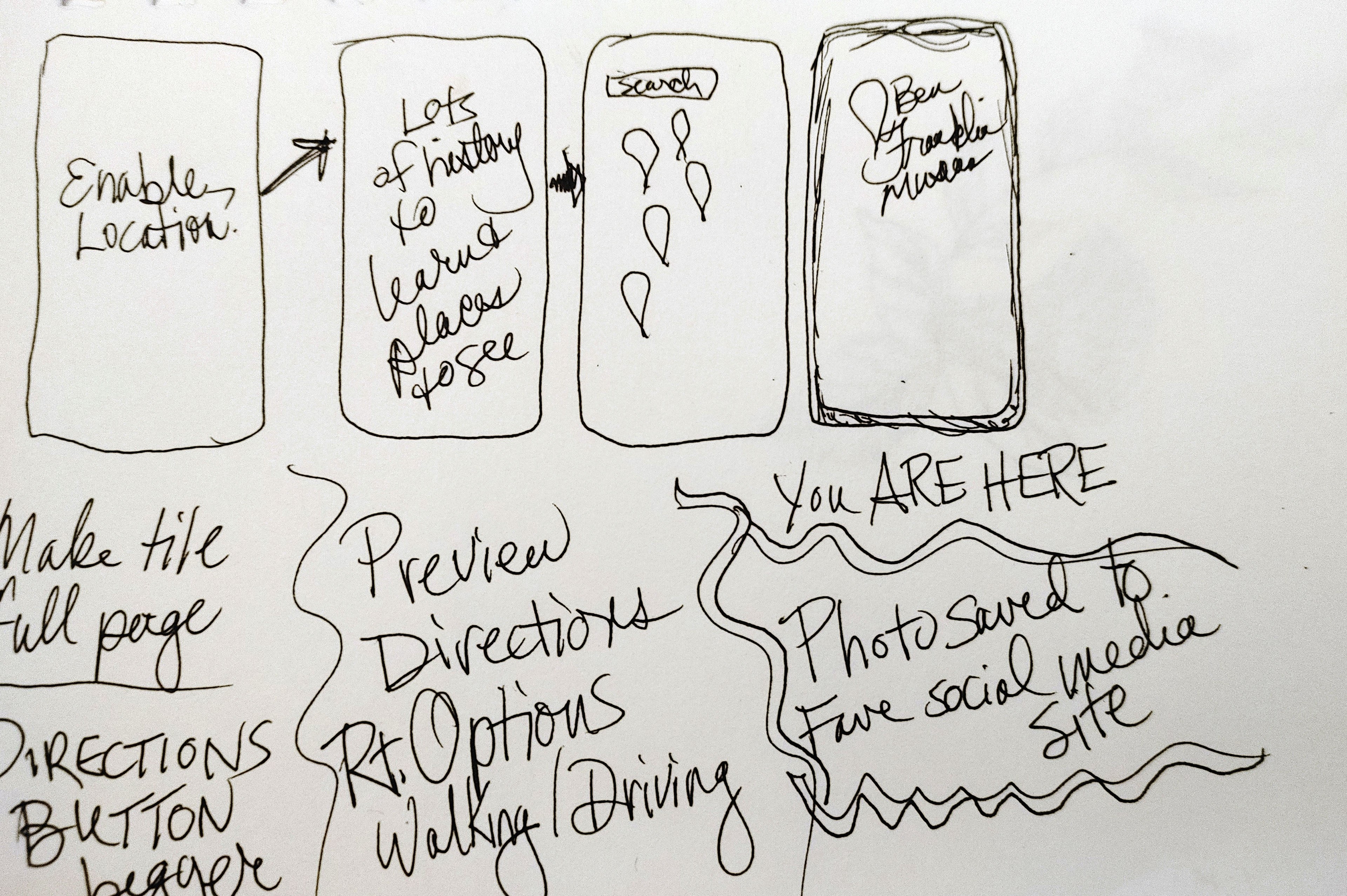
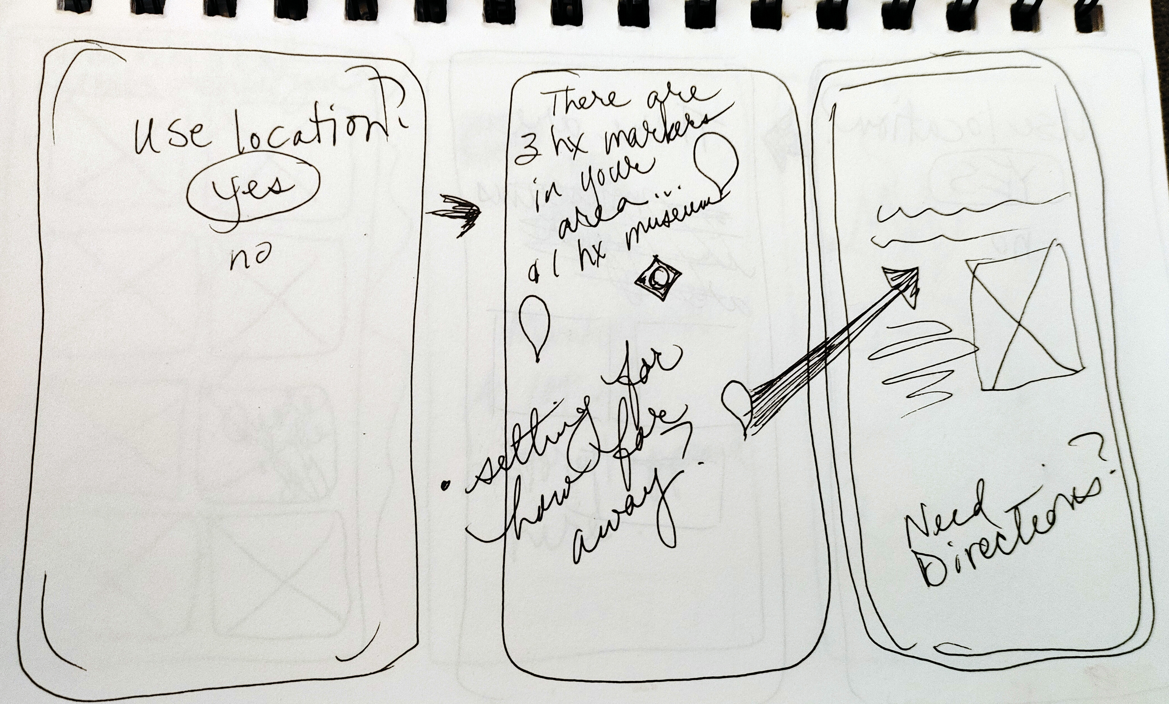
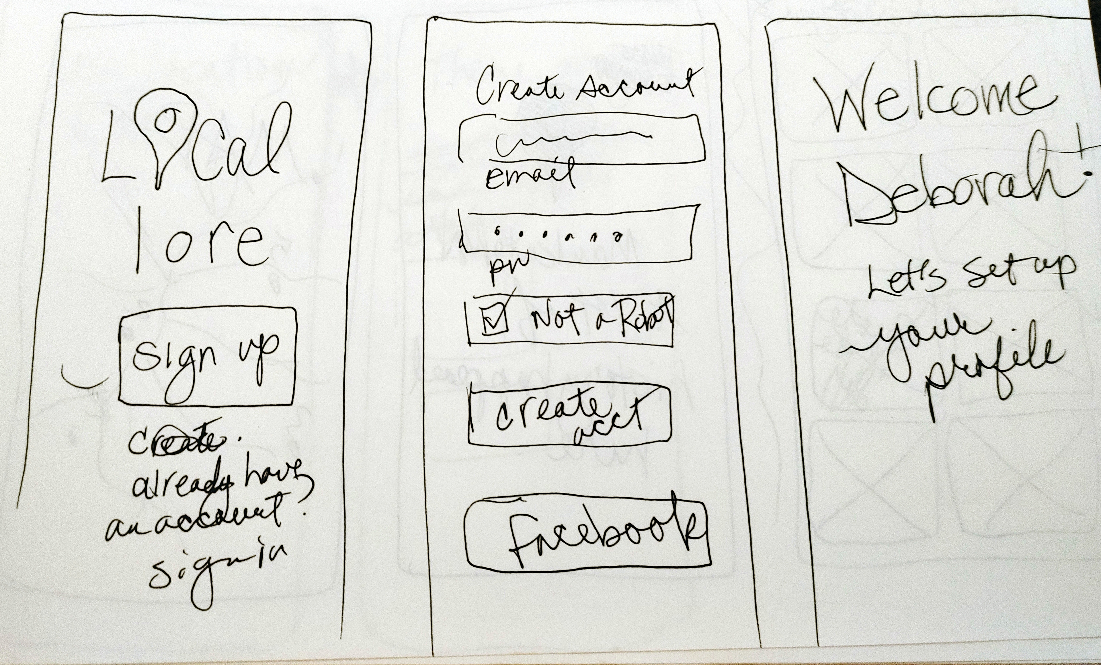
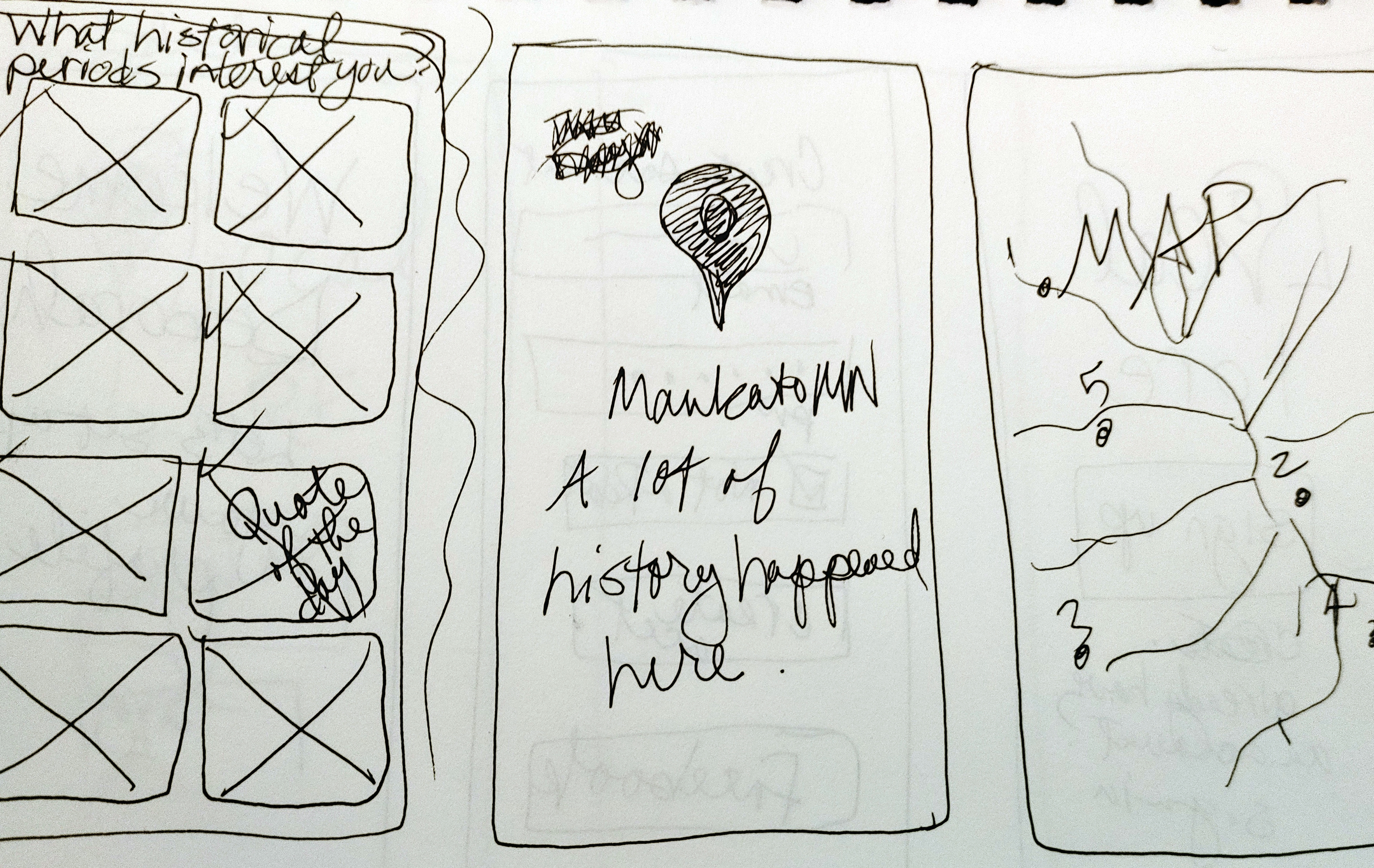
With the user stories and user flows created I was able to move on to sketching the prospective wireframes, using the portable tools of paper and pen. Using these tools I was able to do quite a bit of preliminary work before going to the software.
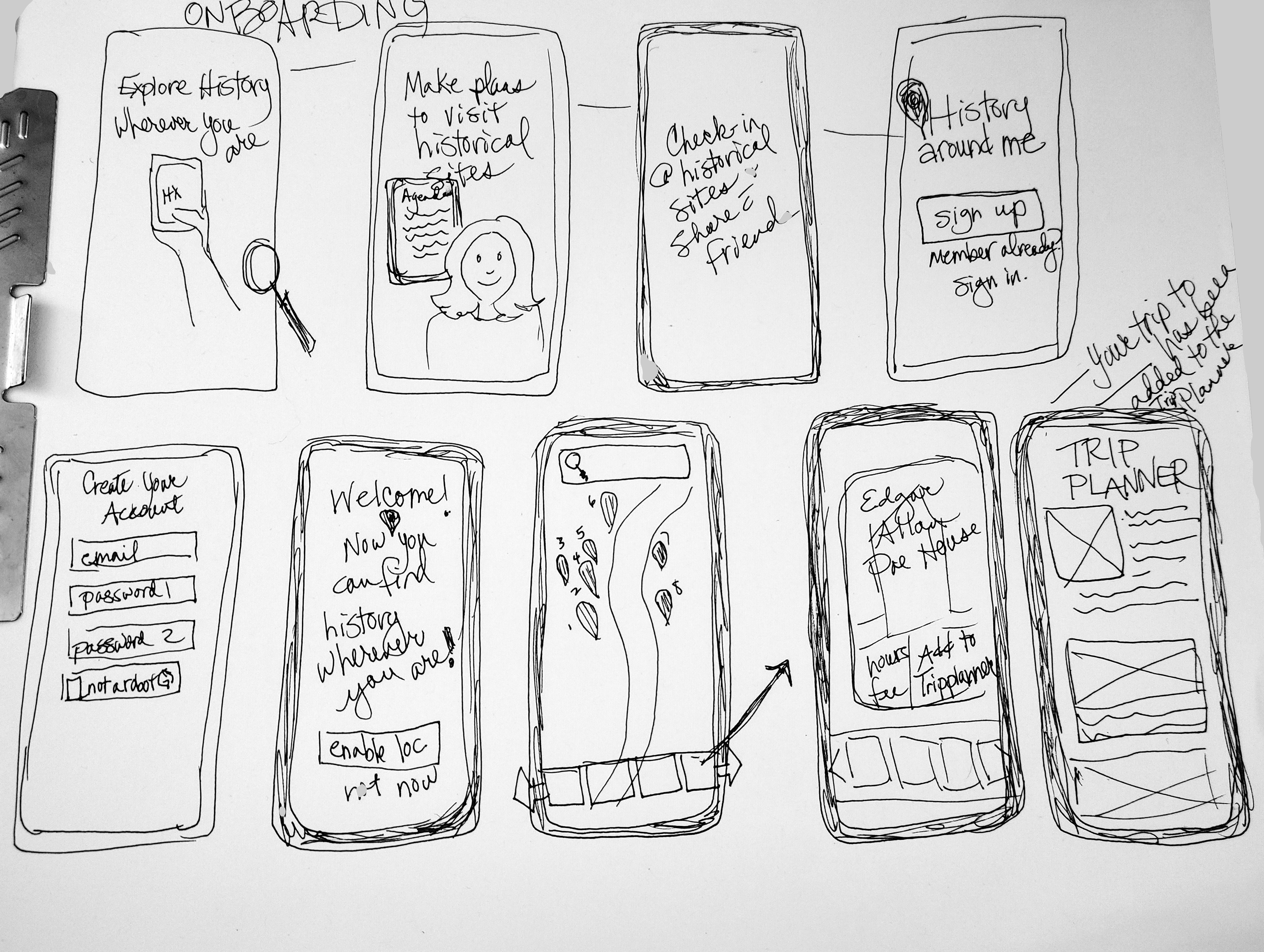
Digital Wireframes
Low-Fidelity Wireframes
Low-fidelity wireframes don't typically use color, but mine do as I repurposed onboarding illustrations from another project, the preliminary logo has a color element, and the Mapsicle plug-in has only colored maps. I will address the repercussions of using color in a low-fidelity wireframe in the mistakes section.
Version 1: Low-Fidelity
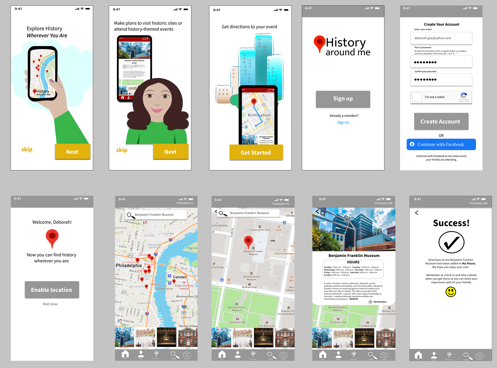
Version 2: High-Fidelity
In this high-fidelity iteration of Version 2, I applied the color palette that I had selected for the app.
Peer Review
After Version 2, I received feedback through a Peer Review that included a number of ideas for improvements to the app which I worked on addressing in the next iteration.
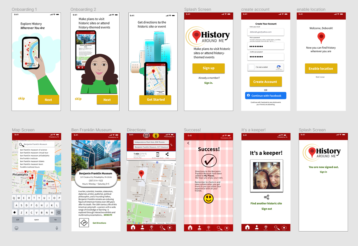
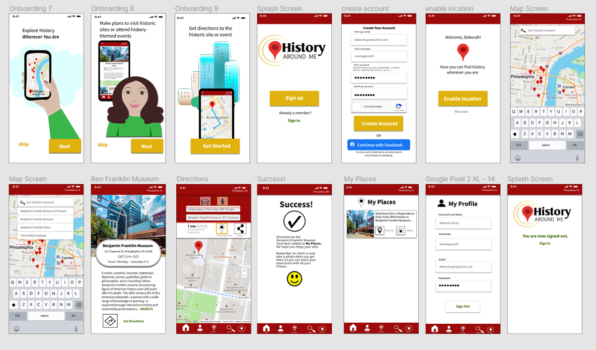
Version 3: High-Fidelity
This version incorporates changes suggested by the above-referenced peer review. Version 3 is an end-to-end user experience, from login to logout. Logout takes place on the newly added profile page. Time did not allow for the inclusion of a desktop view.
_______________________________________
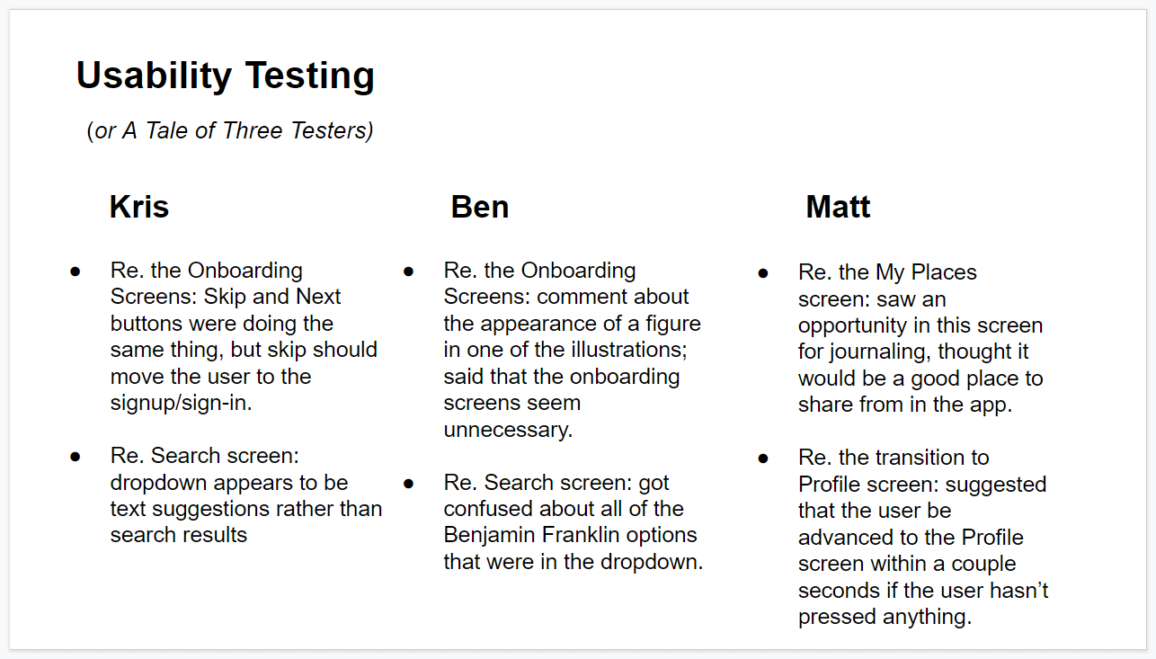
Usability Testing
Once I had wireframes and a prototype I could do usability testing. Usability testing is an incredibly important part of developing an app and I would no sooner skip it than I would skip proofreading something I had written. When I say that it often takes fresh eyes to spot mistakes and problems, I am speaking from experience.
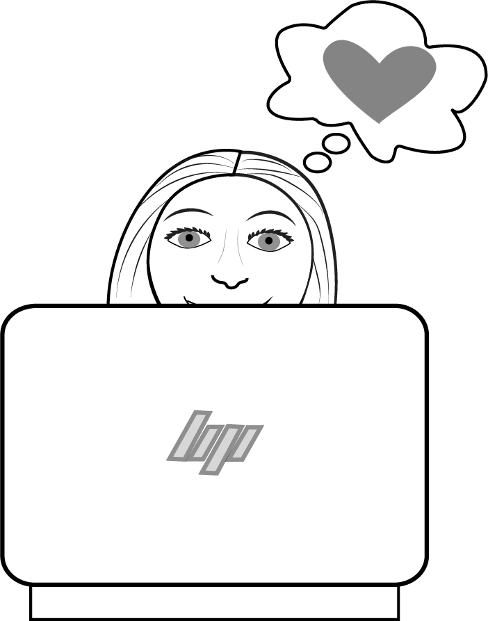
Usability testers for History Around Me were three men: one in his 50s, one in his 30s, and one in his 20s. All three of them are experienced users of smartphones and computers. Two of the testers accessed the prototype on my computer, an HP Envy laptop. One of the testers had the link to my prototype and did usability testing remotely.
©Deborah Goschy
Tasks tested
• Onboarding
• Creating an Account
• Searching for a historic site/event
• Select site/get directions
• Save directions to My Places
• Go to Profile and sign out
Overall Experiences
Three out of three testers--or 100%--were able to successfully complete the tasks in the app. That doesn't mean that there weren't problems noted by my testers, as well as possible opportunities. All of these findings are recorded below.
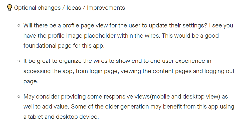
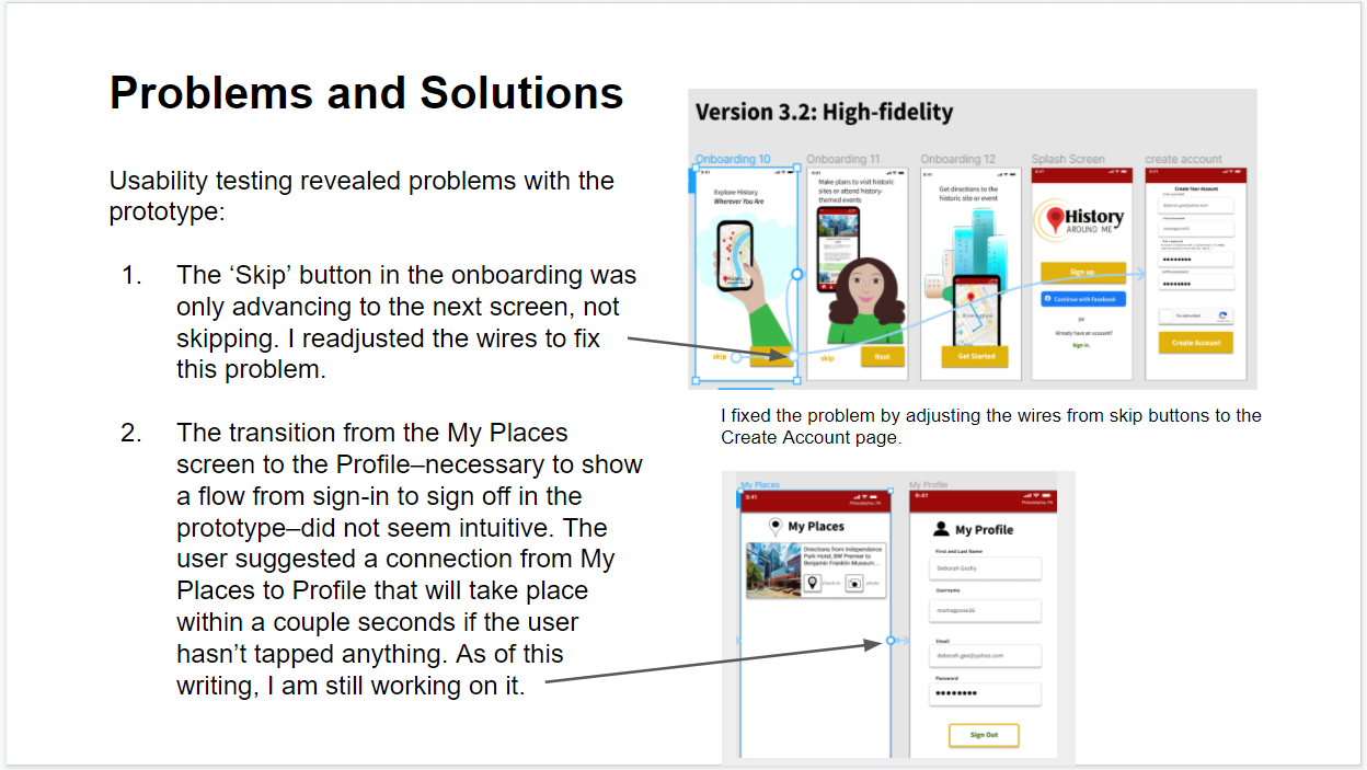
Problems, Suggestions, and Solutions
Two of the problems noted above were easy to address. The 'skip' button that wasn't skipping was easily fixed with an adjustment to the wires. The transition from the My Places to the My Profile screens is improved by modifying the interaction between the two screens. It's still a little problematic--it likes to transition a little too quickly to be helpful-- but I am working on it. I'm not sure about the feedback that the dropdown from the search screen appears to be text suggestions rather than search results. As I used a Google search for the Benjamin Franklin Museum to populate that list, I can say for certain that they are not text suggestions. Matt's suggestion to include journaling in the My Places screen is something that I will consider adding.
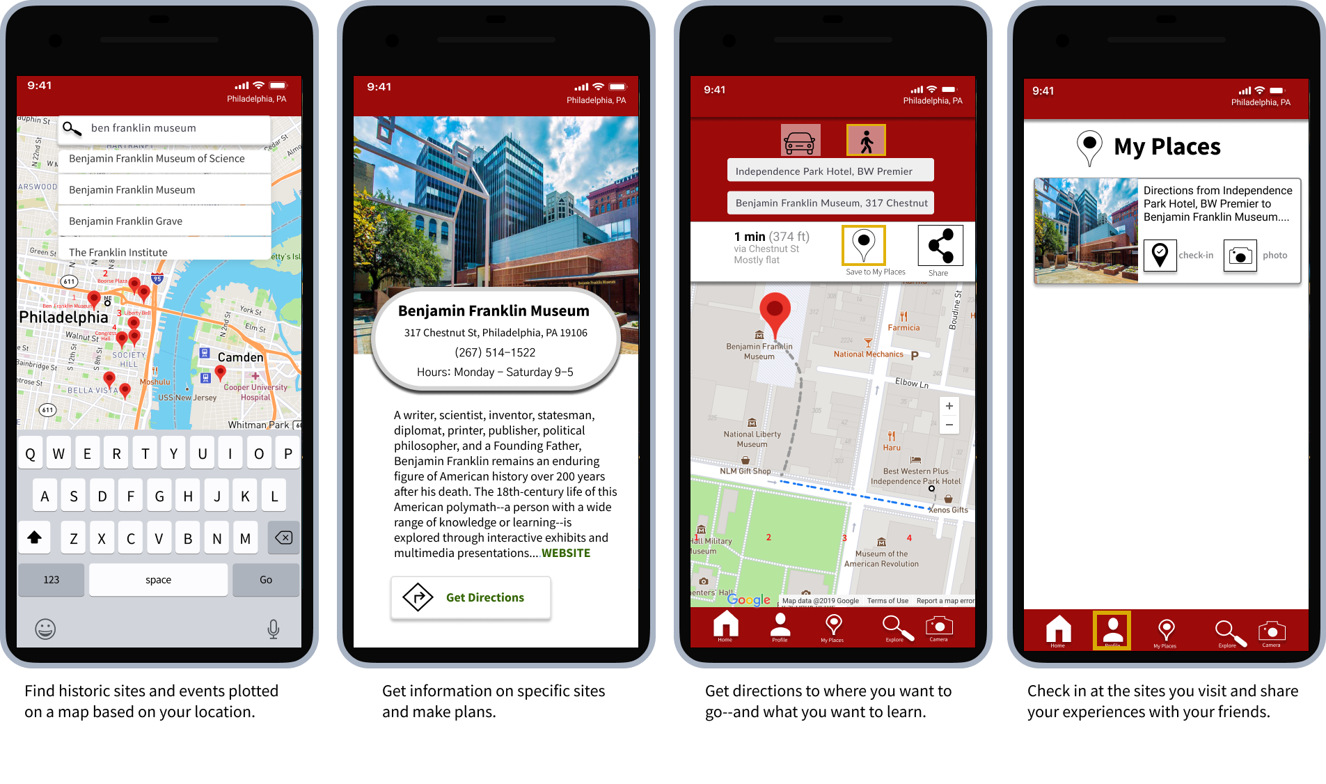
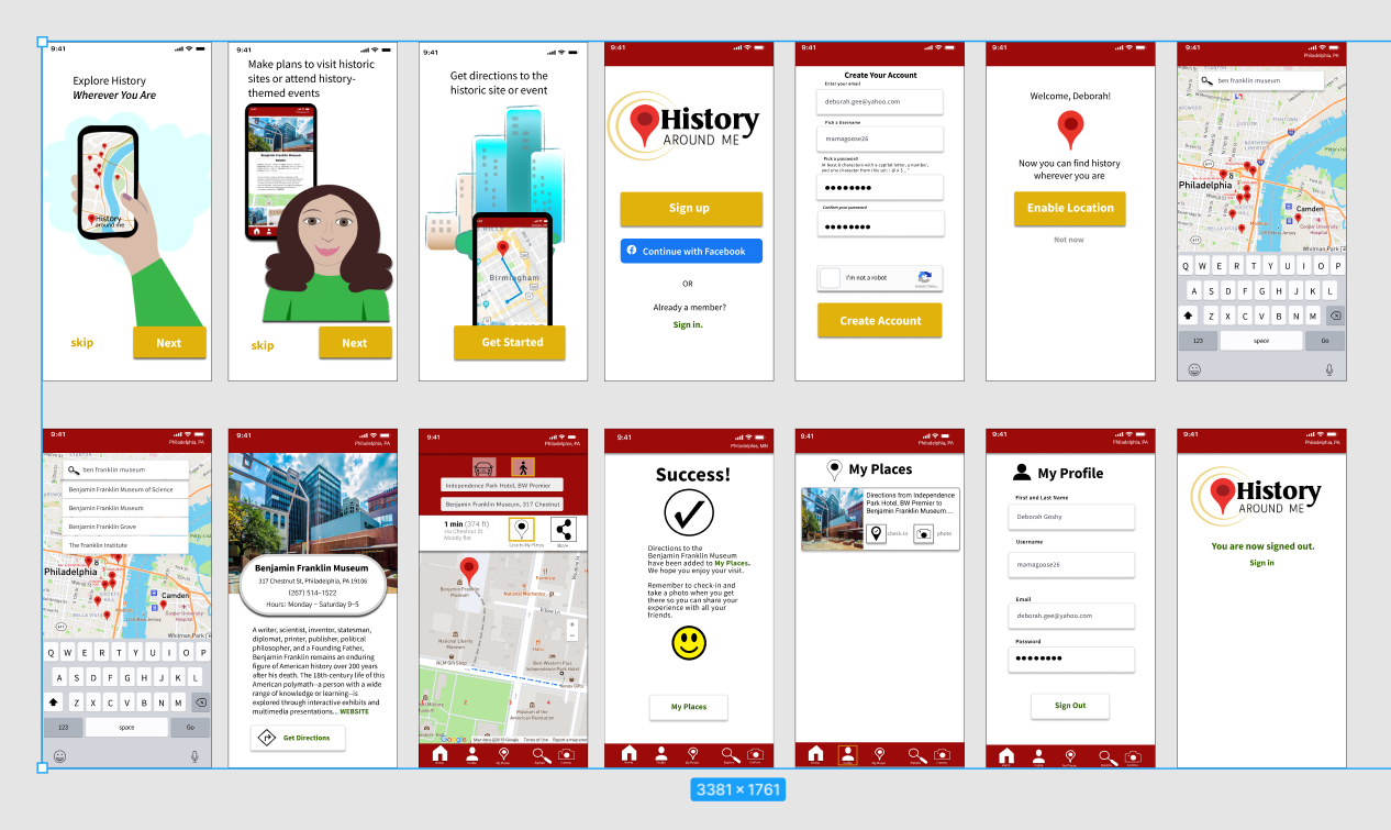
High-Fidelity Wireframes Version 3.2
The final version of the high-fidelity wireframes to date
with all the bells, whistles, and fixes.
Brand Development
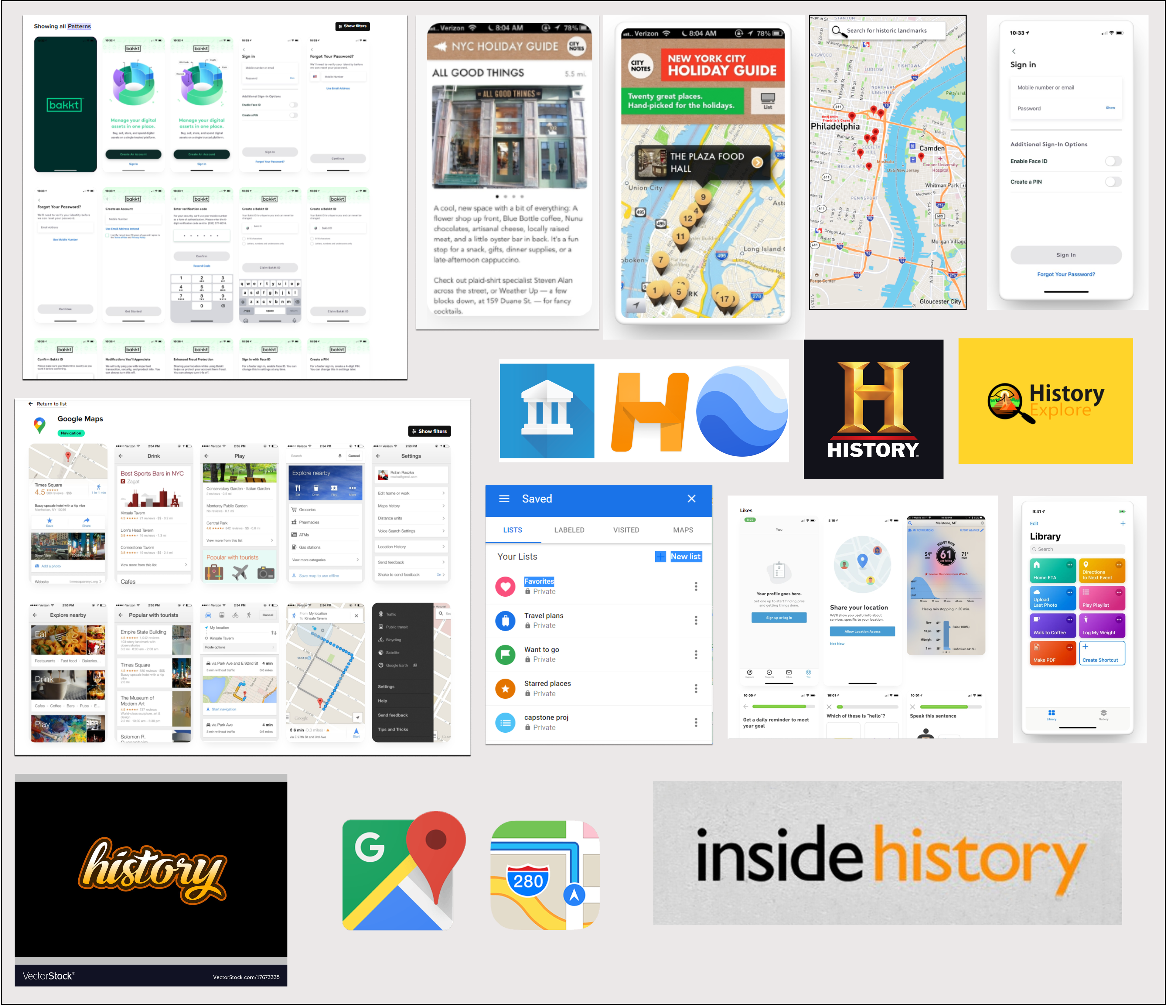
Moodboard
In order to get ideas and inspiration for the visual design, I made a moodboard of UI patterns, individual screens, and logos.
Sketches
As always, I began with sketching. Below are sketches for the wireframes and logos. I also included sketches for a short project that informed the work I did on History Around Me.
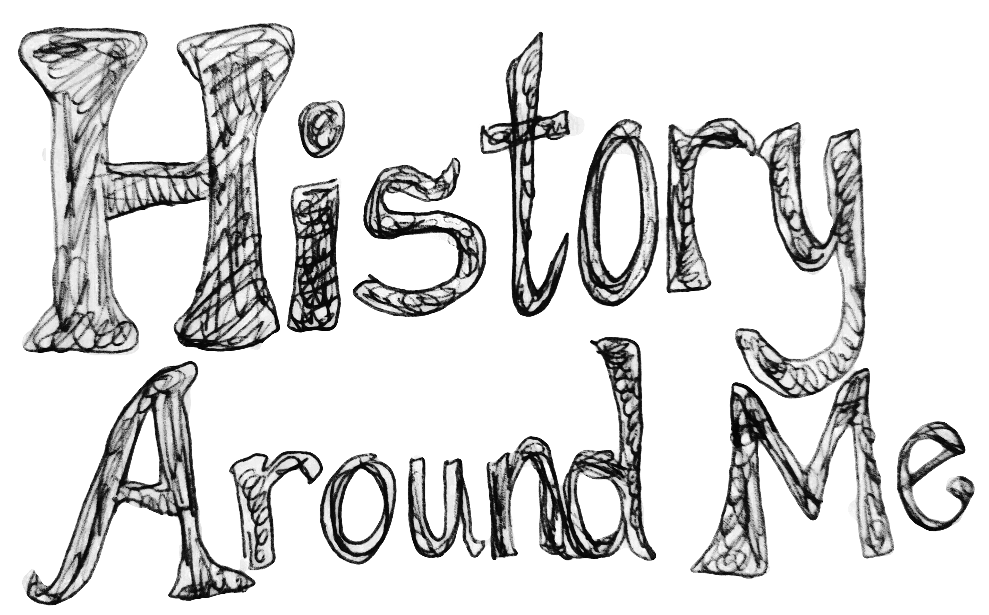


First a name, then a logo:
I initially thought I would call my app "Local Lore", a name that I liked --it was short and sweet and had an alliterative sound. I thought that it aptly described what the app would do, helping users find history around their locations, but rather than bringing the large scope of history to mind, it made the app sound small and forgettable. That's why I changed the name to History Around Me.
I sketched my ideas for the wireframes as I designed the flow of my app, and those sketches helped me to consider the logo and icons as well. I used a location balloon icon to represent the user's location. The two concentric circles around the location balloon are meant to represent the area around a user's location, the "Around Me" in the name of the app.
Logo Design and Process

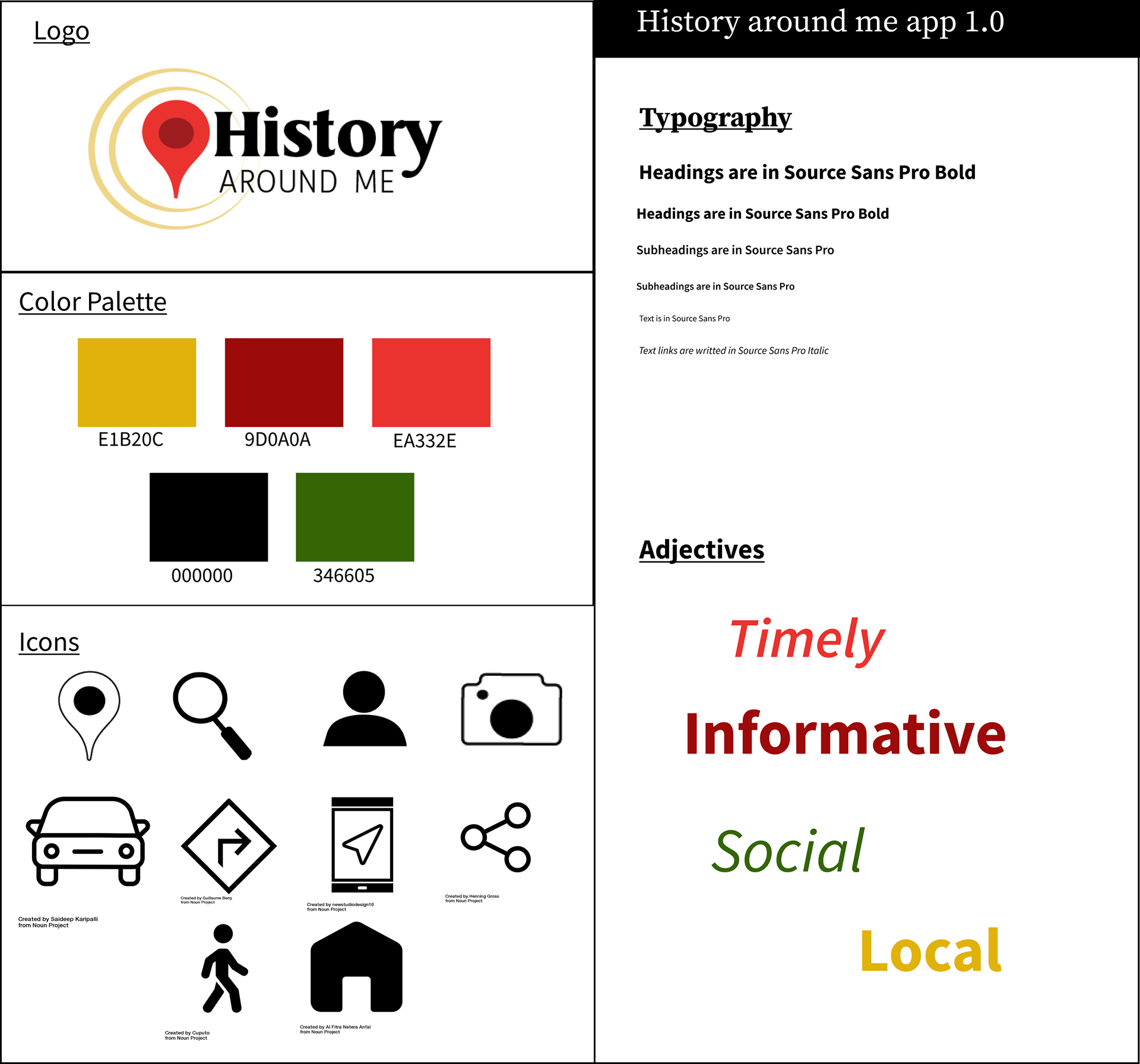
Color Palette
I chose deep colors for the color palette because they are colors that connote establishment, endurance, and history. If you look at other history logos, you'll find that maroon and gold have been used before, one notable example being the History Channel logo.

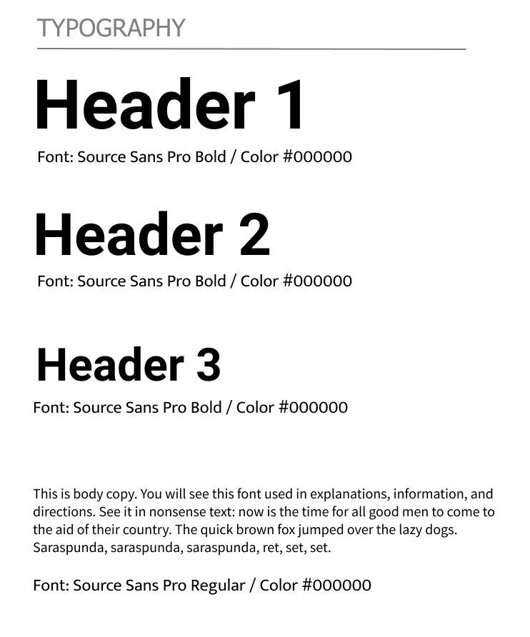
Typography
I chose Source Sans Pro for the type because of its nice clean lines. I chose the color palette for connotations of establishment and history, but the same type of choice in typography will only make the interface look dated. That is why I favored a sans serif type over a serif type for this project.
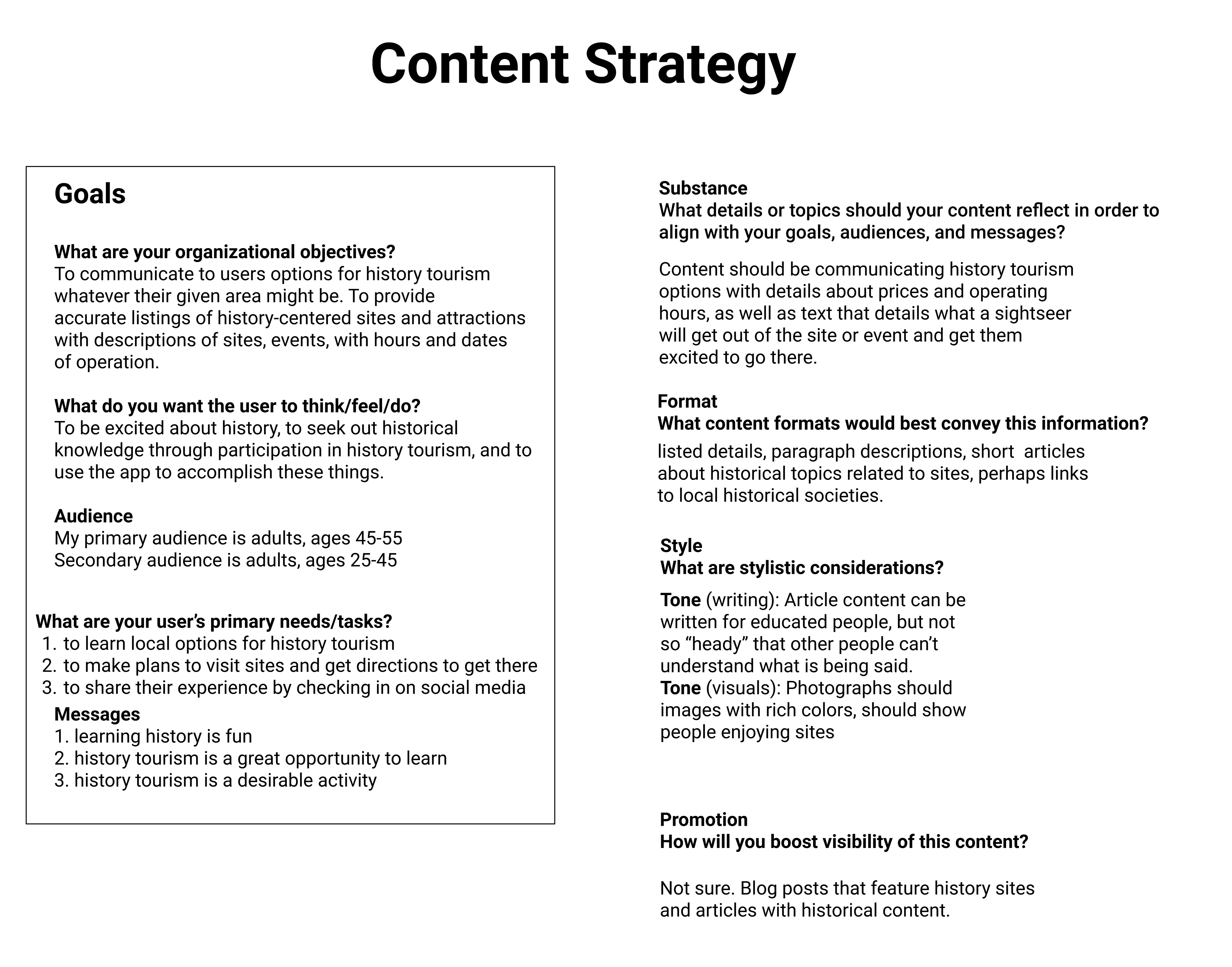
Content Strategy
This project introduced me to the concept of content strategy, the thought process behind the writing, and images that will appear in the app. What kind of impression do I want to make on my primary and secondary audiences? What do I want to communicate to users of the app? What are the best formats for conveying information to users?
Style Tile
The Style Tile shows the color and typography choices I made while designing this app. It should be considered as a style guide for anyone who would make further revisions to the app.
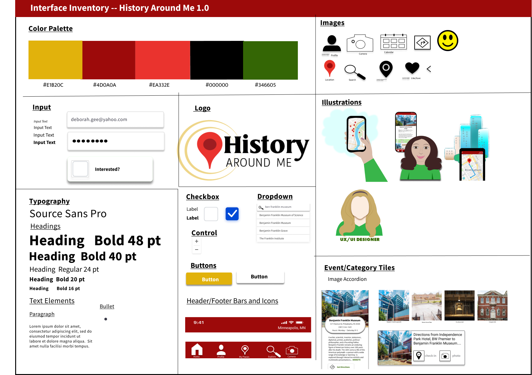
Interface Inventory
This interface inventory shows the stylistic choices of the app--color palette and typography--as well as the type of images used, logo, bars, boxes, and icons.
Prototype Video Capture
Key Images
Final Thoughts
Successes

©Deborah Goschy

Learning Opportunities
©Deborah Goschy
Mistakes
Failure is the key to success;
each mistake teaches us something.
~Morihei Ueshiba

Thanks for Reading!